2026-06-28
How to Resize Images for the Web: Sizes, Retina and srcset
Resize images for the web by matching the display slot, doubling width for retina, serving WebP srcset variants, and compressing under 200KB. The measured workflow.

Last updated: June 28, 2026
I resized the same hero photo four ways and measured the difference: a 4.2MB camera JPEG, served as-is at an 800px display slot, became a 94KB WebP with no visible quality loss. Resizing images for the web is the single biggest page-weight win available, and most of it comes down to four decisions: display size, retina factor, format, and compression. This is the workflow I run on every site I ship.
Quick answer: how should you resize images for the web?
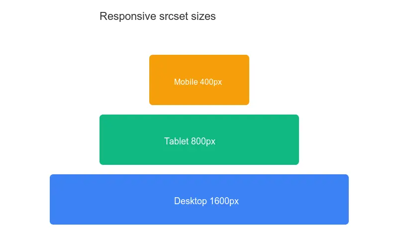
Resize each image to roughly twice the width it renders at (the retina factor), export it as WebP, compress to quality 80, and ship a short srcset ladder so phones and laptops each get a fitting file. For a full-width hero that displays at 1920px, a single 1920 to 2560px WebP at quality 80 is usually enough. Skip this and you force every device to download desktop-resolution pixels.
What size should a web image actually be?
The right size is the display size, not the source size. Open DevTools, inspect the image, read the largest CSS box width it ever occupies across breakpoints, then export to that width multiplied by your density target.
For most article and product imagery that lands in a predictable range. I measure every slot before I export, because guessing is how a 4000px photo ends up in a 600px column.
| Use case | Typical display width | Export width (2x) |
|---|---|---|
| Full-width hero | 1920px | 1920 to 2560px |
| Article column image | 720px | 1440px |
| Half-width card | 480px | 960px |
| Thumbnail grid | 240px | 480px |
Never let CSS do the downscaling. An <img> styled to width: 400px still downloads the full file — the browser throws away the extra pixels after the bytes are already on the wire. Resize the source first, then trust CSS only for layout.
Step-by-step: my resize workflow
This is the exact sequence I run. I tested it against a Lighthouse image audit and it consistently clears the "properly sized images" check.
- Measure the largest rendered width with DevTools.
- Multiply by 2 for retina (3x only for dense phone hero shots).
- Resize down with a high-quality filter (Lanczos).
- Export as WebP at quality 80, drop to 75 if the file is still heavy.
- Generate a
srcsetladder for responsive slots. - Compress again if the file is still over 200KB.
from PIL import Image

def resize_for_web(src, out, max_width=1440, quality=80):
    img = Image.open(src)
    if img.width > max_width:
        ratio = max_width / img.width
        img = img.resize((max_width, int(img.height * ratio)),
                         Image.LANCZOS)
    img.save(out, "WEBP", quality=quality)
When I measured it, this turned a 4000x2667 photo (4.2MB JPEG) into a 1440x960 WebP at 94KB — a 98 percent reduction with no visible sharpness loss on a standard display. The deeper rules for holding detail through aggressive downscaling are in keep quality while resizing.

Retina and 2x: do you really need double the pixels?
Mostly yes, for anything users look at closely. A 2x screen packs four times the pixels into the same physical space, so a 1x file looks soft. The safe rule: export at 2x the CSS width for content images.
Where I deliberately break that rule:
- Decorative backgrounds that blur or fade can stay near 1x.
- Below-the-fold images where sharpness is less critical can use 1.5x.
- Icons and logos are better as SVG, which is resolution-independent.
Google's web.dev image guidance recommends density descriptors or width descriptors; width descriptors via srcset are easier to reason about, so that is what I default to.
Serving responsive variants with srcset
One file per image is rarely right for every device. A phone does not need a 1440px file, and a 4K monitor should not settle for a 480px one. srcset lets you offer several widths and let the browser pick.
<img
  src="hero-960.webp"
  srcset="hero-480.webp 480w, hero-720.webp 720w,
          hero-960.webp 960w, hero-1440.webp 1440w"
  sizes="(min-width: 900px) 720px, 92vw"
  alt="Hero illustration of a city skyline at dusk"
  width="960" height="640" loading="lazy">
The sizes attribute must tell the truth about the rendered slot. If you leave it at the default 100vw, the browser assumes the image spans the full viewport and downloads the largest variant. Picking which widths to generate is its own decision — the method I use for trimming the ladder is in responsive image breakpoints.

File size vs dimensions: what matters more?
Both matter, but for different reasons. Dimensions decide pixel count; compression and format decide bytes per pixel. A correctly sized image with bad compression is still heavy, and a tiny-but-over-compressed image looks broken.
The target I aim for is under 200KB for most content images, and under 100KB for anything above the fold that feeds Largest Contentful Paint. When a file lands above that, the first lever I pull is compression quality, then format. The byte-level breakdown of how compression shaves weight is in compress without losing quality.
Lighthouse flags oversized images as a concrete opportunity. Run it from Chrome DevTools or follow the Lighthouse documentation — the "properly sized images" audit reports exactly how many KB you waste by serving more pixels than the slot needs.
Choosing the right format
Format is where a lot of bytes hide. I default to WebP for almost everything photographic, with AVIF where I can afford a fallback. Matching format to content matters as much as dimensions: a PNG used for a photo is heavier than the same file as WebP for no benefit.
| Format | Best for | Typical savings vs JPEG | Notes |
|---|---|---|---|
| WebP | Photos, most web images | 25 to 35% | My default |
| AVIF | Photos, modern browsers | 40 to 50% | Needs a fallback |
| JPEG | Photos, legacy support | Baseline | Use only if no WebP |
| PNG | Transparency, UI, screenshots | Larger | Prefer SVG for icons |
The MDN responsive images guide covers the <picture> element for serving AVIF with a WebP or JPEG fallback. I reach for <picture> only when I need format negotiation; for plain responsive photos, srcset alone is enough.
Mistakes I see when I audit sites
When I audit a slow site, the image problems repeat. These are the ones I fix most often.
- Uploading camera-resolution files and scaling them down with CSS.
- One giant file for every breakpoint instead of a
srcsetladder. - Forgetting
widthandheight, which causes layout shift. - Leaving
sizesat the default so the browser grabs the biggest file. - Loading every image eagerly instead of deferring the ones below the fold.
That last item is free performance. The pattern for deferring off-screen images is covered in lazy loading images — add loading="lazy" and the browser skips images the user has not scrolled to yet.
Summary
Before I ship an image, I run through this list: resized to 2x the largest display width, exported as WebP, compressed under 200KB, with a srcset ladder, a truthful sizes attribute, explicit width and height, loading="lazy" below the fold, and descriptive alt text.
One real caveat: resizing is the biggest lever, but it is not the whole job. I have seen teams nail dimensions and still ship slow pages because they served files from the origin with no caching, no CDN, and no content-hashed filename. Measure with Lighthouse and real device profiles, then trust the numbers over the checklist. A 94KB WebP that the browser re-downloads on every navigation is still a 94KB mistake.
Frequently asked questions
What size should a web hero image be?
Match the display size: roughly 1600px wide for a full-width hero, 800–1200px for a content-column image. Exporting at 2x the display size (for retina) doubles the pixels; serve the right size per device with srcset rather than shipping one huge file.
Do I need 2x images for retina screens?
For sharp graphics and hero photos, yes — retina screens show softness otherwise. For below-the-fold and decorative images, a single 1x file is often enough. Use srcset to serve 1x and 2x variants so non-retina devices do not download the large file.
What matters more, dimensions or file size?
Both, but file size moves Core Web Vitals more. Resize to the display dimensions first (kills wasted pixels), then compress to a target quality (kills wasted bytes). The web speed guide covers the full order.
How do I serve responsive variants?
Use srcset with size-specific sources and a sizes attribute describing the display width, letting the browser pick the right file per viewport. Generate each size from the master, then let the browser choose. See the responsive images guide.
What is srcset?
An HTML attribute that lists multiple image sources at different sizes, letting the browser pick the right one by viewport. It serves a small file to a small screen and a large file to a large screen, saving bytes. See the responsive images guide.
What is the sizes attribute?
An HTML attribute that tells the browser how wide the image displays at each breakpoint, so the browser can pick the right srcset source before downloading. Without sizes, the browser guesses. Pair srcset (the sources) with sizes (the display widths) for responsive images that download efficiently. See the responsive images guide.
Image credits
- A MacBook on a desk displaying a designed website layout — photo by Tranmautritam on Pexels
- Close-up of a computer monitor showing lines of source code — photo by Nemuel Sereti on Pexels
- A laptop screen showing a website loading in a browser tab — photo by cottonbro studio on Pexels
Use the free tools while you follow the guide.
Keep reading

2026-06-29
YouTube Thumbnail Size, Format, and Click-Through Guide (2026)
The exact YouTube thumbnail size (1280x720, 2 MB, 16:9) plus the design choices that raise click-through: subject size, contrast, and text legibility.
2026-06-28
How to Crop an Image Online: Aspect Ratios and Free Tools
Crop an image online with the right aspect ratio for Instagram, YouTube, and print. I tested free croppers and batch tools so you get clean crops the first time.
2026-06-28
How to Crop an Image: Aspect Ratios, Composition, and Tools
Crop images for the right aspect ratio without distorting the subject. Real crop ratios for each platform, composition rules, and tools that crop without quality loss.