2026-06-28 · Updated 2026-07-10
How to Add a Vintage Filter to Any Photo in 2026
Add a vintage filter to photos using free online tools. Learn sepia, faded film, and Polaroid looks plus exact settings and export steps that keep quality.
Last updated: July 10, 2026
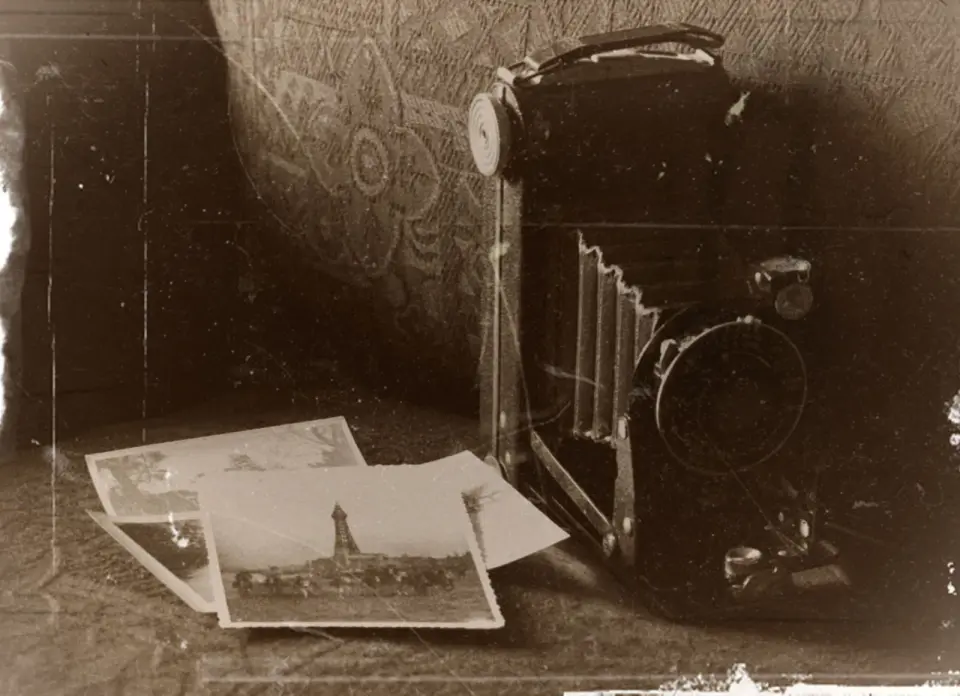
A vintage filter simulates the look of aged film — warm sepia browns, faded blacks, color shifts, grain, and light leaks. You can apply one to a modern photo in under a minute with a free browser tool, no Photoshop required. Below I cover the actual settings that produce believable retro looks, how to match each effect to the right photo, and how to export without degrading the file.
Quick answer: how do you add a vintage filter to a photo?
The fastest path is our Vintage Filter tool: upload your photo and drag the amount slider to roughly 60%. If the photo will be cropped or resized later, do that first with the image cropper and image resizer so the filter is applied to the final framing. Keep the original; vintage effects are destructive once you flatten and export.
What counts as a vintage filter?
A true vintage filter is more than a sepia overlay. Classic film stocks each had a signature color response, and convincing retro looks borrow from that history. Kodak Portra leaned warm with soft contrast, while Fuji reversal film pushed greens and deep blacks. A digital filter approximates these by shifting white balance, lifting shadows, desaturating highlights, and adding grain.
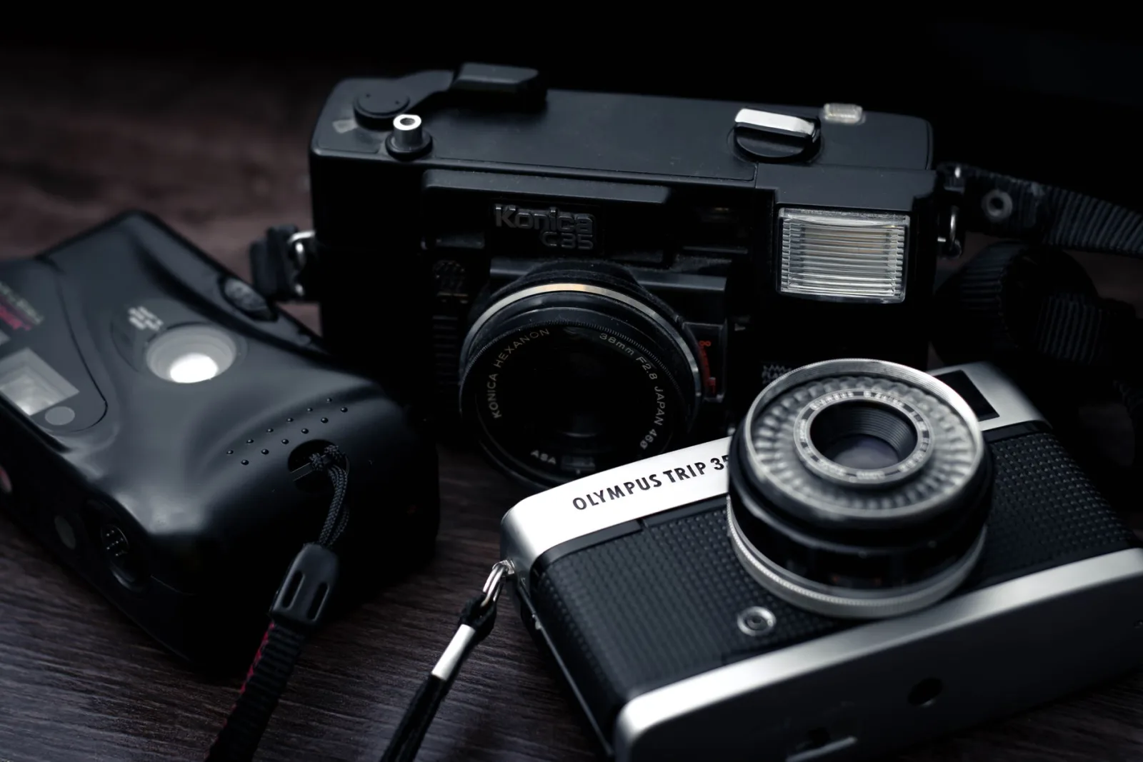
Film grain is the component most people under-apply. Real 35mm stock had visible silver halide clumps that softened detail and smoothed skin. A light grain layer (10-20% opacity) is what separates a believable aged photo from a flat brown tint. For an authoritative reference on how silver halide crystals formed film grain, the Kodak technical primer on photographic emulsions documents the underlying chemistry.
Which vintage look should you choose?
Match the look to the subject, not the other way around. Portraits read well with warm, low-contrast tones; landscapes can carry cooler, grainier treatments.
| Look | Best subject | Key settings |
|---|---|---|
| Sepia | Portraits, documents | Warm tint, lifted shadows, soft contrast |
| Faded film | Street, travel | Lifted blacks, slight desaturation, grain |
| Polaroid | Casual, social | Green/cyan shift, vignette, white border |
| Cross-process | Bold, graphic | Shifted highlights, crushed blacks |
- Sepia is the safest starting point — flattering on faces and forgiving of weak lighting.
- Faded film works on busy scenes where a flat, low-contrast look hides noise.
- Polaroid borders feel dated in a deliberate way; use them for social, not product shots.
- Cross-process is loud. Reserve it for single-subject frames.
- Grain matters more than the color tint for realism; start at 15%.
Step-by-step: applying a sepia vintage filter
This is the exact sequence I use for portraits and old family scans.
- Open the photo in the Vintage Filter tool and set the amount slider.
- If the framing is loose, crop to the subject first using the image cropper.
- Drop saturation by about 15%, then push color temperature warmer by 800-1200K.
- Lift the black point 8-12 units so shadows look faded rather than crushed.
- Add film grain at 15% and a soft vignette at 25%.
- Export at full resolution. If you need a smaller file, compress the image afterward, not before.
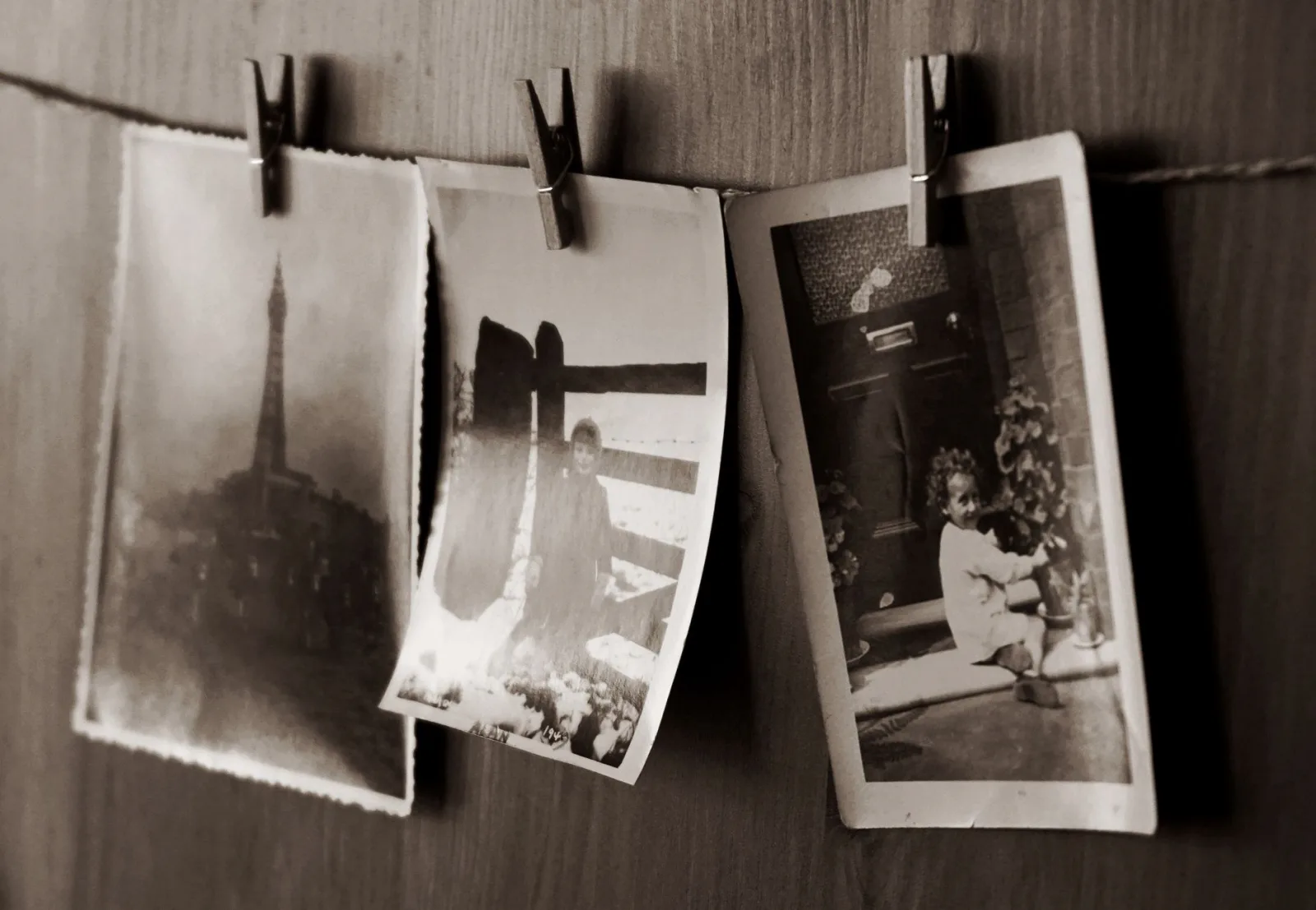
Prepping the file matters as much as the filter. If your source is a phone JPEG that has already been compressed, the grain step will amplify artifacts. For scanning work where the original is damaged, run it through photo restoration first — see the old photo restoration guide. A clean source lets the vintage treatment sit on top of real detail instead of hiding flaws.
A common mistake is treating intensity as a creativity dial. It is not. Past 70% the filter stops looking like aged film and starts looking like a brown overlay slapped on a modern photo. The believable range is 50-70% with grain doing the heavy lifting. If a portrait still looks too sharp after the tint, the fix is more grain, not more sepia.
How do you get a faded Polaroid look?
The Polaroid aesthetic is less about color and more about the instant-camera flaws: slight overexposure, a cyan-green cast, soft corners, and that white frame. Build it in layers rather than one preset.
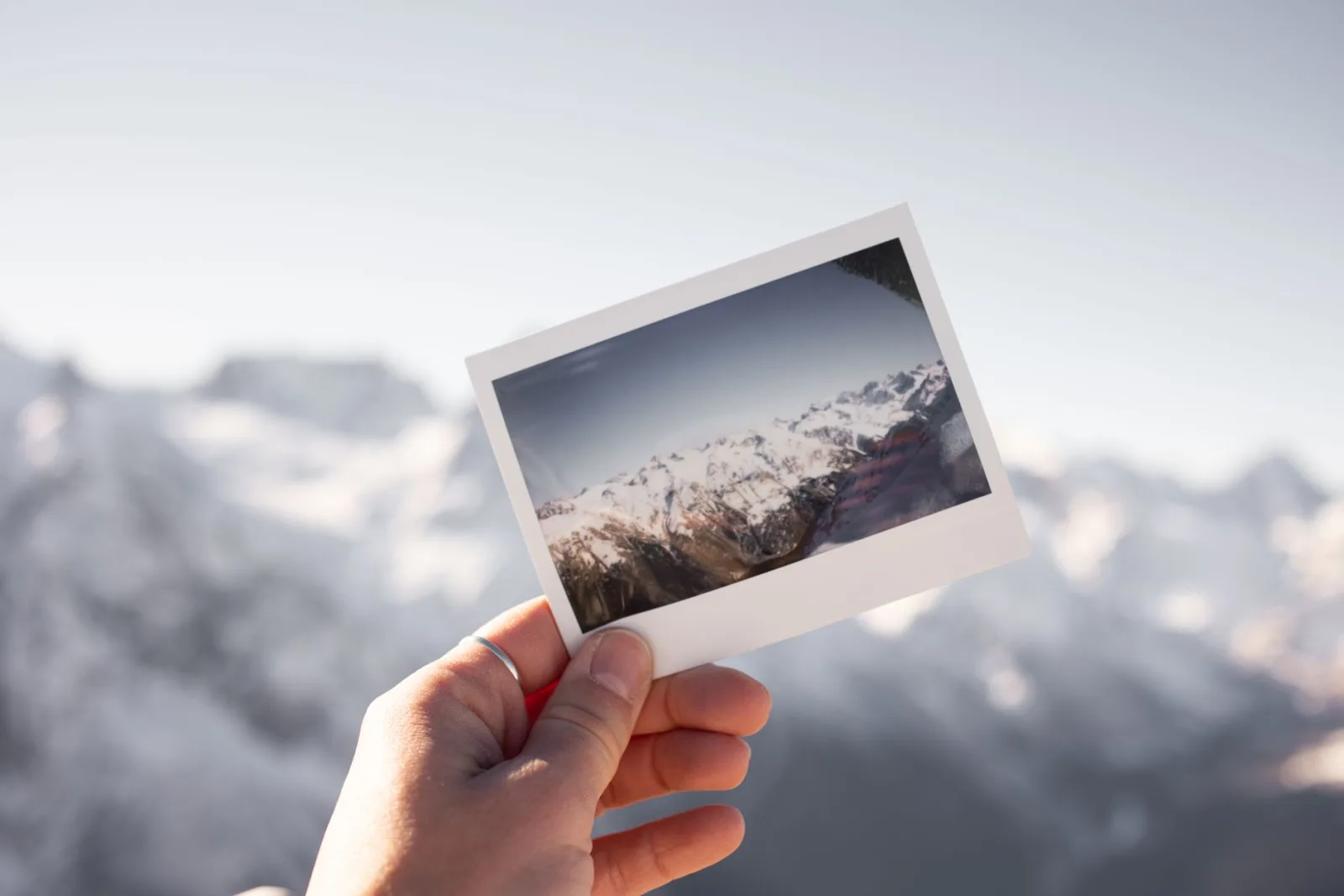
- Overexpose by +0.5 stops to mimic instant film's tendency to blow highlights.
- Shift whites toward green-yellow, about -8 on the tint slider.
- Add a radial vignette and a 4-6% white border crop.
- Keep grain low — instant film was surprisingly sharp despite the soft look.
If you want to push the instant-photo feeling further, pair the result with the light leak effect or layer a duotone for a stylized catalog shot — see the duotone photo effect guide for the color-mapping method.
Keeping quality through export
Vintage filters add grain and lift shadows, which makes files compress worse than a clean original. Export order matters.
| Stage | Format | Why |
|---|---|---|
| Working | PNG or TIFF | Lossless, re-editable |
| Final web | WebP at q 80 | Smallest, grain holds |
| PNG | Avoids JPEG banding in shadows |
- Never re-save a JPEG through multiple filter passes; each save compounds artifacts.
- For social upload, resize to the platform spec first — try the social media size reference.
- Grain resists compression, so you can usually drop WebP quality to 78 without banding.
- When in doubt about format trade-offs, the WebP vs JPEG comparison breaks down where each wins.
- If the source is too small for grain to read, upscale with the image upscaler before filtering.
For the technical basis on why lifted shadows band under JPEG compression, the Mozilla image format reference on DCT quantization documents the coefficient behavior that causes banding in flat tonal regions.
When should you skip the vintage filter?
Not every photo benefits from aging. Crisp product shots, real estate interiors, and anything meant to convey accuracy (medical, documentary) lose credibility under a sepia treatment. A vintage look is a storytelling choice — it signals memory, nostalgia, or analog craft. If the goal is "this is real and current," keep the colors clean. For marketing images where you want a retro catalog mood, the AI product photo generator can build the scene from scratch instead of aging a flat original.
A practical test: cover the filtered half of the photo and look at the unedited half. If the unedited version already tells the story you wanted, the filter is decoration, not communication. Save the vintage treatment for photos where the aged look adds meaning — old family scans, travel memory shots, or brand work that leans on nostalgia.
Quick reference card
Pin these starting points before you tweak.
- Sepia portrait: warm +1000K, saturation -15%, grain 15%.
- Faded street: black point +10, contrast -12, grain 20%.
- Polaroid social: exposure +0.5, tint -8, vignette 25%.
- Restored family scan: restore first, then sepia at 60%.
- Always keep the unedited original in PNG.
The right vintage filter is the one a viewer believes was shot on film. Start subtle, match the look to the subject, and export lossless. For batch work across a folder of photos, the batch image processing tool applies the same preset to every file at once.
Frequently asked questions
What makes a filter look vintage?
A warm color cast, faded blacks (raised black point), reduced saturation, added grain, and sometimes a soft focus or vignette. No single slider does it — vintage is a combination of subtle analog imperfections.
Should I add grain to a vintage filter?
Yes, lightly. Real film has grain, and a small amount sells the analog look. Too much grain turns muddy, especially in shadows and after compression. Keep it subtle enough to read as texture, not noise.
Does a vintage filter reduce image quality?
Not in the pixel sense — it changes color and tone, not resolution. But heavy grain and faded contrast can hide detail, so keep the original and export the filtered version separately. The noise reducer guide is the inverse operation.
How do I get a faded Polaroid look?
Raise the black point (so shadows are dark gray, not black), reduce saturation slightly, add a warm cast and faint grain, and optionally a soft vignette. The raised black point is the key — it mimics aged film stock's lost contrast.
Can I save a vintage look as a preset?
Yes — once you tune the cast, faded blacks, grain, and vignette to a look you like, save it as a preset to apply consistently across a set. Consistency is what makes a series of vintage photos read as intentional.
Use the free tools while you follow the guide.
Keep reading
2026-07-28
AI Action Figure Trend: How to Prep Your Photo Right
Turn a photo into a collectible toy portrait: what makes the prompt work, and the crop, background, and resolution steps that avoid an obvious fake.
2026-07-26
AI Anime Generator Guide: Prompts, Styles, and Safe Exports
A practical AI anime generator workflow for portraits, avatars, banners, and social posts, with prompt templates, style checks, and export rules.

2026-07-26
Text-to-Image AI in 2026: How Prompt Generation Actually Works
Text-to-image AI turns a written prompt into a finished picture. Here is how the models, prompts, and settings behind image generation fit together in 2026.