2026-03-15
Mobile Image Optimization Guide for Faster Pages
A practical mobile image optimization workflow covering responsive sizes, WebP, lazy loading, CDN delivery, image SEO, and Core Web Vitals.
Last updated: June 28, 2026
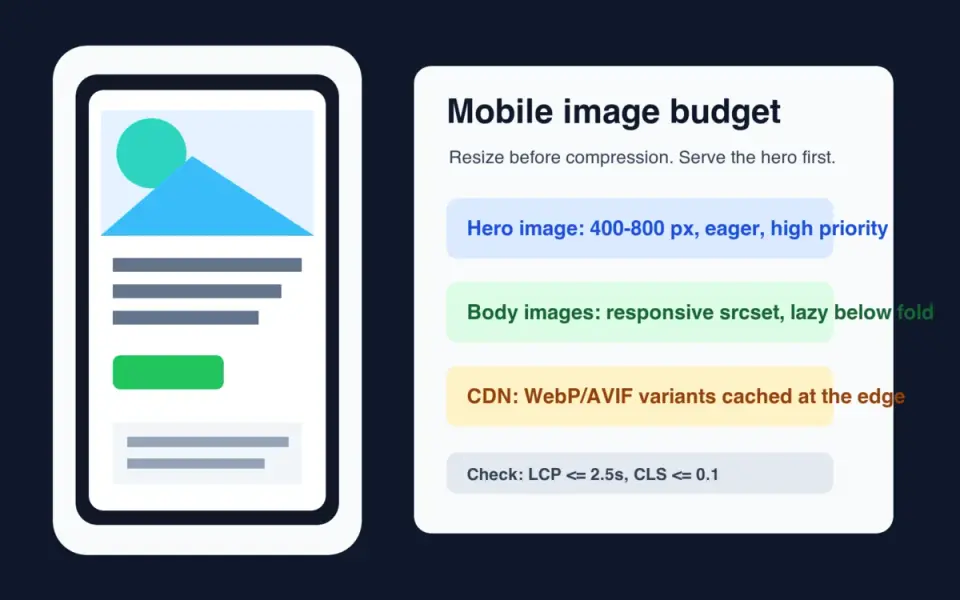
Mobile image optimization starts with one constraint: a phone should not download pixels it cannot display. Resize the source, serve responsive variants, keep the largest above-the-fold image out of lazy loading, and publish crawlable WebP or AVIF files through a CDN.
Quick answer: how should you optimize images for mobile?
Use this order: resize first, encode second, deliver third, measure last. A 4000 px product photo shown at 390 px wide is wasteful even if it is compressed. The browser still has to fetch, decode, and scale it before the page feels ready.
For most mobile pages, ship a WebP or AVIF source set with widths around 400, 800, and 1200 px. Keep a JPEG fallback if your audience includes old browsers, email clients, or partner feeds. For a deeper format decision, use the AVIF vs WebP comparison.
Google's LCP guidance says pages should aim for Largest Contentful Paint at 2.5 seconds or less at the 75th percentile, split by mobile and desktop. Images are often the LCP element, so the hero image deserves special handling: preload or prioritize it, set real dimensions, and do not lazy-load it.
What actually changes on a phone?
A phone changes three things at once: viewport width, network quality, and layout density. Desktop images often fail on mobile because the page keeps the same 1600 px asset, crops the subject badly, or delays the hero behind JavaScript.
I generated one 1600 x 1000 source graphic and encoded it as WebP q82 at three widths. The result shows why resizing beats quality tweaking:
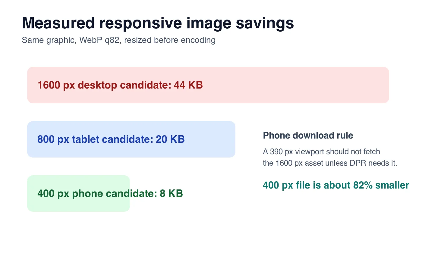
| Candidate | Encoded size | Good use | Mobile problem if overused |
|---|---|---|---|
| 1600 px WebP | 44 KB | Desktop hero or large retina slot | Too many pixels for a 390 px viewport |
| 800 px WebP | 20 KB | Tablet, high-DPR phone hero | Still heavy for small thumbnails |
| 400 px WebP | 8 KB | Standard phone card or narrow image | Too soft if stretched across desktop |
These numbers are illustrative, not universal. A detailed photo will be larger than this clean graphic, and a flat logo will be smaller. The useful rule is stable: make the browser choose from real width candidates instead of one oversized file.
Which mobile image sizes should you create?
Start from the rendered slot, not from the camera file. Inspect your template at common breakpoints and record the maximum CSS width for each image type.
| Image type | Typical mobile display width | Practical source widths | Loading rule |
|---|---|---|---|
| Hero image | 360-430 px | 480, 768, 1200 px | Eager, high priority |
| Product card | 150-220 px | 320, 480, 640 px | Lazy if below first screen |
| Blog body image | 320-430 px | 480, 768, 1024 px | Lazy unless it appears immediately |
| Logo or icon | 24-160 px | SVG or exact-size PNG/WebP | Inline or cached asset |
| Full-width gallery | 360-430 px | 480, 800, 1200 px | Lazy after the lead image |
Use width descriptors when layout width changes:
<img
  src="/images/hero-800.webp"
  srcset="/images/hero-400.webp 400w, /images/hero-800.webp 800w, /images/hero-1200.webp 1200w"
  sizes="(max-width: 640px) 100vw, 720px"
  width="800"
  height="500"
  alt="Reusable water bottle on a kitchen counter"
>
MDN's responsive images guide explains the srcset and sizes selection model. The short version: srcset lists candidates, and sizes tells the browser how wide the rendered slot will be before layout is complete.
For a batch workflow, generate widths from the same master file. The batch resize guide covers the command-line pattern, and the image compression deep dive explains why resize should happen before final compression.
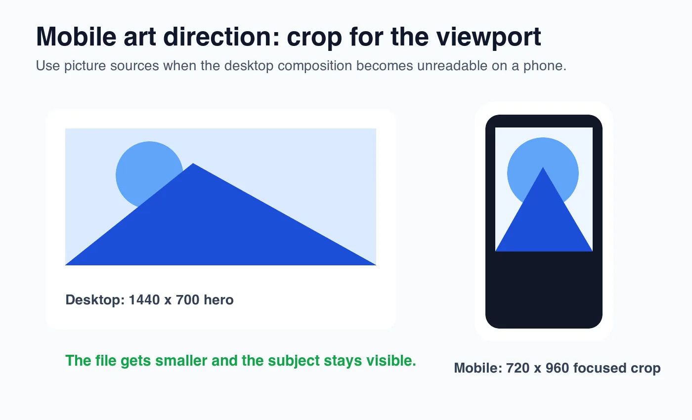
When should you use picture for mobile crops?
Use <picture> when the mobile image needs a different crop, not only a smaller file. A wide desktop hero can become useless on a phone if the subject sits on the far left or the text area covers the product.
<picture>
  <source
    media="(max-width: 640px)"
    srcset="/images/shoe-mobile.webp 720w"
    sizes="100vw"
    type="image/webp"
  >
  <source
    srcset="/images/shoe-desktop.webp 1440w"
    sizes="min(100vw, 1440px)"
    type="image/webp"
  >
  <img
    src="/images/shoe-desktop.jpg"
    width="1440"
    height="700"
    alt="Trail running shoe with the sole tread visible"
  >
</picture>
Use art direction for:
- Product hero images where the product gets tiny on mobile.
- Editorial banners where a face or object must stay centered.
- Marketplace listings that need square thumbnails and wide detail images.
- Before/after images where both sides must remain readable.
- Screenshots with small text that needs a tighter crop.
Do not use <picture> as a substitute for normal responsive widths. If the composition is the same, srcset plus sizes is simpler.
How do WebP, AVIF, and JPEG fit mobile performance?
Use WebP as the baseline mobile format when you need one modern file that works broadly. Use AVIF when your pipeline can generate it and you can keep WebP or JPEG fallback. Keep JPEG for email, old partner systems, and source archives that other tools need to open.
| Format | Mobile role | Watch out for |
|---|---|---|
| WebP | Safe default for web delivery | Still needs a fallback in strict legacy environments |
| AVIF | Best compression for many photos and heroes | Slower encoding and occasional tooling gaps |
| JPEG | Compatibility fallback | Larger files at similar visual quality |
| PNG | Icons, transparency, sharp UI screenshots | Too large for most photos |
| SVG | Logos and simple vector marks | Not for complex photos |
The complete image optimization checklist covers the broader publishing sequence. If you need to compare tools that output WebP and AVIF, see TinyPNG alternatives.
Use a <picture> stack when you can:
<picture>
  <source srcset="/images/card-480.avif 480w, /images/card-800.avif 800w" type="image/avif">
  <source srcset="/images/card-480.webp 480w, /images/card-800.webp 800w" type="image/webp">
  <img src="/images/card-800.jpg" width="800" height="600" alt="Blue ceramic mug beside a notebook">
</picture>
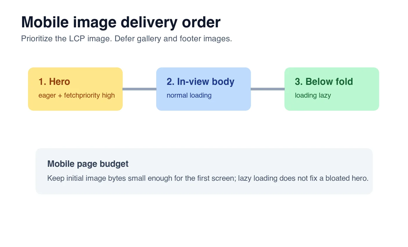
How should lazy loading work on mobile?
Lazy-load images that start below the first viewport. Do not lazy-load the LCP image. Browser-level lazy loading is useful, but it is not a performance plan by itself.
Google's browser-level lazy loading guide recommends native loading="lazy" for offscreen images. The same guidance warns against lazy-loading immediately visible images because it can delay the content users are waiting for.
Use this checklist:
- Give the hero image
loading="eager"or omitloading. - Add
fetchpriority="high"to the most likely LCP image. - Add
loading="lazy"to images after the first screen. - Set
widthandheighton every image. - Use CSS
aspect-ratiowhen the rendered ratio changes by breakpoint. - Avoid JavaScript-only image injection for the hero.
- Check that CDN image URLs include long cache headers.
- Test on a throttled mobile profile, not only desktop Wi-Fi.
- Watch the LCP element in PageSpeed Insights.
- Re-run after design changes, because the LCP element can change.
Google's LCP documentation lists image elements, video posters, and background images among possible LCP candidates. That is why a background hero can still hurt LCP even if it is not an <img>.
What should an image CDN do for mobile?
An image CDN should remove repetitive manual work: resize at the edge, negotiate format, cache variants, and keep public URLs stable. The CDN does not replace source hygiene. Uploading a blurry 900 px product photo to an image CDN will not create real 1600 px detail.
Look for these controls:
- Width transforms for common mobile and desktop slots.
- WebP and AVIF output with the correct
Content-Type. - Cache keys that include width, quality, and format.
- A way to preserve original uploads separately from public derivatives.
- Stable public URLs that Google Images can crawl.
- Monitoring for 404s after deploys and migrations.
For search, Google's image SEO best practices emphasize useful, visible images near relevant text, descriptive filenames and alt text, and crawlable image URLs. A CDN URL is fine when it is indexable, stable, and referenced from the page.
What should you test before publishing?
Test the page the way a mobile visitor receives it. One clean Lighthouse run is helpful, but it can hide CDN misses, oversized responsive candidates, and layout shifts that only appear in real templates.
| Check | How to verify | Pass condition |
|---|---|---|
| Right candidate downloaded | Chrome DevTools Network, filter Img | Phone viewport does not fetch desktop-only widths |
| LCP image priority | PageSpeed Insights or Lighthouse trace | Hero is not lazy and appears early |
| Layout stability | Inspect image boxes before load | Width, height, or aspect ratio reserves space |
| Search usefulness | Rendered page and source HTML | Image sits near relevant text with descriptive alt |
| CDN health | curl -I each final image URL |
HTTP 200 and Content-Type: image/webp |
One practical command for a local audit:
curl -I https://cdn.example.com/images/product-card-480.webp
Then check the rendered page at a narrow viewport. If a table or image overflows the screen, fix the layout before celebrating the byte savings.
Mobile image SEO and GEO checklist
Search engines and answer engines need the same thing a person needs: direct context. Do not bury images in a carousel with no nearby explanation and expect the asset to carry meaning by itself.
Before publishing, confirm:
- The page has one clear answer near the top.
- Each important image has descriptive alt text.
- Filenames describe the visible subject, not
IMG_9021. - The image URL is crawlable without cookies.
- The surrounding paragraph explains why the image is present.
- The mobile hero is not larger than the rendered slot needs.
- Body images use
loading="lazy"only when below the first viewport. - Tables summarize decisions that a reader can reuse.
- External claims link to authoritative sources.
- Internal links point to the next real workflow, not a random cluster page.
For the SEO-specific pass after compression, use the image SEO optimization checklist. For one-off file work, the Image Compressor, Image Converter, and Image Resizer cover the common manual steps.
Frequently asked questions
What is the single biggest mistake in mobile image optimization?
Serving one oversized master image to every viewport instead of a real srcset of resized candidates.
Should I use WebP or AVIF for mobile images?
Use WebP as the safe default and add AVIF when your pipeline can generate it, keeping a WebP or JPEG fallback.
What image widths should I generate for a mobile hero?
Generate at least 480, 768, and 1200 px WebP or AVIF candidates so the browser can pick the closest match.
Should the hero image be lazy-loaded on mobile?
No, the hero or likely LCP image should load eager with fetchpriority="high", never loading="lazy".
When should I use picture instead of srcset for mobile?
Use <picture> only when the mobile crop must change, such as a product photo that shrinks to nothing on a narrow viewport.
How much smaller is a 400 px WebP image than a 1600 px source?
In the measured example in this guide, the same source dropped from 44 KB at 1600 px to 8 KB at 400 px WebP q82.
Does an image CDN fix a low-resolution source photo?
No, a CDN resizes and re-encodes at the edge but cannot recreate detail that was never captured in the original upload.
What should I check before publishing mobile images?
Confirm the phone downloads the right width candidate, the hero is not lazy-loaded, and every image has descriptive alt text.
Image credits
- Cover, responsive width chart, art-direction crop, and loading-priority chart were generated for this article with ImageMagick and exported as WebP. The responsive width chart uses measured WebP q82 output from the same 1600 x 1000 source graphic.
Use the free tools while you follow the guide.
Keep reading
2026-07-18
Convert HEIC to JPG: Free Tools and Batch Methods Compared
Convert HEIC iPhone photos to JPG with free web, Mac, Windows, iPhone, and command-line tools, compared by speed, batch support, and where each fits.

2026-07-18
JPG to PDF Guide: Combine Multiple Images Into One Document
Turn a set of JPG images into a single ordered PDF for portfolios, reports, and submissions. Free methods for each device, page ordering, and quality settings.
2026-06-28
How to Check Image Size, Dimensions, and File Format
Find an image's exact pixel dimensions, file size in KB or MB, DPI, and format. Methods for Windows, Mac, iPhone, Android, and online, plus what each value means.