2026-06-28 · Updated 2026-07-26
Image Optimization Checklist: Every Step for Fast Web Images
A complete image optimization checklist: format choice, resizing, compression, responsive delivery, lazy loading, and CDN setup. Run through it before every publish.

Last updated: July 26, 2026. Re-run this checklist before every publish for consistent results.
Image optimization is a sequence, not a single step. Skip a stage and the result is either slow or blurry. This checklist walks through every stage — format choice, resizing, compression, responsive delivery, lazy loading, and CDN setup — in the order you actually do them, so you can run through it before every publish and know the images will load fast and look sharp.
Quick answer: what does a full image optimization pass include?
A complete pass means choosing the right format (WebP for photos, SVG for vector, PNG for transparency), resizing to the display dimensions, compressing to the target file size, serving responsive variants with srcset, lazy-loading below-the-fold images, and delivering from a CDN. Skipping any stage leaves performance on the table — an uncompressed image is slow, an oversized image wastes bytes, and an image without lazy loading delays the initial render. Run the whole checklist rather than picking stages.
Why run a checklist instead of optimizing ad hoc?
Image optimization has many small steps, and forgetting one undoes the work of the others. A checklist turns a forgettable multi-step process into a repeatable routine that produces consistent results.
| Stage | What it controls |
|---|---|
| Format choice | File size, quality, transparency |
| Resizing | Pixels served vs pixels needed |
| Compression | Bytes per pixel |
| Responsive delivery | Right size per device |
| Lazy loading | Initial render speed |
| CDN delivery | Latency to the user |
- Each stage addresses a distinct performance factor.
- Skipping a stage leaves that factor unaddressed.
- The stages are independent enough to checklist reliably.
Stage 1: Choose the right format
Format is the first decision because it constrains everything after. Match the format to the image content.
- WebP — the default for photos on modern browsers. Smaller than JPEG at the same quality.
- AVIF — even smaller than WebP, with growing support. Use with a WebP or JPEG fallback.
- SVG — for logos, icons, and vector graphics. Scales infinitely, tiny file.
- PNG — for images that need transparency and lossless quality.
- JPEG — the universal fallback for photos when modern formats are unsupported.
The format comparison guide and the AVIF vs WebP guide cover the trade-offs in depth. Choose the format that gives the smallest file at acceptable quality for the content.
Stage 2: Resize to the display dimensions
Never serve an image larger than it displays. A 4000-pixel photo in a 600-pixel slot wastes bandwidth and slows the page. Resize to the largest size the image will display, accounting for retina (2x).
| Display context | Resize to |
|---|---|
| Full-width hero | Display width × 2 (retina) |
| Content image | Column width × 2 |
| Thumbnail | Thumbnail size × 2 |
| Background | Max display width × 2 |
Resizing before compression matters because compression works on pixel count — fewer pixels compress to fewer bytes. The resize guide covers doing this without quality loss.
Stage 3: Compress to the target file size
After resizing, compress to reduce bytes. Target the smallest file with no visible quality loss.
- Photos: WebP or JPEG at quality 80.
- Graphics with flat color: PNG or lossless WebP.
- Test at 100% zoom to confirm no visible artifacts.
- Aim for hero images under 200 KB and content images under 100 KB.
The compression guide covers the techniques and quality settings.
Stage 4: Serve responsive variants
Different screens need different image sizes. Serve them with srcset so each device downloads the right file rather than one-size-fits-all.
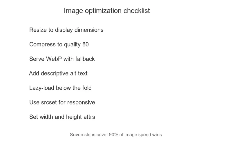
- Generate 1x, 2x, and 3x variants for retina screens.
- Use width descriptors (
400w,800w) withsizesfor responsive layouts. - Let the browser pick the right file.
- The responsive images guide covers the markup.
Stage 5: Lazy-load below-the-fold images
Images below the fold should not load until the user scrolls to them. This frees up bandwidth for the initial render and improves the Largest Contentful Paint metric.
- Add
loading="lazy"to below-the-fold images. - Keep the hero image eager-loaded so the LCP element loads fast.
- The lazy loading guide covers the implementation.
Stage 6: Deliver from a CDN
Serve images from a content delivery network so they load from an edge location near each user. A CDN cuts latency and offloads the origin server, which matters most for sites with a geographically spread audience — a user on another continent otherwise waits for every image to cross that distance from your origin. The CDN guide covers setup, including the transformation features that let a CDN resize and reformat on the fly, and the Core Web Vitals guide ties fast image delivery to the metrics that affect ranking.
A CDN also absorbs traffic spikes. When a page goes viral or a campaign sends a burst of visitors, the edge cache serves the images instead of the origin, so the site stays fast under load that would otherwise overwhelm a single server. For sites where uptime under traffic matters as much as average load time, this resilience is as valuable as the latency reduction.

Common optimization mistakes
Even with a checklist, a few errors recur and undo the work. Knowing them speeds up the verification step.
- Compressing before resizing — wastes effort on pixels that get discarded. Always resize first.
- Serving one size to all devices — phones download desktop-sized files. Use srcset.
- Lazy-loading the hero image — delays the LCP element. Keep the above-the-fold image eager.
- Forgetting width and height attributes — causes layout shift while images load. Always include them.
- Using PNG for photos — balloons the file. Use WebP or JPEG for photographic content.
Verification: did the optimization work?
After running the checklist, verify the result with measurement rather than guessing. Tools confirm whether the images actually load fast, and measurement is the only way to know the optimization worked — visual inspection does not reveal file size or load order. Run these checks on both a fast and a slow connection, since optimization that looks fine on broadband can still struggle on mobile data.
- Run Google PageSpeed Insights and check the image-related opportunities.
- Confirm the LCP element loads within 2.5 seconds.
- Check the network tab to confirm the right-sized file loads per device.
- Verify lazy-loaded images defer until scroll.
The web.dev performance measurement guide documents how PageSpeed scores pages, and the Mozilla performance guide covers the metrics in depth. A page that passes these checks after the checklist has genuinely fast images — not images that merely look optimized. For the broader SEO context, the image SEO guide connects these performance gains to search ranking.
Frequently asked questions
What does a full image optimization pass include?
Choosing the right format, resizing to display dimensions, compressing to a target file size, serving responsive variants with srcset, lazy-loading below the fold, and caching at a CDN. Skipping any stage leaves bytes or quality on the table. The checklist exists so no stage is forgotten.
Why run a checklist instead of optimizing ad hoc?
Because ad hoc optimization misses stages — a developer compresses but forgets to resize, or adds srcset but forgets lazy-loading. A checklist ensures every image gets every stage, consistently, across a whole site. Consistency is what moves Core Web Vitals at scale.
What is the single biggest image optimization win?
Resizing to the display dimensions. A 6000px camera photo served at 800px is the largest single waste on most sites. Resize first; everything else compounds on a correctly-sized base.
How do I serve responsive variants?
Generate each image at the sizes your breakpoints need, then use srcset and sizes to let the browser pick the right file by viewport. The browser downloads only the variant it needs, saving bytes on small screens. See the responsive images guide.
How often should I re-optimize images?
Whenever you add new images, and audit the existing set when Core Web Vitals drop. Old images optimized years ago may be JPEG where WebP would now be smaller. A periodic audit catches format and compression drift.
How do I audit an existing site's images?
Run a crawl (Lighthouse, or a tool like Screaming Frog) to list every image with its size and dimensions, then flag any that are oversized for their display slot, served as JPEG where WebP would be smaller, or missing width/height attributes. Fix the largest offenders first — a few huge images usually account for most of the page weight. Re-run the audit after fixes to confirm the improvement.
Use the free tools while you follow the guide.
Keep reading
2026-09-10
Image Blurry After Export? 7 Fixes That Target the Cause
Fix an image blurry after export by checking pixels, compression and upload changes. See measured examples, PNG vs JPEG choices, and seven practical fixes.

2026-08-01
Image Compression in 2026: WebP, AVIF, JPEG XL & JPEG AI Benchmarked
I benchmarked WebP, AVIF, and JPEG XL on 4 real photos. WebP saves 32% vs JPEG, AVIF 65%, JPEG XL 30%. Full data, browser support, and which format to pick in 2026.
2026-07-26
How to Compress an Image to Under 100KB Without Ruining Quality
Resize to the display width, then export as WebP. Measured file sizes for phone photos, product shots, and screenshots show the recipe to land each under 100KB.