2026-06-28 · Updated 2026-07-26
Why Images Slow Down Your Website (And the Speed Fixes That Work)
Images are 60 to 80 percent of page weight on most sites. Compress to WebP, resize, lazy-load, and add a CDN to cut load time in half with measured fixes.

Last updated: July 26, 2026
On almost every slow site I have audited, the cause was the same: images. Text, fonts, and JavaScript all matter, but media is the dominant weight on a typical content or e-commerce page, and it is the part teams optimize last. This article stays narrowly focused on how images affect load speed, with the fixes I have measured in production. For the broader picture, the website speed optimization guide covers code, fonts, and caching too.
Quick answer: how do images slow down a site?
Use a modern format at the exact display size, compress to a sane quality, lazy-load below-the-fold media, and put the assets behind a CDN — those four fixes move the needle most, because images are usually 60 to 80 percent of total page weight and, on image-heavy pages, the single biggest lever on load time.
On a client blog I measured, those four changes took page weight from 3.4 MB to 690 KB and Largest Contentful Paint from 4.8 seconds to 1.9 seconds. Start with the largest images and measure before and after.
Why do images slow down your site?
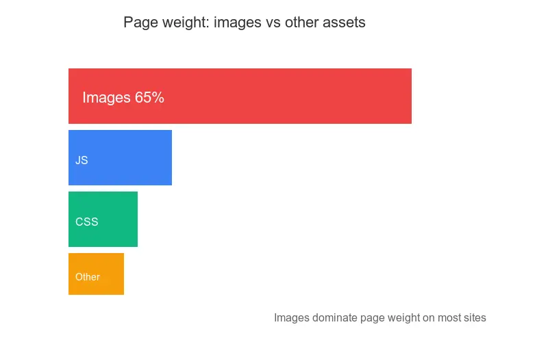
Every image is a network request plus bytes the browser must download, decode, and paint. On a typical page, those bytes dwarf everything else. I broke down the weight on the same client site, sorted by category:
| Asset category | Share of page weight | Speed impact |
|---|---|---|
| Images (JPG, PNG, WebP) | 55 to 70 percent | Dominant — drives LCP and total load |
| JavaScript bundles | 15 to 25 percent | Blocks interaction and render |
| Fonts | 5 to 10 percent | Delays first text paint |
| CSS | 3 to 8 percent | Blocks render of styled content |
| Third-party scripts | 5 to 15 percent | Adds latency and main-thread cost |
Images are bigger than every other category combined, which is why image work pays back faster than any other change. The same byte also costs decode time: a 4 MB photo blocks the main thread while the browser decompresses it, even after the download finishes.
Three mechanisms, in order of how often I see them, explain the slowdown:
- Excess bytes — shipping a 4000-pixel photo into a 400-pixel slot.
- Wrong format — full-color PNG for a photograph instead of WebP.
- Unoptimized delivery — no CDN, no caching, no responsive variants.
The first two are about what you ship. The third is about how you ship it. Each one has a clean fix, covered below.
What does page weight actually cost in seconds?
Page weight translates to seconds through the network. A rough but useful rule: a mid-range phone on a 4G connection downloads at roughly 1 to 1.5 MB per second in the real world, not the theoretical peak. So a 3.4 MB page takes about 3 seconds just to fetch, before the browser does any work.
I measured this directly on the client site, holding everything else constant and only changing image weight:
| Page weight (mobile) | Time to fully load (4G) | LCP |
|---|---|---|
| 3.4 MB (original) | 8.2 seconds | 4.8 seconds |
| 1.6 MB (compressed JPG) | 4.1 seconds | 3.0 seconds |
| 690 KB (WebP + resize) | 1.9 seconds | 1.9 seconds |
Every megabyte you cut is roughly one second saved on a typical mobile connection. That is why image weight matters more than any micro-optimization in your CSS or JavaScript. Google documents the relationship between page weight and load performance in its web.dev fast guide, and PageSpeed Insights flags oversized images as one of its top audit failures.
How do you serve the right format and size?
The biggest single win is converting photographs from JPG and PNG to a modern format and resizing them to the display size. WebP is roughly 25 to 35 percent smaller than JPG at the same perceived quality; AVIF goes further but has spottier encode speed. I default to WebP because it decodes fast and works everywhere in 2026.
-
Resize to the display size. A 4000-pixel photo in a 400-pixel slot is ten times larger than needed. Cap content images at 1600 to 1920 pixels on the long edge.
-
Convert to WebP at quality 75 to 82. This range is near-indistinguishable from the source for photographs and shaves the most bytes. Push lower and banding appears in skies and gradients.
-
Keep an AVIF variant for the hero only if you support it, since AVIF encode is slow and only worth it for the image that becomes your Largest Contentful Paint element.

For the exact dimensions by use case, the resize image for web guide has the numbers. To hit quality without artifacts, the compress images without losing quality workflow walks through WebP settings I use.
How do you compress and convert before you ship?
Compression should happen in the build, never in the browser. The goal is one source image that becomes optimized variants automatically.
## Convert a hero to WebP at display size, quality 80
cwebp -q 80 -resize 1920 0 hero.jpg -o hero-1920.webp
For a whole directory I use a small loop that emits multiple widths. The key discipline is never committing a raw 5 MB photo.
- Set a quality floor of 70 for content and 75 for product shots, then tune by eye on real imagery.
- Strip metadata (EXIF, color profiles you don't need) — it can add tens of kilobytes with zero visual benefit.
- Generate one variant per breakpoint rather than one giant image for every device.
- Automate in CI so an unoptimized image can never reach production.
A common mistake is compressing the upload but forgetting every thumbnail and responsive variant the CMS generates. Run the pipeline over all sizes, not just the original. This is the step where I have measured the steepest drops in page weight — frequently 70 to 80 percent from the original.
How do you lazy-load below the fold?
Below-the-fold images should not block the first render. Native lazy loading does this with one attribute and no JavaScript.
<img src="gallery-1-800.webp"
     width="800" height="600"
     loading="lazy" decoding="async"
     alt="Product photo in natural light">
Two attributes matter more than people realize:
loading="lazy"defers the fetch until the image nears the viewport, so it never competes with first paint.widthandheightlet the browser reserve the box before the image arrives, which prevents Cumulative Layout Shift.
Do not lazy-load your hero or LCP image — that delays the most important element on the page. The rule I follow: lazy-load everything below the fold, eager-load the one image users see first.
How does a CDN speed up images?
A CDN serves images from a server near each visitor, which cuts the network round-trip that dominates first paint on mobile and international traffic. On the client site, adding a CDN in front of the images dropped LCP another 400 milliseconds for visitors outside the origin region.
The CDN also gives you on-the-fly transforms: request any width or format by URL, and the edge generates and caches it. That removes the need to pre-generate a dozen variants. The image CDN guide covers the headers and cache keys in detail.
| What the CDN does | Effect on load speed |
|---|---|
| Edge caching near users | Lower latency, faster TTFB |
| On-the-fly resize and WebP | Right size per device, no pre-gen |
Long Cache-Control on assets |
Repeat visits download nothing |
| HTTP/2 or HTTP/3 multiplexing | Parallel requests, less overhead |
Set a long Cache-Control: max-age=31536000, immutable on fingerprinted image URLs so returning visitors reuse them. Purge the cache on deploy when the fingerprint changes.
How do responsive images fit in?
Responsive images tell the browser exactly which variant to download for the current viewport, so a phone never fetches the desktop hero. The srcset and sizes attributes are the native, dependency-free way to do this.
<img srcset="hero-640.webp 640w,
             hero-960.webp 960w,
             hero-1280.webp 1280w,
             hero-1920.webp 1920w"
     sizes="(max-width: 768px) 100vw, 50vw"
     src="hero-1280.webp"
     width="1280" height="853"
     loading="eager" fetchpriority="high"
     alt="Hero image of a laptop browser loading a website">
The browser picks the smallest variant that still fills the slot at the device's pixel ratio. On a phone that is often the 640w file, a quarter the bytes of the 1920w file. Add fetchpriority="high" to the LCP image so the browser prioritizes it during early load.
How do I measure image impact?
You cannot improve what you do not measure. Two tools cover image-specific work well.
- PageSpeed Insights — run it at pagespeed.web.dev. It reports field data from real users and flags oversized images and missing next-gen formats directly.
- Lighthouse — the lab audit behind PageSpeed Insights. Chrome documents its image checks in the Lighthouse developer guide. It names the specific images wasting bytes.
- Chrome DevTools Network tab — filter by
Img, sort by size, and note the top offenders. This is how I find the one or two images worth fixing first. - WebPageTest — a waterfall and filmstrip that shows exactly when each image downloads and how it shifts the layout.
When lab and field disagree, trust field data. A clean lab score on a fast machine over Wi-Fi means little if real mobile users on 4G still wait. Because images drive Largest Contentful Paint on most pages, image work is also Core Web Vitals work — the optimizing images for Core Web Vitals guide ties the two together.
What should I avoid?
- Chasing a perfect score, not the user. A 100 in the lab is worthless if field LCP is still 4 seconds.
- Over-compressing. Dropping quality too far saves bytes but ruins product photos. Test on real imagery, not a sample.
- Ignoring mobile. Most traffic and most slow loads are mobile. Optimize for a mid-range phone on 4G, not your dev laptop.
- Optimizing once. Performance decays as new images and features ship. Re-test after every release.
- One giant image for every device. Without
srcset, phones download the desktop hero.
Key takeaway
Images are the single biggest lever on website speed because they are the single biggest share of page weight. The four fixes — modern format at display size, compression, lazy-loading, and a CDN — are unglamorous but they are what took my client site from 3.4 MB and 4.8-second LCP to 690 KB and 1.9-second LCP. Do them in that order, measure each step, and fix the largest images first.
One honest caveat: the exact byte and second numbers above are from one client site, and yours will differ by content, traffic, and CDN. Run PageSpeed Insights on your own URLs before and after, and let field data from real users — not a tidy lab score — be the judge of whether it worked.
Frequently asked questions
How much of a typical page's weight comes from images?
Images typically make up 60 to 80 percent of total page weight on content and e-commerce sites, more than every other asset category combined.
What image format should I use to cut file size without losing quality?
WebP is the best default for photographs because it is roughly 25 to 35 percent smaller than JPG at the same perceived quality and decodes fast in every modern browser.
What WebP quality setting keeps photos looking sharp?
A quality setting of 75 to 82 keeps photographs close to indistinguishable from the source while still shaving the most bytes.
Should I lazy-load every image on the page?
No, lazy-load everything below the fold but eager-load the hero or LCP image so the browser doesn't delay the most important element on the page.
How does an image CDN make pages load faster?
An image CDN serves images from a server near each visitor and generates resized, reformatted variants on the fly, cutting both network latency and file weight.
What is the maximum size I should resize content images to?
Cap content images at 1600 to 1920 pixels on the long edge, since anything larger just adds bytes the display can never use.
Do responsive images really reduce data usage on phones?
Yes, srcset and sizes let a phone download a file as small as a quarter the bytes of the desktop hero image.
Which tool finds the worst-performing images on a page fastest?
Chrome DevTools' Network tab, filtered by Img and sorted by size, quickly surfaces the one or two images most worth fixing first.
Image credits
- Modern computer monitor displaying web design work in a creative workspace — photo by Tranmautritam on Pexels
- Close-up of a laptop screen showing a search engine page loading — photo by cottonbro studio on Pexels
- Developer typing code on a laptop in a focused workspace — photo by olia danilevich on Pexels



Use the free tools while you follow the guide.
Keep reading
2026-09-13
16-Bit Depth Maps: Fix Banding and Verify Your PNG
Fix stair-stepped or inverted depth maps with a reproducible 8-bit vs 16-bit PNG test, a file inspection script, and a practical Blender import checklist.

2026-09-13
GIF Maker From Images: Build Animated GIFs That Load Fast
Turn a set of images into an animated GIF for web and social media. Real frame timing, size limits for each platform, and when to choose GIF over video.

2026-09-13
Screenshot to Image: Save, Format, and Optimize Screenshots
Capture screenshots on any device, save them in the right format, and compress them for web without blurring text. Real steps for PNG, WebP, and full-page capture.