2026-03-28 · Updated 2026-07-12
Photo to Oil Painting Effect: Practical Workflow
Turn a photo into a believable oil-painting style image with input selection, brush settings, face/detail cleanup, and web or print export choices.
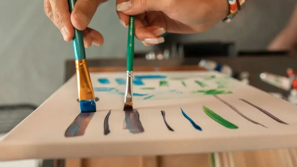
Last updated: July 12, 2026
An oil painting effect works best when the photo already has clear light, simple shapes, and a subject that can survive losing fine detail. The edit is less about pushing one dramatic filter and more about choosing the right source image, setting brush strength conservatively, then exporting a file that still looks clean on the page or in print.
Quick answer: how do you make a photo look like an oil painting?
Start with a sharp, well-lit photo at least 1600px wide. Apply our Oil Painting Effect tool at a medium brush size, keep face or product details masked or less stylized, then add a small contrast and color pass after the effect. Export WebP for websites, JPEG for sharing compatibility, and a high-resolution JPEG or TIFF-style master if the file will be printed.
For portraits, keep the effect light on eyes, lips, hands, jewelry, and text. For landscapes, you can use a wider brush because trees, sky, water, and distant buildings can tolerate broader color blocks. For still life and product photos, test the effect at 100% zoom before publishing because labels, edges, and small highlights can turn muddy.
If you use Photoshop, Adobe's official Oil Paint filter documentation names the important controls: stylization, cleanliness, scale, bristle detail, angular direction, and shine. Online tools use different labels, but the same decisions apply: brush size, texture amount, edge preservation, color strength, and output format.
I tested the examples in this article from real Pexels photos, converted them to WebP, then processed them locally with a medium and strong paint pass so the setting advice matches visible results rather than a stock screenshot.
Which photos work best for an oil painting effect?
The best inputs have shape before detail. A painterly filter simplifies local texture, so the image needs a subject that remains readable after some detail disappears. A soft portrait with window light, a village landscape, a bouquet, or a pet in clean light usually works. A screenshot, low-light phone photo, busy group shot, or product label with tiny text usually does not.
Use this quick selection table before you upload:
| Source photo | Oil-painting potential | What to check before editing |
|---|---|---|
| Single portrait in soft side light | High | Eyes and mouth must already be sharp |
| Landscape with clear sky, path, or buildings | High | Avoid tiny branches filling the whole frame |
| Flowers, food, or tabletop still life | High | Keep the main object separated from the background |
| Product image with labels or logos | Medium | Mask the text or use a very light effect |
| Low-light phone snapshot | Low | Denoise first or pick another image |
| Screenshot, document, chart, or UI | Poor | Use a comic or poster effect instead |
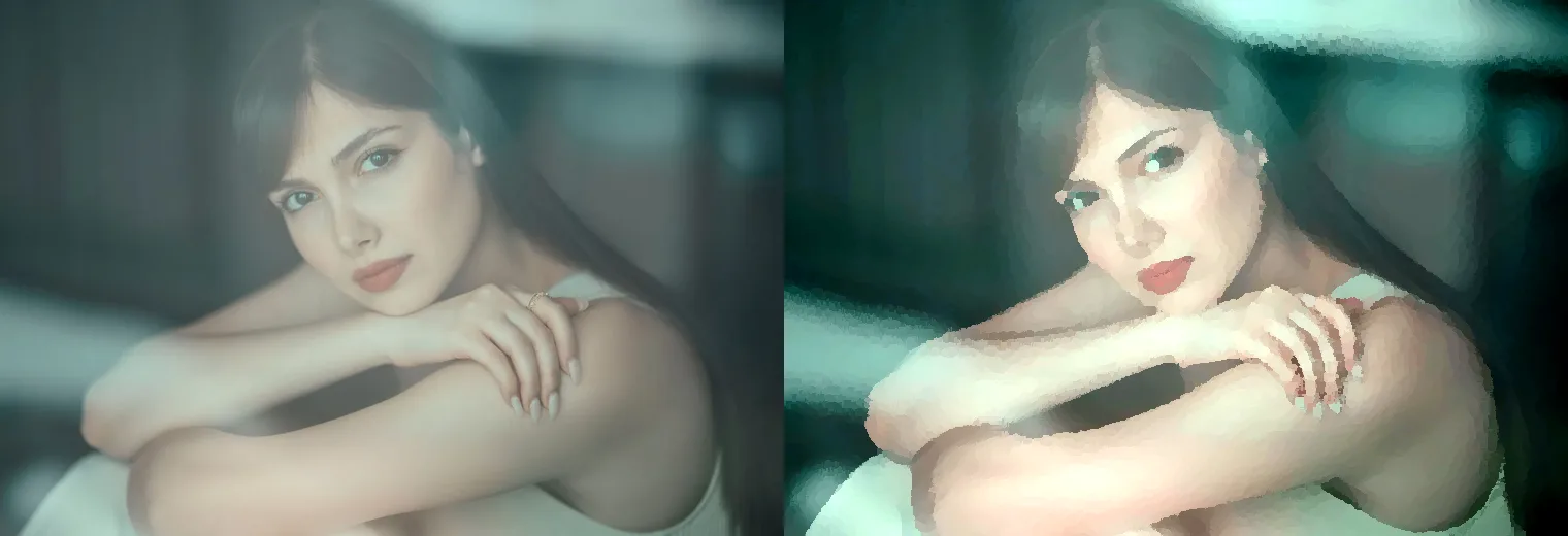
For a portrait like the example above, the right effect strength is the point where cheeks and background become painterly but the eyes still read as eyes. If the face starts looking waxy, reduce brush size before adding sharpening. Sharpening after an overdone effect usually makes the artifacts louder.
Good input checks:
- Use a photo where the main subject is obvious at thumbnail size.
- Prefer side light, window light, golden hour, or soft studio light.
- Avoid heavy JPEG artifacts before applying the effect.
- Crop out empty areas before stylizing so the filter spends detail on the subject.
- Keep an untouched original, especially for client or print work.
- If the image is small, resize only modestly; upscaling cannot recover real brush detail.
For sizing decisions before you begin, the image resolution and DPI guide explains when pixel count matters for print and when it does not matter for screens.
What settings should you use first?
Use a medium setting first, not the maximum. In most tools, the controls map to three visual outcomes: stroke size, smoothing, and surface shine. A believable oil look usually comes from moderate strokes with low shine. High shine can make the image look like plastic or wet varnish rather than paint.
| Control name you may see | Start here | Raise it when | Lower it when |
|---|---|---|---|
| Brush size, scale, or stroke width | 25-45% | Landscapes need broader blocks | Faces or product edges smear |
| Stylization or strength | 35-60% | The photo still looks untouched | Skin, text, or hair becomes lumpy |
| Cleanliness or smoothing | 40-65% | Noise is still visible | The image becomes too airbrushed |
| Texture, bristle, or detail | 20-40% | Canvas feel is too weak | Small speckles distract |
| Shine or lighting | 0-20% | You want a glossy paint surface | Highlights look metallic |
| Color saturation | +5 to +12% | The result looks flat | Skin tones turn orange or red |
These are starting points, not universal values. A landscape can handle stronger brush scale because the viewer expects simplified grass, clouds, and rooftops. A headshot needs a lighter pass and selective cleanup.
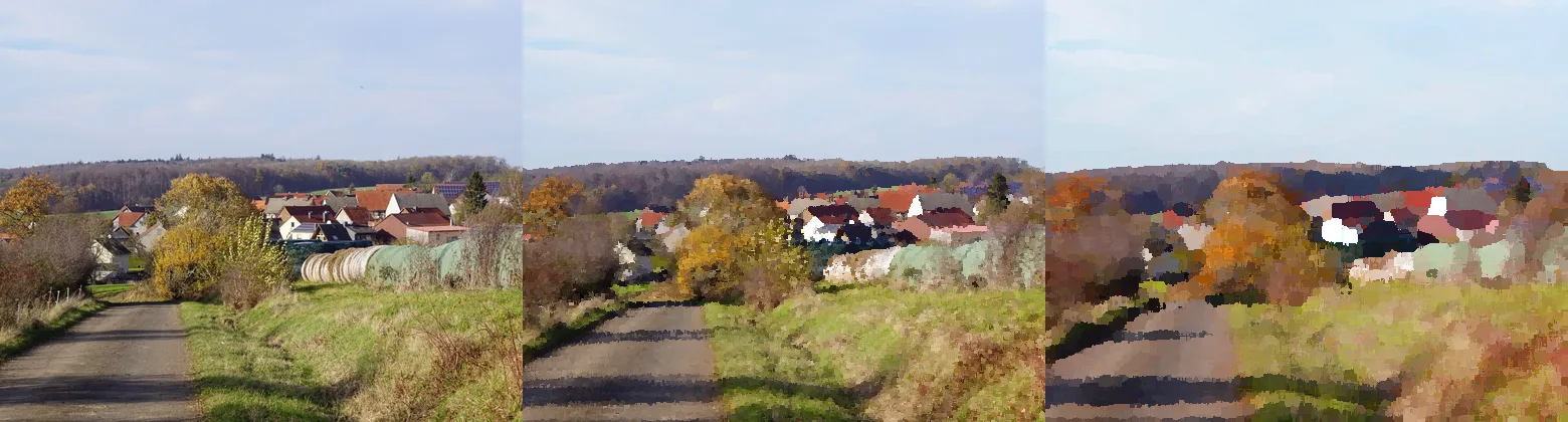
For a landscape, judge the result at two sizes:
- At full width, ask whether the scene still reads immediately.
- At 100% zoom, check whether roofs, paths, and tree lines became harsh blocks.
- At mobile width, make sure the subject is not lost in texture.
- In the final crop, confirm the horizon does not look warped.
- After export, compare the WebP or JPEG against the edited master.
If the oil effect is part of a visual series, save a preset after the first approved image. Then test it on two other photos before committing. A preset that works only on one image is a starting point, not a brand style.
How do you keep faces, text, and details from looking messy?
Do the effect in layers when the tool allows it. Apply the painting pass to a duplicate layer, mask the important details back from the original, then reduce opacity until the blend looks natural. Photoshop users can apply filters to Smart Objects so the filter remains editable; Adobe's Smart Filters guide covers that non-destructive setup.
For browser tools without layers, make two exports: one subtle and one stronger. Use the subtle version for portraits, products, or any image with readable text. Use the stronger version only when the subject is organic or scenic.
Detail areas to protect:
- Eyes, lashes, eyebrows, and catchlights.
- Teeth, lips, fingers, and jewelry.
- Logos, labels, packaging, and signs.
- Pet eyes, whiskers, and nose texture.
- Building edges that define the subject.
- Any text that a customer must be able to read.
A practical portrait cleanup pass is simple: reduce the effect on the face, add a slight contrast curve, and sharpen only the eyes. Do not sharpen the whole image after a heavy effect. That can create crunchy outlines around every brush block.
If the source image is noisy, fix noise before stylizing. Oil filters often convert noise into speckles that look intentional in the wrong way. The image compression deep dive explains why artifacts become more obvious after repeated editing and saving.
What is the best export format for oil-painting images?
Choose the export based on destination. Painterly images often contain smooth gradients and many color transitions, so they compress well as WebP or AVIF. Keep a higher-quality master, then make separate web and social exports.
| Destination | Recommended export | Practical setting |
|---|---|---|
| Blog or portfolio page | WebP | 1600-1920px wide, quality 80-85 |
| Shopify or marketplace gallery | JPEG or WebP | Match platform rules, avoid tiny text |
| Instagram feed | JPEG | 1080px square or 1350px tall |
| Pinterest pin | JPEG or WebP | 1000x1500 or similar 2:3 crop |
| Print proof | High-quality JPEG | 300 PPI at final physical size |
| Archive master | PNG, TIFF-style workflow, or high-quality JPEG | Keep the largest clean edit |
MDN's image format guide describes WebP and AVIF as modern web formats with better compression than older formats. For a practical web decision, use the AVIF vs WebP comparison after the creative edit is finished.
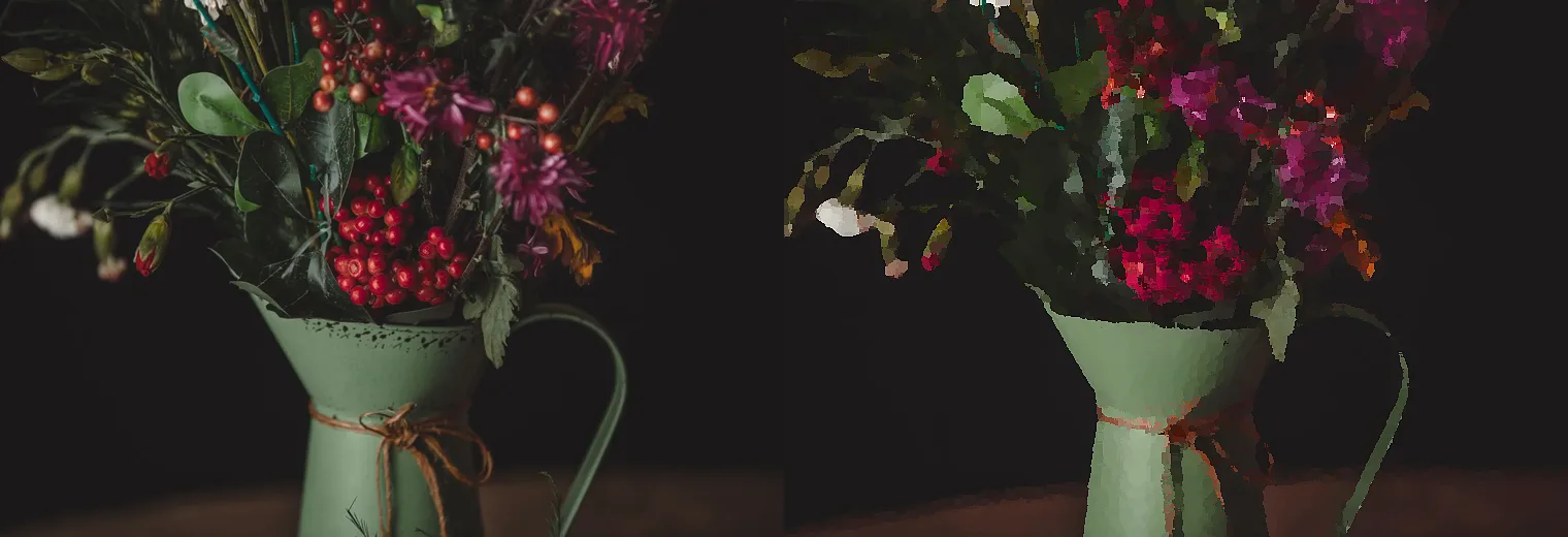
After export, check the dark areas and saturated reds first. Painterly still lifes can look clean in the editor and then band or block after aggressive compression. If the WebP looks blotchy, raise quality before lowering dimensions. If the file is still too heavy, resize to the displayed width rather than crushing quality.
For web publishing, follow Google's image SEO best practices: use sharp images, place them near relevant text, and make the image URLs crawlable. The image optimization for SEO guide covers filenames, alt text, dimensions, and page placement in one checklist.
What workflow should you follow from upload to final file?
Use this order when you need a reliable result rather than a lucky filter pass:
- Pick a source photo with clear light and a simple subject.
- Crop to the final composition before applying the effect.
- Remove obvious noise, dust, or compression artifacts.
- Duplicate the image or keep a separate original.
- Apply a medium oil-painting effect.
- Compare at full page size and 100% zoom.
- Reduce the effect on faces, text, logos, and important edges.
- Add a small contrast and color adjustment after the effect.
- Export one master and one destination-specific file.
- Compress only after the final crop and format are set.
- Reopen the exported file and inspect the exact version you will publish.
- Name the file descriptively, such as
window-portrait-oil-painting.webp.
For a batch of related images, process one representative photo first. Then run the rest with the same settings and review the outliers manually. The batch resize guide is useful when you need consistent dimensions across a gallery after the effect is approved.
Common mistakes
The fastest way to ruin an oil painting effect is to over-stylize the wrong details. A photo can look impressive for two seconds and then fall apart when someone notices the eyes, fingers, or text.
Avoid these mistakes:
- Applying the strongest setting because the preview looks dramatic.
- Starting with a tiny or heavily compressed source file.
- Using the same brush size for portraits and landscapes.
- Leaving halos around hair, buildings, or product edges.
- Adding too much shine and making the image look synthetic.
- Exporting one giant file for every destination.
- Compressing repeatedly after each revision.
- Publishing without checking the exported file at mobile width.
- Using vague alt text such as "oil painting effect image."
- Replacing the original master with the filtered export.
If you want a more graphic result, a comic or poster treatment may be a better fit. The comic book effect guide covers a sharper, inked style that preserves outlines better than an oil look.
Related guides
- AVIF vs WebP vs JPEG
- How Image Compression Works
- Image SEO Optimization Checklist
- Image Resolution and DPI Explained
- Batch Resize Guide
- Image Comic Book Effect
Frequently asked questions
What type of photo works best for an oil painting effect?
A sharp, well-lit photo with a clear subject and simple shapes, such as a portrait, landscape, or still life, converts most reliably.
What settings should I use first when trying an oil painting effect?
Start with a medium brush size and low shine, since maximum settings usually make skin, text, and edges look muddy.
How do I stop faces from looking waxy or messy in an oil painting effect?
Reduce the effect on the face, mask the eyes and mouth back from the original layer, and sharpen only those details afterward.
What image size should I start with before applying the effect?
Use a source photo at least 1600px wide, since upscaling afterward cannot recover real brush detail.
Should I use the same brush settings for portraits and landscapes?
No, portraits need a lighter, smaller brush pass while landscapes can handle broader strokes across sky, water, and rooftops.
Why does my oil painting effect look plastic or glossy instead of painted?
The shine or lighting control is usually too high; keeping it in the 0-20% range keeps highlights from looking metallic.
What is the best export format for an oil painting effect image?
Export WebP for websites, JPEG for sharing and marketplace compatibility, and a high-resolution JPEG or TIFF-style master for print.
What resolution do I need to print an oil painting effect photo?
Export a high-quality JPEG at 300 PPI at the final physical size, kept separate from the smaller web version.
Image credits
- Cover - hands painting on canvas, photo by RDNE Stock project on Pexels, converted to WebP.
- Portrait before/after - source photo by shahin khalaji on Pexels, converted and processed locally.
- Landscape brush comparison - source photo by Hans-Jurgen Braun on Pexels, converted and processed locally.
- Still life export check - source photo by Orcun Cikmaz on Pexels, converted and processed locally.
Use the free tools while you follow the guide.
Keep reading
2026-07-28
AI Action Figure Trend: How to Prep Your Photo Right
Turn a photo into a collectible toy portrait: what makes the prompt work, and the crop, background, and resolution steps that avoid an obvious fake.
2026-07-26
AI Anime Generator Guide: Prompts, Styles, and Safe Exports
A practical AI anime generator workflow for portraits, avatars, banners, and social posts, with prompt templates, style checks, and export rules.

2026-07-26
Text-to-Image AI in 2026: How Prompt Generation Actually Works
Text-to-image AI turns a written prompt into a finished picture. Here is how the models, prompts, and settings behind image generation fit together in 2026.