2026-03-28 · Updated 2026-07-10
Image Comic Book Effect: Make Photos Look Inked
Turn a photo into a comic-book style image with clean ink lines, bold color, halftone texture, and export settings that still look sharp online.
Last updated: July 10, 2026
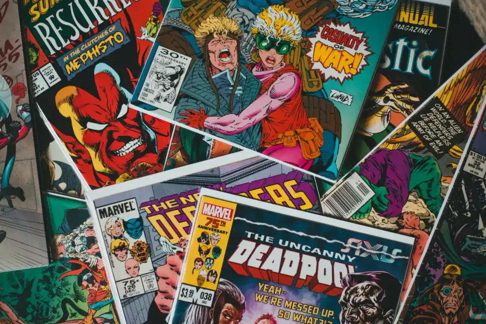
A good image comic book effect is not just a high-contrast filter. It needs inked edges, simplified shadows, hard color blocks, and just enough dot texture to suggest print without burying the face, product, or caption.
Use this workflow when you want a profile photo, poster, thumbnail, product promo, or social post to feel like a comic panel while still reading clearly on a phone.
Quick answer: how do you make an image look like a comic book?
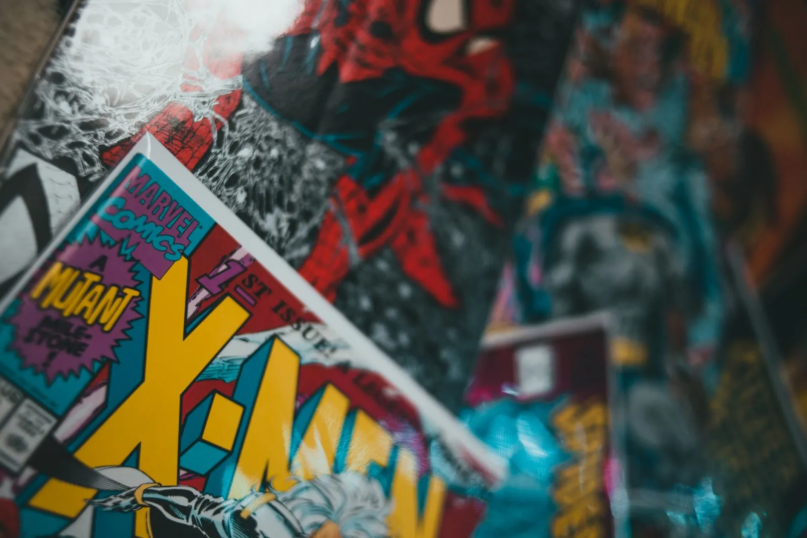
Our Comic Book Effect tool automates this with real edge detection. Manually: start with a sharp, well-lit photo. Add a black edge or poster-edge layer, reduce the color palette, push saturation selectively, and add a halftone or paper-dot texture only after the main subject is readable.
For portraits, protect the eyes, mouth, hairline, and hands from heavy dots. For products, protect labels, seams, logos, and fine edges. A comic effect should make the subject clearer, not turn every midtone into noise.
Export a WebP or high-quality JPEG for the web, then check the result at the final display size. Tiny dots that look clever at 200% zoom often collapse into dirty gray when the image is shown in a 1080 px Instagram square.
What makes a comic-book photo effect work?
Comic art depends on decisions that are stronger than normal photo editing. Lines carry form, color separates planes, and shadows are often flat shapes instead of soft gradients.
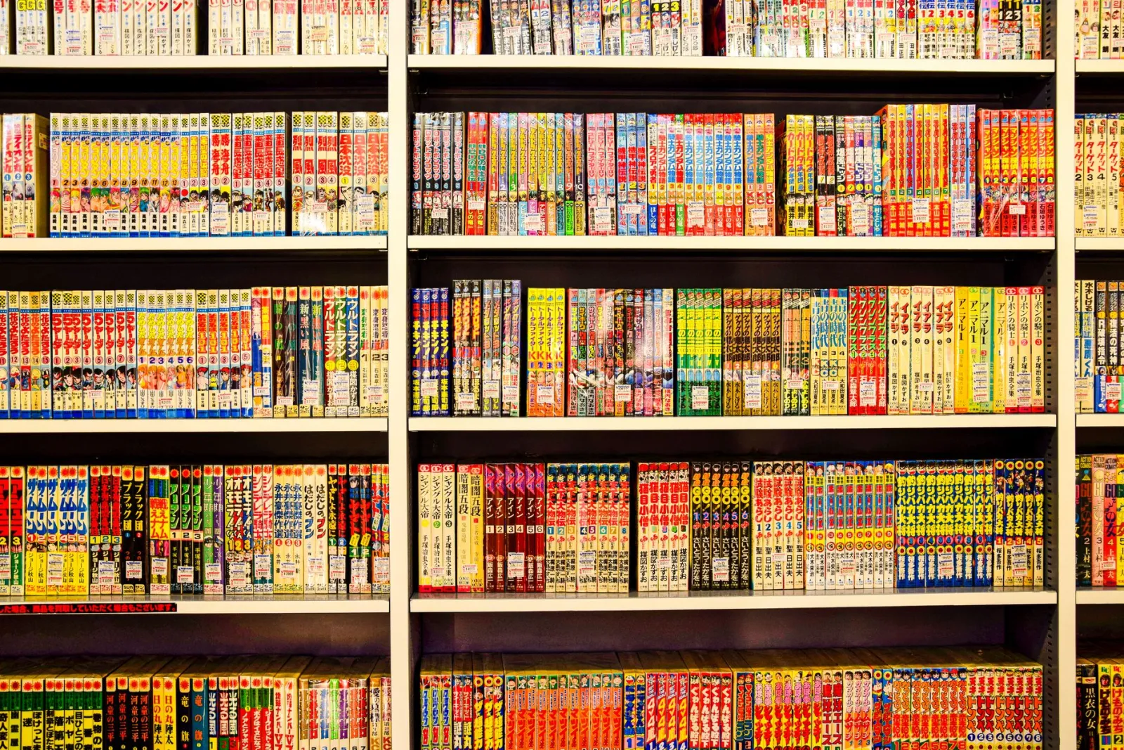
The Library of Congress notes that its public comic-book collection spans material from 1934 to the present, which is a reminder that there is no single comic look. A 1960s pulp cover, a manga shelf, and a modern superhero panel use different color, line, and paper cues. See the Library of Congress comic-book collection for the range.
Use these visual ingredients deliberately:
- Ink lines: outlines around the subject, plus smaller interior lines for folds, hair, and features.
- Posterized values: three to six tonal steps instead of smooth photographic gradients.
- Bold color: saturated but controlled reds, yellows, blues, and skin tones.
- Halftone texture: dots in shadows or flat backgrounds, not everywhere.
- Speech or caption space: clean areas that can carry type without fighting the image.
- Panel crop: a tighter frame that makes the action or expression obvious.
| Comic cue | What to adjust | Good sign | Warning sign |
|---|---|---|---|
| Ink outline | Edge strength, radius, black level | Face or object reads instantly | Hair and skin turn scratchy |
| Color blocks | Saturation, posterize steps | Main colors feel intentional | Skin becomes orange or gray |
| Halftone dots | Dot size, opacity, placement | Texture supports shadows | Dots cover eyes or small text |
| Panel crop | Aspect ratio, subject scale | Action fills the frame | Important edges are clipped |
Which photos are best for a comic filter?
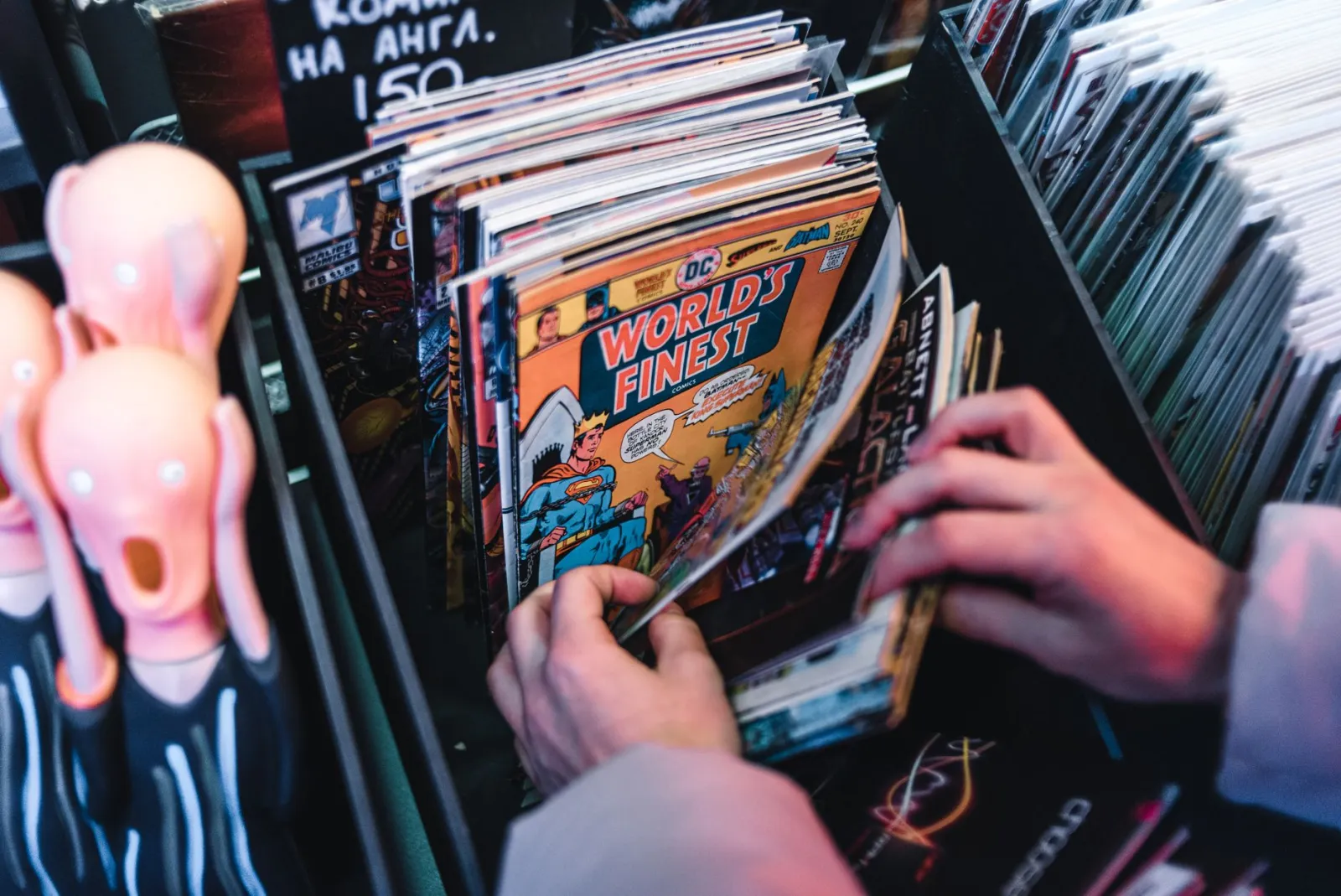
Pick photos with simple lighting and a clear subject. A comic-book effect exaggerates whatever is already in the image, so messy backgrounds, flat lighting, and motion blur become harder to hide.
The easiest source photos usually have one person, one product, or one prop in front of a background with obvious separation. Side light and rim light help because the edge filter has real contrast to grab.
Avoid starting with:
- Small screenshots or heavily compressed downloads.
- Faces covered by harsh shadows.
- Group photos with many tiny faces.
- Product shots where the label is already soft.
- Busy backgrounds that have the same contrast as the subject.
- Images where the final crop must be very small.
If the image needs cleanup first, remove distractions before the stylized pass. The guides for removing a background, cropping online, and checking image dimensions are better first steps than trying to fix everything inside the comic effect.
How should you set edges, color, and halftone dots?
Use this order: edge, value, color, texture, type. It keeps the edit readable because each pass has a job.
- Duplicate the original or keep an untouched copy.
- Crop to the final ratio before judging the effect.
- Add edge detection or a poster-edge filter at low to medium strength.
- Mask the edge layer off noisy skin, sky, glass, and soft backgrounds.
- Posterize or simplify values until shadows look graphic.
- Increase saturation after posterizing, not before.
- Add halftone texture to shadows, background, or accent areas.
- Add captions, borders, or burst shapes only if they improve the composition.
- Export, then check the image at phone size.
- Compare it with the original and remove one effect if the result feels muddy.
| Goal | Starting setting | Where to check | Fix if it looks wrong |
|---|---|---|---|
| Portrait avatar | Thin edges, low dot opacity | Eyes, teeth, jawline | Mask dots off the face |
| Product promo | Medium edge, no dots on logo | Label, package corners | Sharpen before stylizing |
| Poster artwork | Strong outline, larger dots | Title area, large shadows | Reduce color count |
| Thumbnail | Thick edge, bright color | 25% zoom or phone preview | Remove tiny line detail |
Adobe's Photoshop documentation recommends nondestructive editing with adjustment layers, Smart Objects, and Smart Filters because those changes do not overwrite the original pixels. That advice matters here: comic effects are easy to overcook, and a live layer stack lets you back off quickly. See Adobe's nondestructive editing guide.
What is the fastest workflow for social posts?
For a social post, do not build a museum-grade comic treatment. Build an image that survives compression, cropping, and fast scrolling.
Use this compact workflow:
- Crop to the platform first, such as square, vertical, or wide thumbnail.
- Keep the subject large enough that the outline is visible without zooming.
- Use one halftone area, usually the background or shadow side.
- Keep text outside the busiest part of the image.
- Export a test version and preview it on a phone.
- Compress only after the style is final.
If you are preparing a post for a specific channel, pair this article with Instagram image sizing, social media image sizes, and image compression without quality loss.
How do you keep the result sharp on the web?
Sharpness comes from source quality, clean export, and realistic dot size. Do not rely on output sharpening to rescue a blurry source.
WebP is a good final format for comic-style images because it handles photographic color and web delivery well. MDN describes WebP as supporting lossy and lossless compression, and its image-format guide lists WebP as a common web image type. See MDN's image file type guide.
Before publishing, run this quick check:
- View the file at 100% and at the actual page size.
- Check that black outlines are not jagged.
- Check that dots are visible but not crawling over faces.
- Make sure transparent or light borders did not turn gray.
- Keep a source copy in PNG, TIFF, PSD, or another editable format.
- Export the final web image as WebP when your site supports it.
For format decisions beyond this effect, use the WebP versus JPEG and PNG guide or the broader image format converter guide.
Common mistakes that make comic effects look cheap
The most common problem is applying every available setting at once. Thick outlines, giant dots, heavy saturation, paper texture, glow, and speech bubbles can work in a hand-built poster, but they usually fight each other on a photo.
Watch for these issues:
- Dirty skin: halftone dots are too strong on cheeks and foreheads.
- Lost expression: edge detection erased the eyes or mouth.
- Fake vintage look: yellow paper texture covers the whole image evenly.
- Unreadable product text: posterization crushed small letters.
- Muddy shadows: dots, noise, and compression all stack in dark areas.
- Wrong crop: the subject feels like a photo with a filter, not a panel.
Fix one layer at a time. If the image only looks good when every slider is maxed out, switch to a cleaner source photo.
Frequently asked questions
Does the comic book effect work on any photo?
No — it works best on clean, high-contrast photos with a single clear subject and simple background. Busy scenes, low light, and soft focus fight the effect because the edge detection has nothing clean to trace. A sharp portrait on a plain wall converts in one pass; a crowded street scene turns to mush.
What is halftone and why does it matter?
Halftone is the dot pattern comic books use to fake shades of gray or color with only a few inks. In a digital comic effect it simulates that printed look, but if the dots are too large or dense they turn muddy in shadows. Keep halftone to midtones and light areas; drop it from the darkest shadows where dots, noise, and compression all stack up.
Is a comic filter good for product images?
Rarely. A comic effect abstracts detail, which is the opposite of what a product photo needs. It suits editorial portraits, memes, and social posts where style matters more than accuracy.
Key takeaway: build the effect like a panel, not a filter
The best image comic book effect starts with composition. Crop first, make the subject obvious, then use lines and color to simplify the photo.
Use halftone as seasoning, not wallpaper. Keep faces and labels clean. Export in a modern web format, then inspect the final image where people will actually see it.
If the edit works as a tiny thumbnail and still has character at full size, it is ready to publish.
Use the free tools while you follow the guide.
Keep reading
2026-07-28
AI Action Figure Trend: How to Prep Your Photo Right
Turn a photo into a collectible toy portrait: what makes the prompt work, and the crop, background, and resolution steps that avoid an obvious fake.
2026-07-26
AI Anime Generator Guide: Prompts, Styles, and Safe Exports
A practical AI anime generator workflow for portraits, avatars, banners, and social posts, with prompt templates, style checks, and export rules.
2026-07-26
Text-to-Image AI in 2026: How Prompt Generation Actually Works
Text-to-image AI turns a written prompt into a finished picture. Here is how the models, prompts, and settings behind image generation fit together in 2026.