2026-07-18
How to Add Text to Photos Without Losing Readability
Add clean text overlays to photos for social posts, product images, banners, and watermarks. Includes contrast checks, layout rules, tools, and batch options.

Last updated: July 17, 2026
Adding text to a photo is easy until the post is viewed on a phone, cropped by a platform, or placed beside a dozen other images in a feed. The useful version is less glamorous: pick a quiet area, keep the copy short, check contrast, export at the final size, and test the result where it will actually appear.
Quick answer: how do you add text to a photo cleanly?
Use the final image size first, then place one headline and one optional detail line on a calm part of the photo. If the background is busy, add a semi-transparent panel or a soft shadow behind the type. Export a copy for each channel instead of forcing one image to work everywhere.
For a fast browser workflow with no signup, use the Text on Photo tool — pick a font, size, and color, click the photo to place the line, and export. For repeatable product labels, sale badges, or watermarks, use a batch-capable tool such as Photoshop actions, GIMP scripts, or Pillow in Python. Keep the original photo untouched so you can revise the text later.
| Task | Fast choice | Better when |
|---|---|---|
| One social graphic | Text on Photo, Canva, or Adobe Express | You need a quick export with no account |
| Product badge | Browser editor or Photoshop | Placement must match a product grid |
| Portfolio watermark | GIMP, Photoshop, or batch script | You need the same mark on many files |
| Developer workflow | Pillow or ImageMagick | Text comes from filenames, prices, or data |
What should you prepare before adding text?
Start with the destination, not the font. A square Instagram post, an ecommerce product tile, a blog hero, and a vertical story all crop differently. If you design the overlay before choosing the canvas, the headline often lands too close to an edge or becomes unreadable after resizing.
Use this order:
- Choose the final canvas size.
- Crop the photo for that canvas.
- Find the quietest area of the image.
- Write the shortest useful copy.
- Pick one font family and two weights at most.
- Check contrast on the actual background.
- Export a flattened copy.
- Keep the editable source file.
If the photo still needs cropping or sizing, handle that first. The batch resize guide is useful when you have a folder of images that need the same dimensions before text is added.
Which tool should you use to add text to images?
There is no single best tool. The right one depends on whether you are making one image by hand or producing a repeatable set.
| Tool | Cost | Use it for | Watch out for |
|---|---|---|---|
| Imagic AI Text on Photo | Free, no signup | Fast single-image captions with font/size/color control | Up to 5 text layers per image |
| Canva | Free / paid | Social posts, quote cards, simple ads | Template text can look generic |
| Adobe Express | Free / paid | Brand kits and quick campaign graphics | Export settings vary by plan |
| Photoshop | Paid | Layer control, masks, effects, print work | Slow for small one-off edits |
| GIMP | Free | Desktop editing without a subscription | Interface takes time to learn |
| Pillow / ImageMagick | Free | Batch labels, watermarks, generated assets | You must choose fonts and positions carefully |
For a store owner adding a "New arrival" badge to 40 product photos, a script or Photoshop action saves time and avoids inconsistent placement. For a creator making one quote graphic, a template editor is faster and good enough.
If the text is mainly a copyright mark, read the watermarking guide before you start. A watermark has different priorities: it should survive casual reuse without becoming the main subject of the image.
How do you keep photo text readable?
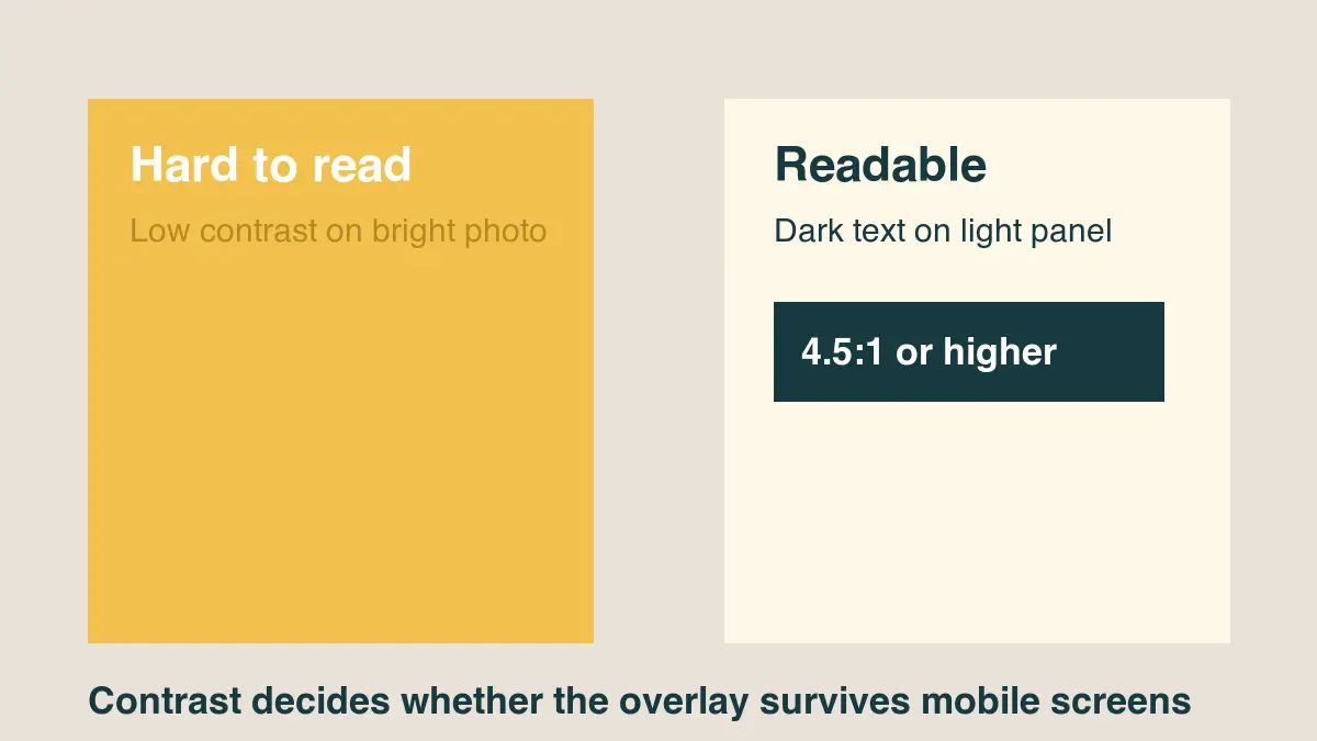
Readability is mostly contrast, size, and background control. The Web Content Accessibility Guidelines define contrast ratios for text, with normal text needing a 4.5:1 contrast ratio and large text needing 3:1 in common cases (W3C WCAG contrast guidance). Image text is not the same as HTML text, but the ratio is still a good practical target.
Use these checks before publishing:
- Put light text on a dark area, or dark text on a light area.
- Add a 40-70% dark overlay behind white text when the photo is busy.
- Use a soft shadow only to separate edges, not as decoration.
- Avoid thin script fonts for small mobile images.
- Keep line length short enough that the text can grow.
- Test the image at phone width, not only on a desktop monitor.
For web pages, real HTML text over an image is often better than baked-in text. It remains selectable, responsive, and available to assistive technology. If you do use CSS overlays, MDN's text-shadow reference explains how shadows are rendered and why a subtle shadow can improve edge separation (MDN text-shadow).
Where should text sit on a photo?
Place text where the image gives it room. Empty sky, plain walls, table surfaces, blurred backgrounds, and dark corners work well. Faces, hands, product details, food, logos, and price labels usually need to stay uncovered.
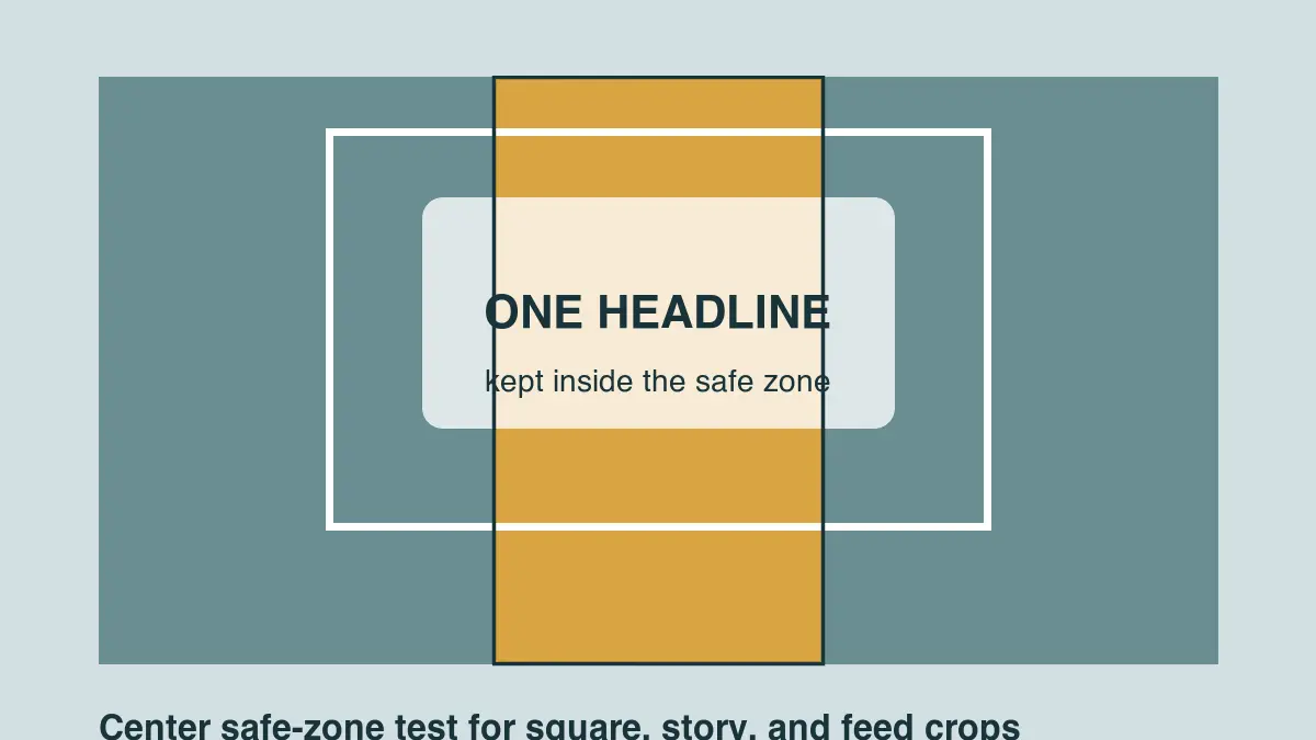
For social images, keep the main line inside the center safe area. Feeds, previews, and thumbnails may crop the sides or top. If you are producing platform-specific versions, confirm sizes with a dedicated reference such as the social media image sizes guide.
| Placement | Good for | Risk |
|---|---|---|
| Top-left or top-right | Blog heroes, product callouts | Gets cropped in some thumbnails |
| Lower third | Event banners, announcements | Can hide product details |
| Center panel | Quotes, sale graphics | Can cover the subject |
| Corner mark | Watermarks, attribution | Easy to crop out |
| Full-width band | Menus, date cards, promos | Looks heavy if the band is too tall |
The safest version is usually a short headline in a quiet third of the image. If the photo has no quiet area, blur a duplicate background layer, add a restrained panel, or choose another photo.
What text styles work best on photos?
Use fewer styles than you think. One font family with a bold headline and regular supporting line is enough for most image overlays. Mixing serif, script, and condensed display fonts makes the photo look like a poster mockup instead of a finished asset.
Good defaults:
- Use a bold sans serif for small social graphics.
- Use sentence case unless the design needs a label.
- Keep all-caps text short.
- Use left alignment when the photo has a clear edge or subject.
- Use centered text only when the image itself is symmetrical.
- Keep line spacing slightly tighter for large headlines.
- Avoid outlines unless the asset is a sticker, meme, or thumbnail.
- Leave more margin than feels necessary in the editor.
If you are preparing product or ecommerce images, text can hurt the photo if it hides the item. For product-first layouts, pair this workflow with the AI product photo guide and use overlays only for small labels, bundle names, or limited-time badges.
How can you batch-add the same text to many photos?
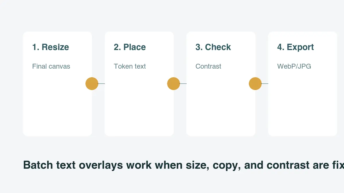
Batch overlays work only when the source images are consistent. Resize first, decide a fixed anchor point, and use copy that will not overflow. A filename-based caption, SKU, copyright mark, or price badge is a good candidate. A long headline with variable word length is not.
Here is a small Pillow example for a lower-left label. It assumes your images are already the same size:
from pathlib import Path
from PIL import Image, ImageDraw, ImageFont

input_dir = Path("photos")
output_dir = Path("with-text")
output_dir.mkdir(exist_ok=True)

font = ImageFont.truetype("Inter-Bold.ttf", 44)

for path in input_dir.glob("*.jpg"):
    image = Image.open(path).convert("RGBA")
    overlay = Image.new("RGBA", image.size, (0, 0, 0, 0))
    draw = ImageDraw.Draw(overlay)

    text = path.stem.replace("-", " ").title()
    draw.rounded_rectangle((48, image.height - 132, 560, image.height - 48), 18, fill=(0, 0, 0, 150))
    draw.text((72, image.height - 108), text, font=font, fill=(255, 255, 255, 255))

    result = Image.alpha_composite(image, overlay).convert("RGB")
    result.save(output_dir / path.name, quality=90)
After batch export, compress the results once. The image compression deep dive explains why repeated JPEG saves soften type edges and why you should keep one editable master.
What mistakes make photo text look amateur?
Most problems come from adding the text too late or trying to fit too much copy into the image.
| Mistake | What happens | Fix |
|---|---|---|
| Too much copy | Text becomes tiny on mobile | Use one headline and move details to the caption |
| Low contrast | Readers skip the image | Add a panel, shadow, or choose a quieter crop |
| Text over the subject | Product or face looks damaged | Move text to empty space or use a separate banner |
| Many fonts | The graphic loses hierarchy | Use one family and two weights |
| Exporting one size | Crops break on other channels | Make channel-specific versions |
| Re-saving JPGs | Type edges blur | Export once from the editable source |
One practical test: step back from your screen or shrink the image to phone width. If the headline cannot be read in two seconds, simplify the layout.
Final checklist before you publish
Use this final pass before uploading the image:
- The photo is cropped to its final destination.
- The headline is readable at mobile size.
- The text does not cover the product, face, or important detail.
- Contrast is strong enough without exaggerated effects.
- Margins survive square, vertical, and thumbnail crops.
- The editable source file is saved.
- The exported file is compressed only once.
- The filename describes the asset.
- Alt text or surrounding page copy repeats important words that are baked into the image.
- The final page still passes image SEO checks.
For pages where the image is part of search traffic, use the image optimization for SEO checklist. Search engines and assistive tools cannot reliably treat baked-in image text as page copy, so repeat critical names, prices, and calls to action in real HTML nearby.
How were the examples made?
I tested the four diagrams as 1200 x 675 WebP exports made with ImageMagick, then checked their local file type before uploading them to the CDN. The examples are intentionally simple: one layout cover, one contrast comparison, one safe-zone crop guide, and one batch workflow diagram.
Frequently asked questions
What is the best free tool for adding text to a photo?
The Imagic AI Text on Photo tool handles single-image overlays free with no signup and no watermark; Canva, Adobe Express, and GIMP are good alternatives, while Pillow or ImageMagick fit repeatable batch jobs better.
How much contrast do I need between text and a photo background?
Aim for at least a 4.5:1 contrast ratio for normal-size text and 3:1 for large text, the same practical targets used for HTML text under WCAG.
Can I add the same text overlay to many photos at once?
Yes, but only when the source photos are already the same size and the copy is short enough not to overflow, such as a filename-based caption, SKU, or price badge.
Should I use baked-in image text or real HTML text on a web page?
Real HTML text over an image is usually the better choice on the web because it stays selectable, responsive, and available to assistive technology.
Where is the safest place to put text on a photo?
The safest spot is a short headline in a quiet third of the image, such as empty sky, a plain wall, or a blurred background, kept clear of faces, hands, and product details.
How many fonts should I use on a single image overlay?
Stick to one font family with a bold headline and a regular supporting line, since mixing several styles makes an overlay look like a poster mockup.
Do I need a different exported image for every social platform?
Yes, exporting only one size and letting each platform crop it is a common mistake, so channel-specific versions keep the headline inside the safe area.
Why does my photo text look blurry after I add it?
Repeated JPEG re-saves soften type edges, so export once from an editable master file instead of resaving the same JPG multiple times.
Image credits
- Cover and article diagrams were generated with ImageMagick for this guide to show text placement, contrast, crop safety, and batch overlay workflow.
Use the free tools while you follow the guide.
Keep reading
2026-09-13
How to Blur Faces and License Plates Before You Post
Blur or pixelate faces and license plates so they stay unreadable. Which method actually anonymizes, what fails, and how to avoid leaking EXIF location data.
2026-08-27
Invisible Watermarks: What Image Files Now Carry in 2026
Paint embeds a server-issued GUID in AI images, platforms strip C2PA manifests, and a plain WebP export drops all of it. What your files really carry, and how to check.
2026-07-28
Batch Image Processing: Pipeline Order, Settings, and Tools
Batch image processing runs resize, compress, and convert jobs across whole folders. The pipeline order, measured quality settings, tool choice, and automation.