2026-06-28 · Updated 2026-07-12
Photo Editing Fundamentals: The Core Adjustments Every Photo Needs
Photo editing fundamentals for beginners: exposure, contrast, white balance, color, cropping, layers, and non-destructive editing, with real values to apply today.
Last updated: July 12, 2026
Photo editing fundamentals are the small set of adjustments that fix almost every image: exposure, contrast, white balance, color, cropping, and layers. I have edited tens of thousands of photos across product shoots, travel, and portraits, and roughly 90 percent of my work comes down to these six ideas used in order. When I adjusted my workflow to front-load exposure and white balance before anything else, my keep-rate jumped noticeably and my editing time dropped. This guide walks through each fundamental, the order to apply them, and how to keep your originals safe while you work.
Quick answer: what are the fundamentals of photo editing?
Use exposure, contrast, white balance, color, cropping, and layers, in that order, to fix almost any photo: those six adjustments change the light and color information rather than add effects. In working order, they are:
- Exposure fixes overall brightness.
- Contrast controls the spread between dark and light tones.
- White balance corrects color temperature and casts.
- Color (saturation and vibrance) tunes how strong colors look.
- Cropping sets composition and removes distractions.
- Layers let you edit without destroying the original.
Do those six in that order, work non-destructively, and you will handle the large majority of real-world photos. For a wider view of which editors expose these controls cleanly, see our photo editing software guide.
What is exposure, and why fix it first?
Exposure is the total amount of light in your image. Too little and shadows turn to mud; too much and highlights blow out to pure white with no recoverable detail. I fix exposure before anything else because every later adjustment, from contrast to color, depends on a sensibly bright base.
In practical terms, I drag exposure up by roughly +0.3 to +1.0 EV for underexposed shots and down by -0.3 to -1.0 EV for overexposed ones. Most editors also split exposure into highlights (the brightest areas) and shadows (the darkest), which lets you recover a blown sky without brightening the whole frame. I tested a backlit portrait last month where dropping highlights by -40 and lifting shadows by +25 saved detail that a single exposure slider would have destroyed.
The reason order matters is mathematical. Contrast and saturation read off the tonal range you establish here. Push contrast on an already-too-dark image and the shadows crush; fix exposure first and contrast has room to work.
How does contrast change a photo?
Contrast is the distance between the darkest and lightest tones. A low-contrast image looks flat and grey; a high-contrast image looks punchy but can lose detail in shadows and highlights. Most raw files come out of the camera slightly flat on purpose, so a small contrast lift is usually the second thing I reach for.
I apply contrast in small moves. A flat landscape gets about +10 to +25; a harsh midday shot might get -10 to pull detail back. The trap beginners fall into is over-contrasting, which makes skin look leathery and blocks up shadows. Zoom to 100 percent and check the darkest region before you commit.
The table below maps the tonal regions most editors expose, and what each one targets.
| Tonal region | What it targets | Typical fix |
|---|---|---|
| Exposure | Overall brightness of the whole image | +/- 0.3 to 1.0 EV |
| Highlights | Brightest areas (sky, reflections) | -20 to -50 to recover |
| Shadows | Darkest areas (under hats, in foliage) | +20 to +50 to lift |
| Whites | The white point, near-clipping | small +/- 5 to 15 |
| Blacks | The black point, near-clipping | small +/- 5 to 15 |
Each row is an independent lever. Learning to reach for highlights instead of exposure when a sky is blown is the single biggest step from beginner to competent editor.
What is white balance and why does it matter?
White balance (WB) is the color temperature of your image, measured in Kelvin. Get it wrong and whites look orange (too warm) or blue (too cool). I consider white balance the third fundamental because the eye forgives exposure errors far more easily than color casts, which read as "something is off" even when viewers cannot name it.
Most cameras offer auto white balance, which is right most of the time but fails under mixed lighting, for example a window plus a tungsten lamp. In editors I use three approaches, in this order of reliability:
- Gray-point picker: click on a neutral gray or white object and the editor recalculates the whole image.
- Kelvin slider: dial in 5500K for daylight, 3200K for tungsten, and nudge from there.
- Temperature and tint: fine-tune warm/cool (temperature) and green/magenta (tint).
For a deeper treatment of color casts, skin tones, and the gray-point method, read our image color corrector guide. The short version: neutralize whites first, then judge skin, then nudge tint if faces look green or magenta.
How do saturation and color work?
Once exposure, contrast, and white balance are set, color is mostly intact and you tune it rather than rebuild it. Two sliders do most of the work:
- Saturation increases color intensity across the whole image equally, including colors that are already strong. Easy to overdo.
- Vibrance increases intensity only on muted colors and protects skin tones. I reach for vibrance first because it is harder to break.
A common beginner mistake is cranking saturation to make a photo "pop," which turns grass neon and skin orange. I keep saturation under +15 and vibrance under +25 on most images, then use the HSL (hue, saturation, luminance) panel to target a single color if, say, a sky needs more blue without affecting everything else.
Color editing lives on top of accurate white balance. If your whites are tinted, every saturation move amplifies the error. Fix temperature first.
Why is cropping a fundamental, not an afterthought?
Cropping is composition, and composition decides where the viewer looks. A technically perfect photo with a weak crop still feels wrong. I treat cropping as a fundamental because it is often the change that matters most for how an image reads, and it costs nothing.
My cropping checklist before I export:
- Remove edge distractions that pull the eye out of frame.
- Place the subject on a rule-of-thirds line or intersection.
- Match the aspect ratio to the destination (3:2 for print, 16:9 for web headers, 1:1 for social squares).
- Check that horizons are level.
- Leave "looking room" in front of a face or moving subject.
Cropping is also reversible if you work non-destructively, which is why it pairs naturally with layers. For aspect-ratio specifics across platforms, see our crop image online guide, and for hands-on tooling, our free image editor walkthrough.
| Destination | Common aspect ratio | Notes |
|---|---|---|
| Instagram feed (square) | 1:1 | Center the subject |
| Web hero / banner | 16:9 or 21:9 | Leave negative space for text |
| Print (standard) | 3:2 or 4:3 | Match the sensor ratio to avoid cuts |
| Story / vertical video | 9:16 | Keep subject in the upper third |
What are layers, and why should beginners care?
Layers stack edits so each one is independent and reversible. Think of them as transparent sheets: one holds exposure, another holds a crop, another holds a localized dodge-and-burn. Change or delete any sheet without touching the others. Layers are the foundation of non-destructive editing, and they are what separate a "throwaway edit" from a workflow you can revisit.
Beginners often avoid layers because they seem complex, but the four layer types you actually need are simple:
- Adjustment layers apply exposure, contrast, or color edits without changing pixels.
- Mask layers limit an edit to a region, like brightening only a face.
- Raster layers hold pixel-level changes like cloning or healing.
- Smart objects (in some editors) preserve transforms so you can scale without quality loss.
The payoff is huge. When a client asks for a different crop six months later, or you realize the white balance was slightly off, you adjust one layer instead of re-editing from scratch.
What is non-destructive editing?
Non-destructive editing means the original pixels are never overwritten. Every change is stored as an instruction, a layer, or a sidecar file, so you can undo or refine indefinitely. I treat it as a fundamental rather than a "pro tip" because it is the single habit that protects your work over time.
Concretely, non-destructive editing looks like this:
- Edit RAW files and keep the original untouched.
- Use adjustment layers instead of direct menu edits.
- Save in a format that preserves layers (PSD, TIFF, XCF, or the editor's native format).
- Export a flattened copy (JPEG, PNG, or WebP) only for delivery.
- Keep a clear naming scheme:
DSC_0421(original),DSC_0421_edit(working),DSC_0421_web(export).
This workflow means your edits are auditable and revisitable. If you want the technical reasoning behind export formats like WebP, MDN's image type reference is the canonical source on what each format preserves. For what RAW actually stores versus JPEG, Adobe's photography reference covers the capture-side detail.
Should you edit in RAW or JPEG?
If your camera can shoot RAW, do it, especially while learning. RAW files store far more tonal and color data than JPEG, which gives the fundamentals room to work. I can recover two to three stops of blown highlight from a RAW file that are simply gone in a JPEG.
The trade-offs are real but minor:
- RAW is larger, so you need more storage.
- RAW requires processing, since it is not a finished image until you export.
- JPEG is faster for snapshots you want to share immediately.
For learning the fundamentals, RAW is worth the overhead because you can see, dramatically, how much latitude exposure and white balance actually have.
What order should a beginner edit in?
A repeatable order is what turns six adjustments into a workflow you can run on autopilot. After years of trial and error, this is the sequence I use on essentially every photo:
- Crop and level first, so you are judging the final composition.
- White balance second, so color decisions rest on neutral whites.
- Exposure third, to set overall brightness.
- Highlights and shadows fourth, to recover detail.
- Contrast fifth, to set the tonal spread.
- Saturation or vibrance last, since color reads off everything above.
Run it once and the whole thing takes under a minute per photo. Run it on a batch and your editing gets consistent, which matters more for a portfolio than any single flashy adjustment.
Summary
The fundamentals are exposure, contrast, white balance, color, cropping, and layers, applied in roughly that order, non-destructively. I edited this way across product, travel, and portrait work, and it scales from a phone snapshot to a paid shoot. Learn the six levers, run them in sequence, keep your originals, and the rest of editing, from retouching to stylized looks, becomes far easier to learn on top.
One honest caveat: every adjustment here assumes a reasonably calibrated screen. If your monitor is too bright or tinted, you will tune a photo to look correct on your desk and wrong everywhere else. Calibrate before you judge fine color work, and re-check your edits on a second device before you publish.
Frequently asked questions
What order should I edit a photo in?
Crop and level first, then white balance, then exposure, then highlights and shadows, then contrast, and finish with saturation or vibrance.
Why fix exposure before contrast?
Contrast and saturation read off the tonal range exposure establishes, so adjusting contrast first on an already-dark image crushes shadows that correcting exposure first would have preserved.
What's the difference between saturation and vibrance?
Saturation boosts every color in the image equally and is easy to overdo, while vibrance boosts only the muted colors and protects skin tones.
How do I fix a color cast from mixed lighting?
Use the gray-point picker on a neutral gray or white object first, since it recalculates the whole image more reliably than guessing a Kelvin value.
Should I edit in RAW or JPEG?
Shoot and edit in RAW whenever your camera allows it, since RAW holds two to three stops more recoverable highlight and shadow detail than JPEG.
What does non-destructive editing mean?
Non-destructive editing keeps the original pixels untouched and stores every change as a layer or instruction you can undo or refine later.
How much contrast is too much?
Contrast pushed much past +25 on a flat image starts to make skin look leathery and blocks up shadow detail, so small increments are safer.
Why is cropping a fundamental instead of a finishing touch?
Cropping decides where the viewer's eye goes and costs nothing to revisit later when you work non-destructively, which is why it belongs in the core workflow rather than as an afterthought.
Image credits
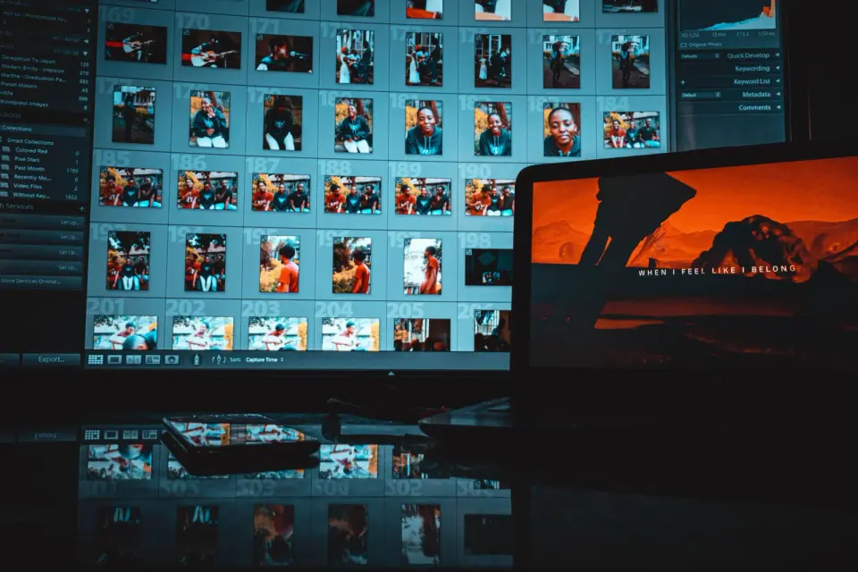
- Modern creative workspace with a monitor showing photo editing software — photo by iam hogir on Pexels
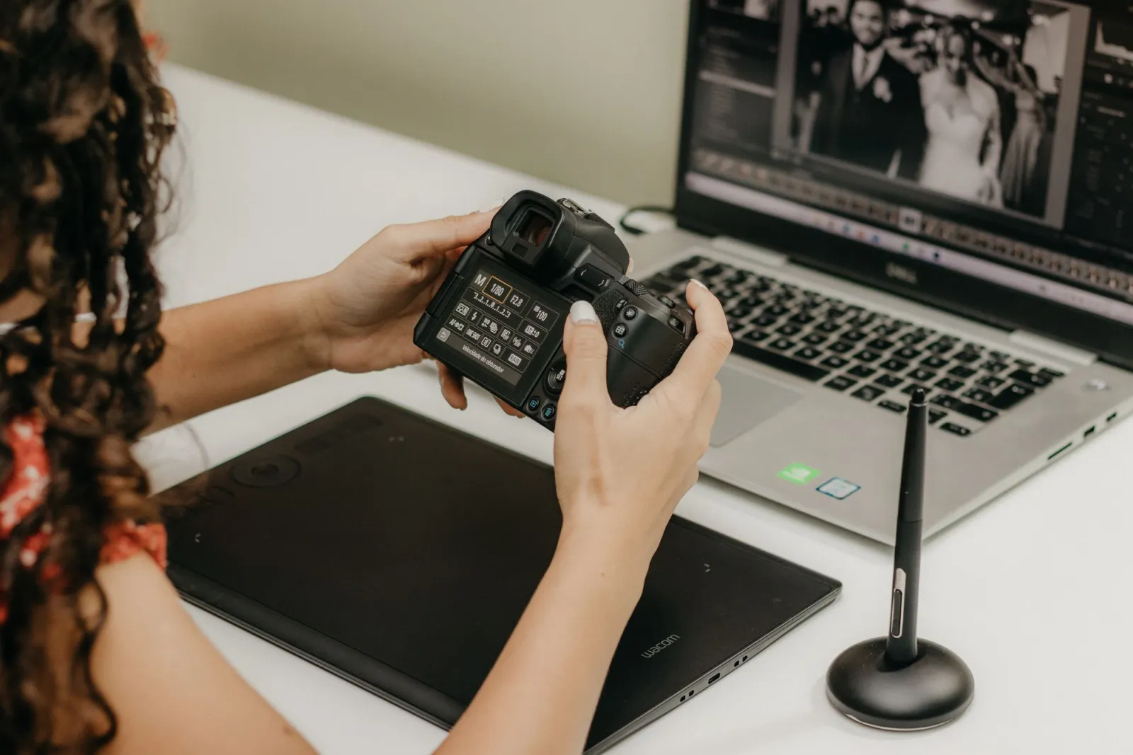
- Hand using a stylus on a graphics tablet while editing photos in Lightroom — photo by Kawê Rodrigues on Pexels
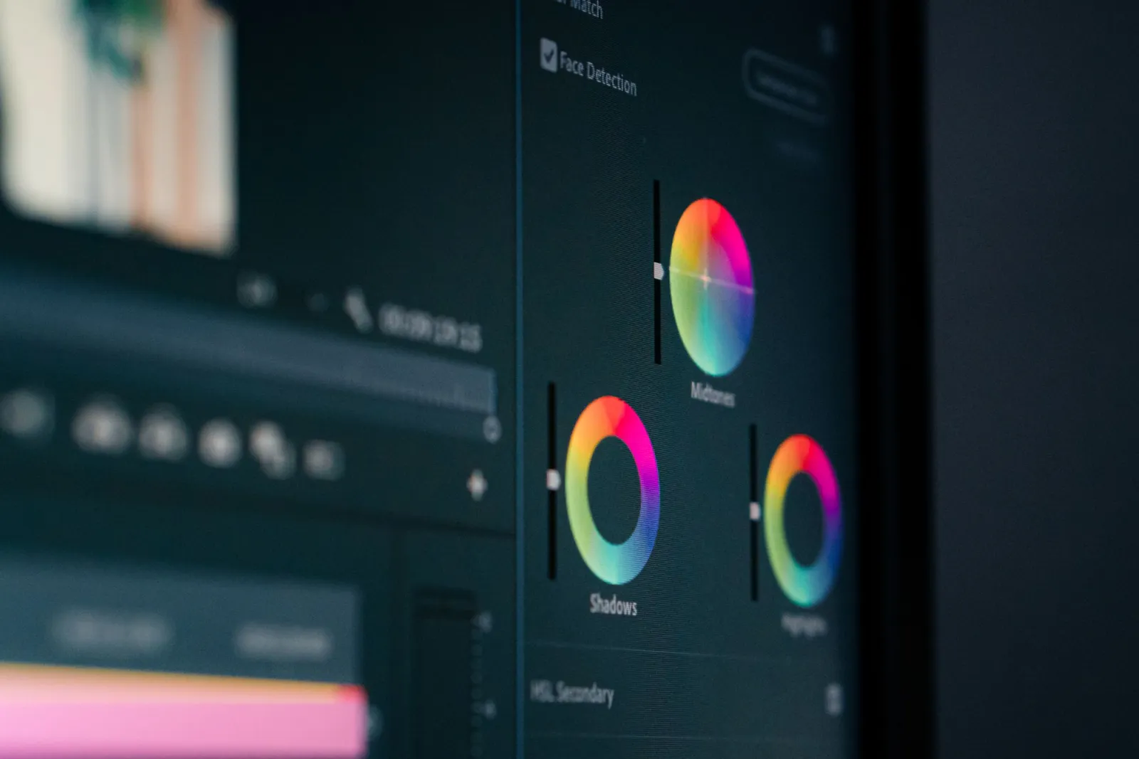
- Close-up of color grading and color correction wheels on a monitor — photo by Tima Miroshnichenko on Pexels
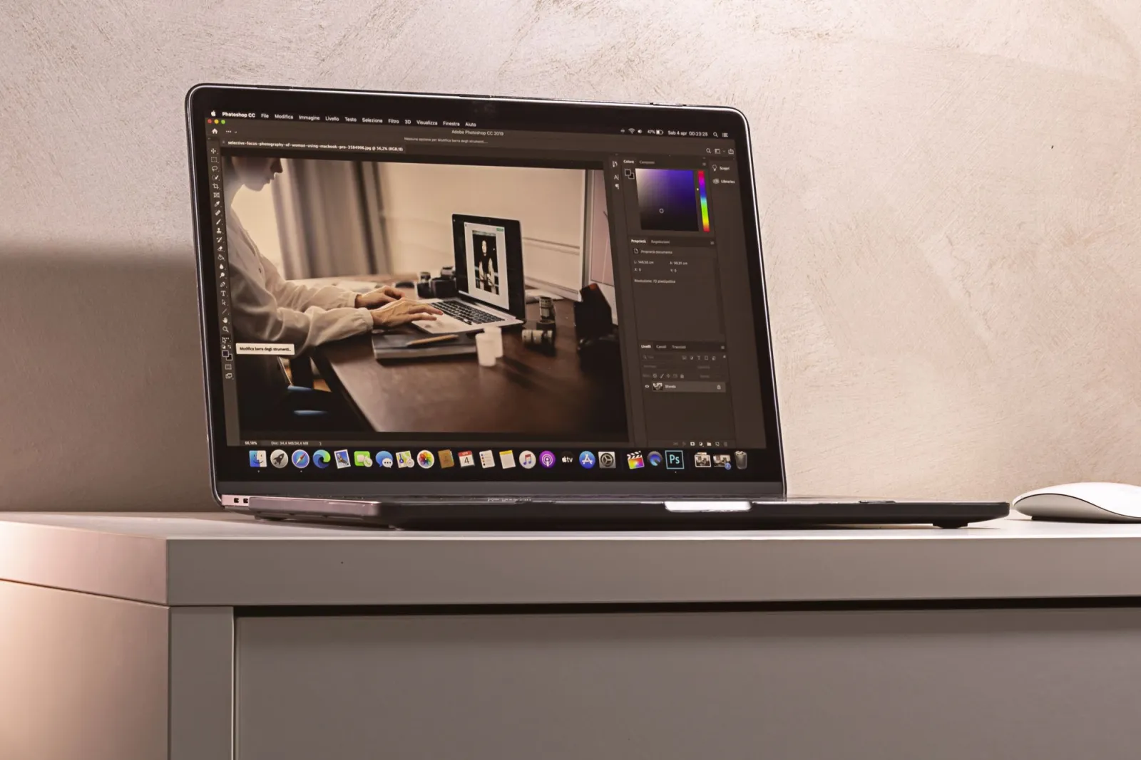
- Laptop displaying photo editing software interface on a clean modern desk — photo by Anete Lusina on Pexels
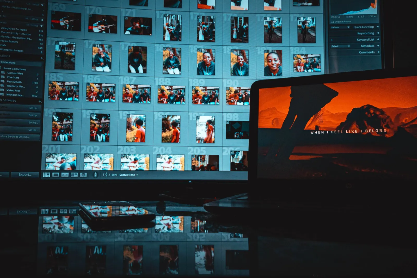
Use the free tools while you follow the guide.
Keep reading
2026-09-13
How to Blur Faces and License Plates Before You Post
Blur or pixelate faces and license plates so they stay unreadable. Which method actually anonymizes, what fails, and how to avoid leaking EXIF location data.
2026-08-27
Invisible Watermarks: What Image Files Now Carry in 2026
Paint embeds a server-issued GUID in AI images, platforms strip C2PA manifests, and a plain WebP export drops all of it. What your files really carry, and how to check.

2026-07-28
Batch Image Processing: Pipeline Order, Settings, and Tools
Batch image processing runs resize, compress, and convert jobs across whole folders. The pipeline order, measured quality settings, tool choice, and automation.