2026-06-28 · Updated 2026-07-10
Image Color Corrector: Fix Photo Colors and White Balance Online
Correct photo colors online: fix white balance, remove color casts, and adjust saturation and contrast. Real steps, the gray-point method, and how to match skin tones.
Last updated: July 10, 2026. Color correction principles are stable across years, but always verify your screen calibration before judging fine color work.
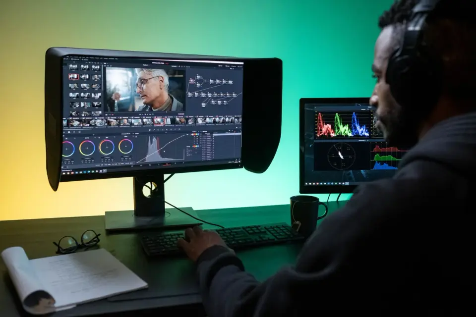
Color correction is the process of fixing a photo's color so it looks accurate rather than tinted. Most photos off a camera have a slight color cast — too warm, too cool, or shifted by mixed lighting — and correction removes that cast so whites look white and skin looks natural. This guide covers how to correct color online, the white balance and gray-point methods that actually work, and how to judge whether the result looks right. The same principles apply whether you use a browser tool or a desktop editor.
Quick answer: how do you correct colors in a photo?
Open the photo in our Color Corrector tool, find a region that should be neutral gray or white, and use the white balance or gray-point tool on it — this removes the overall color cast. Then adjust saturation and contrast to taste, and check skin tones against a reference. For mixed lighting (daylight from a window, lamps indoors), correct for the main light source and accept minor tint in the secondary areas. Always correct on a calibrated screen if accuracy matters. Resize and compress after correction.
What is the difference between correction and grading?
These two terms describe different stages, and confusing them leads to overworking a photo.
| Stage | Goal |
|---|---|
| Color correction | Make colors accurate — remove casts, balance white |
| Color grading | Apply a creative look — mood, style, cinema feel |
- Correction is objective: whites should be white, skin should look human.
- Grading is subjective: a teal-and-orange film look, a warm vintage tone.
- Correct first, grade second — you cannot grade well on an uncorrected image.
Correction is the foundation. A photo with a green cast from fluorescent light cannot be graded effectively until the cast is removed, because every grade sits on top of the cast and compounds it. The color theory guide covers the palette and harmony side that grading builds on.
How do you fix white balance?
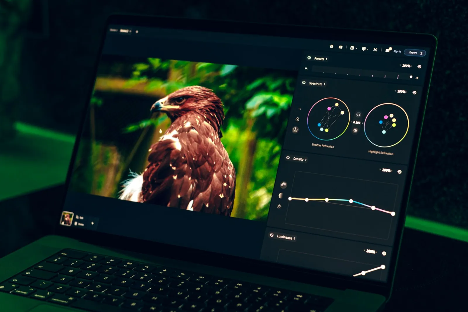
White balance is the single most impactful color correction. It tells the editor what neutral should look like, and everything else shifts to match.
- Find a region in the photo that should be neutral gray or white — a wall, a cloud, paper.
- Sample it with the white balance or gray-point eyedropper.
- The editor shifts the whole image so that region becomes neutral.
- Check skin tones and other known colors to confirm the shift is correct.
- The gray-point method works because neutral has no color bias.
- If no neutral region exists, use a white-balance preset (daylight, cloudy, tungsten).
- Mixed lighting has no single correct answer — pick the dominant light.
The gray-point method is reliable because neutral gray is a known reference. If a wall that should be gray looks blue in the photo, sampling it tells the editor exactly how much blue to remove, and that correction applies across the whole image.
How do you handle mixed lighting?
Mixed lighting — daylight from a window plus warm lamps indoors — is the hardest color case, because no single white balance satisfies both sources. The practical approach is to correct for the dominant light and accept the tint in the secondary areas, or to mask and correct regions separately.
- Correct for the light source lighting the subject's face.
- Accept minor tint in background regions lit by the other source.
- For critical work, mask the regions and correct each separately.
- Convert to black and white if the mixed tint cannot be resolved.
Sometimes the cleanest fix for badly mixed light is to abandon color entirely. A black-and-white conversion removes the color conflict while preserving the composition, which is why many mixed-light interiors and concerts end up monochrome. The color modes guide covers the conversion.
Adjusting saturation, vibrance, and contrast
After white balance, the remaining adjustments tune the photo's intensity. Saturation, vibrance, and contrast each do different things, and understanding the difference prevents the over-saturated look that marks amateur editing.
| Adjustment | What it does | Use for |
|---|---|---|
| Saturation | Boosts all colors equally | Overall intensity |
| Vibrance | Boosts muted colors more | Skin-friendly boost |
| Contrast | Separates lights and darks | Punch and depth |
| Temperature | Shifts warm or cool | Mood after correction |
- Prefer vibrance over saturation for photos with people — it protects skin.
- Add contrast in moderation; too much clips highlights and shadows.
- Temperature shifts are grading, not correction — do them after balancing.
A worked example: correcting a fluorescent-light photo
Walking through a single difficult photo makes the steps concrete. Take an indoor shot lit by fluorescent lights, where everything has a greenish cast and skin looks unwell.
- Identify the cast — the overall green tint is the fluorescent signature. A reference object that should be neutral confirms it.
- Sample a neutral region — a white wall or paper in the scene. The gray-point tool pulls the green out and the whole image shifts.
- Check skin — after the shift, skin should look human rather than ill. If it still reads green, the neutral sample was off; try another.
- Add minor warmth — fluorescent correction can overcompensate toward magenta, so a small temperature nudge toward warm restores balance.
- Boost vibrance slightly — corrected fluorescent photos often look flat, and a small vibrance lift restores life without harming skin.
The result is a photo where white looks white, skin looks healthy, and the green cast is gone. The whole correction took under a minute once the neutral reference was identified, which is why the gray-point method is the workhorse of color correction. The same approach handles daylight casts (too blue, warm them up) and tungsten casts (too orange, cool them down) — identify the direction of the cast, sample a neutral, and let the tool reverse it.
Common color correction mistakes
- Over-saturating — colors look radioactive. Back off and prefer vibrance.
- Trusting an uncalibrated screen — your edit may look wrong elsewhere.
- Correcting before setting white balance — every later edit compounds the cast.
- Ignoring skin tones — if skin looks wrong, the correction is wrong, regardless of the numbers.
- Mixing correction and grading — correct first, then add creative looks.
For the technical foundation, the Mozilla guide to color on the web documents the color models involved, and the International Color Consortium maintains the ICC profile standards that calibrated editing relies on. Judge your results with your eyes on known references — skin, neutral gray, sky — rather than by the numbers alone, because the eye is the final arbiter of whether a color correction actually worked.
Frequently asked questions
How do you correct colors in a photo?
Start with white balance (neutralize a color cast), then adjust exposure and contrast, then fine-tune saturation and vibrance. The order matters: fixing white balance first removes the cast that would otherwise contaminate every later adjustment.
What is the difference between correction and grading?
Correction fixes a photo to be accurate (neutral whites, correct exposure) — it is invisible when done well. Grading applies a creative look (a warm film tone, a cool cinematic cast) on top of a corrected base. Correct first, then grade.
How do I fix white balance?
Find a neutral reference (something that should be white or gray) and neutralize it, or use a temperature/tint slider to remove the cast. Mixed lighting (warm indoor plus cool window) is harder and may need local adjustment.
How do I handle mixed lighting?
Adjust globally first, then mask and correct the differently-lit regions separately. Mixed lighting has no single correct white balance, so you choose which light to neutralize and correct the rest locally. See the color theory guide.
How do I fix a yellow color cast?
Neutralize it with the white balance temperature slider (move toward blue) until a neutral reference (something that should be white or gray) looks neutral. If the cast is uneven, mask and correct the affected region locally.
What is white balance?
The setting that neutralizes color cast so whites look white. If a photo was shot under warm indoor light, it has a yellow cast; cooling the white balance removes it. Correct white balance first, before any other color work, because a cast contaminates every later adjustment. Find a neutral reference (something that should be gray) and neutralize it.
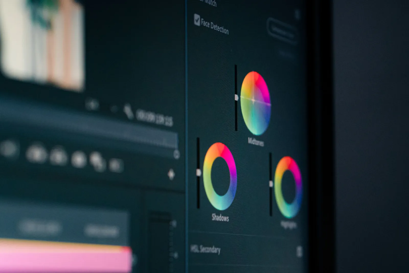
Use the free tools while you follow the guide.
Keep reading
2026-09-13
How to Blur Faces and License Plates Before You Post
Blur or pixelate faces and license plates so they stay unreadable. Which method actually anonymizes, what fails, and how to avoid leaking EXIF location data.
2026-08-27
Invisible Watermarks: What Image Files Now Carry in 2026
Paint embeds a server-issued GUID in AI images, platforms strip C2PA manifests, and a plain WebP export drops all of it. What your files really carry, and how to check.
2026-07-28
Batch Image Processing: Pipeline Order, Settings, and Tools
Batch image processing runs resize, compress, and convert jobs across whole folders. The pipeline order, measured quality settings, tool choice, and automation.