2026-06-28 · Updated 2026-06-30
Color Extraction From Images: Building Palettes That Work
Extract dominant colors from any image and turn them into a usable design palette. Real methods, the 60-30-10 rule, contrast checks, and tools that speed it up.
Last updated: June 30, 2026
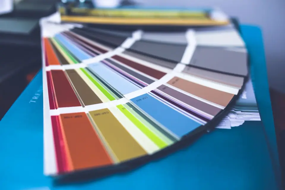
Pulling a color palette out of a photograph is the fastest way to build a set of colors that already feel like they belong together. The photograph did the hard work of choosing harmonious hues; extraction just measures them. This guide covers how extraction actually works, the methods that produce palettes you can use in a design system, and the contrast rules that keep those colors accessible.
Quick answer: how do you extract colors from an image?
Open the image in a color picker tool, sample the 5 to 7 most frequent colors, and weight them by how much area each one covers. Discard near-duplicates, keep one dominant color, one or two secondaries, and one accent. Then apply the 60-30-10 rule: 60% dominant, 30% secondary, 10% accent. Check every text-and-background pairing against a WCAG contrast checker before you ship — a palette that looks good but fails contrast is unusable for real text.
Why extract colors from a photo?
A good photograph already contains a harmonious palette because the photographer or the scene composed it that way. When you extract those colors, you inherit that harmony instead of picking hex codes from scratch. This is why brand designers often start from a hero image, a founder's favorite landscape, or a product photo.
The alternative — choosing colors from a wheel — works, but it tends to produce palettes that are technically correct yet emotionally flat. Colors lifted from a real image carry the context that makes them feel intentional.
How does color extraction work?
Extraction reduces thousands of distinct pixels to a handful of representative colors. Three methods dominate, and each has a trade-off.
| Method | How it works | Best for |
|---|---|---|
| Frequency counting | Counts pixel colors, returns the most common | Quick palettes, simple images |
| Median cut | Splits color space into boxes recursively | Photos with clear color regions |
| K-means clustering | Groups pixels into k color centroids | Complex images, gradients |
- Frequency counting is fast but over-weights large backgrounds like sky.
- Median cut balances speed and quality and is what most editors use.
- K-means produces the most "designed" results but is slower.
A practical detail: always downscale the image to around 100×100 pixels before extracting. A full-resolution photo has millions of pixels and the extra detail does not change the top colors, it just slows the count. The Mozilla canvas pixel manipulation reference documents the pixel-reading step that underpins browser-based extractors.
Which colors should you keep?
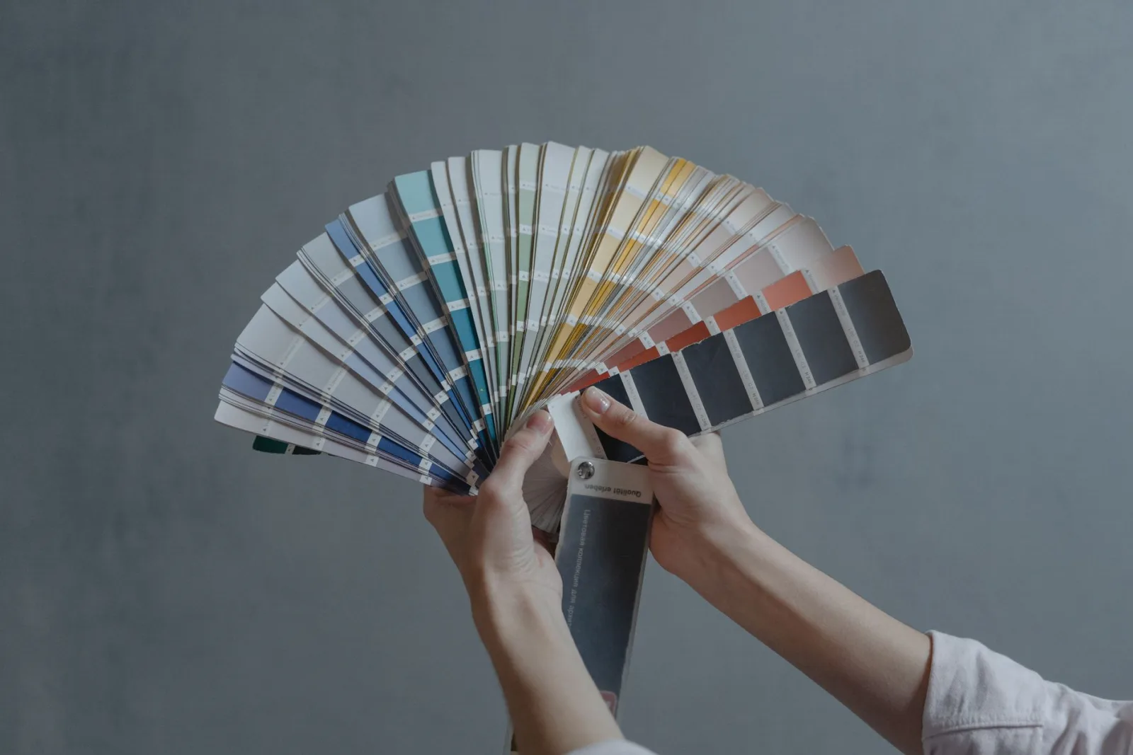
Extraction usually returns more colors than you can use. A photo might yield twelve candidates, but a usable palette is five to seven. The filtering step is where most palettes go wrong.
- Keep one dominant color — the one covering the most area, often a neutral or a sky tone.
- Keep one or two secondary colors that support the dominant.
- Keep exactly one accent color for calls to action and highlights.
- Discard near-duplicates; two greens three shades apart read as one muddy color.
- Discard pure black and pure white unless the design needs them as neutrals.
The 60-30-10 rule for applying a palette
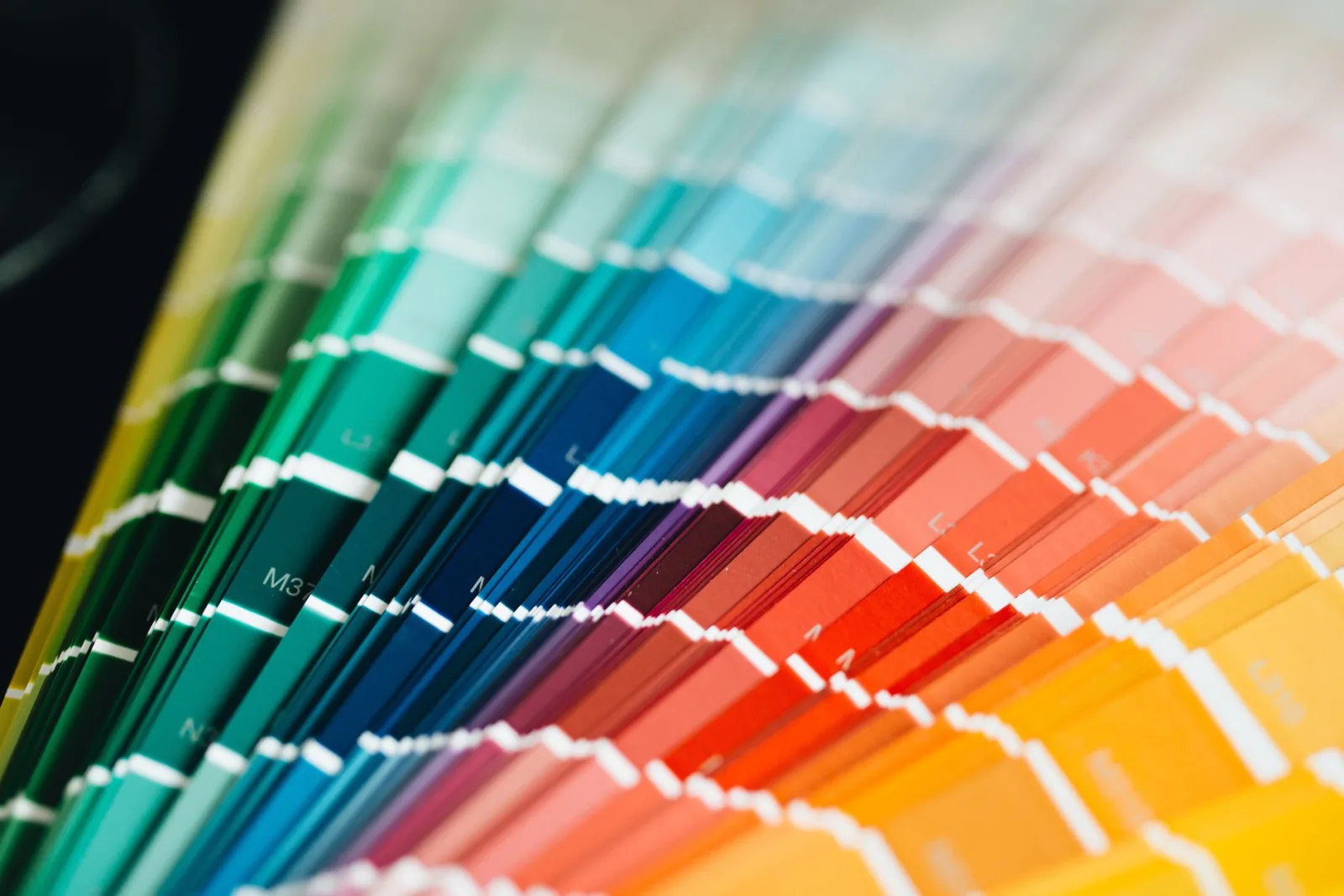
Once you have your colors, the 60-30-10 rule tells you how much of each to use. It is a guideline from interior design that translates cleanly to interfaces.
| Role | Share | Where it goes |
|---|---|---|
| Dominant | 60% | Backgrounds, large surfaces |
| Secondary | 30% | Cards, sidebars, supporting areas |
| Accent | 10% | Buttons, links, highlights |
A worked example: extract from a forest photo and you might get a dominant green, a lighter secondary green, and a brown accent. The green becomes the page background at 60%, the lighter green fills cards at 30%, and the brown drives the call-to-action button at 10%. The result feels like the forest without being a literal forest.
How do you check colors for accessibility?
A palette that fails contrast is not a finished palette. Text needs a minimum contrast ratio against its background to be readable, and the standard is WCAG 2.1.
- Normal text needs at least 4.5:1 contrast against its background.
- Large text (18pt or 14pt bold) needs 3:1.
- Aim for 7:1 for body text when you can; it helps low-vision readers.
Test every pairing you actually plan to use — accent on dominant, text on secondary, and so on. The WebAIM contrast checker is the standard free tool, and the W3C WCAG 2.1 contrast guidance defines the math. If an accent color fails on your background, either darken the accent or lighten the background until it passes.
Turning a palette into a design system
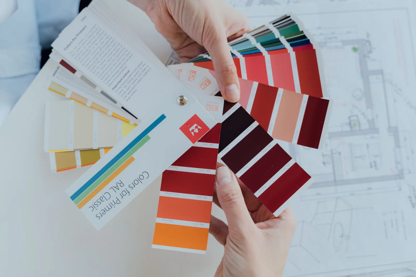
A set of hex codes is not a system until you assign roles and build variants. This is the step that separates a mood board from something a developer can use.
- Name each color by role (primary, secondary, accent, surface, text), not by hue.
- Generate a light and dark variant of each so you support both modes.
- Define hover and active states by shifting saturation or luminance slightly.
- Lock the palette into your tool's variables so it stays consistent.
Once the palette is in place, the rest of the build gets faster. Buttons, headers, and cards all pull from the same named tokens. For images that will sit inside this system, run them through the image compressor and image resizer so they match the system's performance budget. The image optimization guide covers the format and sizing decisions that keep a color-rich design fast.
When extraction gives you the wrong palette
Extraction measures what is in a photo, not what your brand needs. A few common failure modes:
- A bright sky dominates the count and you end up with five blues.
- A small but important accent color gets dropped because it covers little area.
- Compression artifacts introduce noise colors that look like real swatches.
- A photo with mixed lighting produces muddy mid-tones.
When the extracted palette feels off, weight the extraction by perceptual impact — luminance, saturation, and edge contrast — rather than raw frequency. Or pick a different source image. The source photo is the single biggest factor in whether the resulting palette is usable, so choose one that already has the mood you want. For stylized brand work where you want a controlled two-tone palette instead of a sampled one, the duotone effect guide walks through mapping an image to two colors deliberately. If the extracted colors will also drive a logo or icon set, the SVG to PNG converter keeps vector marks crisp at every size the palette touches.
Frequently asked questions
How do you extract colors from an image?
A tool clusters the image's pixels by similarity and returns the most frequent colors as a palette — usually five or six. Each color comes with its hex or RGB value. The result is a data-driven palette grounded in the photo rather than a guess.
Which extracted colors should I keep?
The dominant color (most frequent), one or two accents, and a neutral. Drop colors that are too close to each other or that appear only in tiny areas. Five colors is usually enough; more fragments the palette. Apply them with the 60-30-10 rule.
What is the 60-30-10 rule?
A proportion guide: 60 percent of the design in the dominant color, 30 percent in a secondary, 10 percent in an accent. It keeps a palette balanced instead of muddy. Extracted colors feed directly into these roles.
How do I check colors for accessibility?
Test the contrast ratio between text and background colors against WCAG thresholds (4.5:1 for normal text). A palette that looks good can still fail accessibility if a light accent sits on a light background. Adjust the shade, not the hue, to fix contrast.
How many colors should a palette have?
Usually five: a dominant color, one or two secondaries, an accent, and a neutral. More fragments the palette and makes it hard to apply consistently. Five colors map cleanly onto the 60-30-10 proportion rule.
How do I apply an extracted palette to a design?
Use the 60-30-10 rule: the dominant color covers 60 percent of the design (usually the background), a secondary color 30 percent (surfaces, secondary elements), and the accent 10 percent (calls to action, highlights). This proportion keeps a palette balanced instead of muddy. Drop any extracted colors that do not fit these three roles, even if they appeared in the source photo.
Use the free tools while you follow the guide.
Keep reading

2026-09-13
How to Blur Faces and License Plates Before You Post
Blur or pixelate faces and license plates so they stay unreadable. Which method actually anonymizes, what fails, and how to avoid leaking EXIF location data.
2026-08-27
Invisible Watermarks: What Image Files Now Carry in 2026
Paint embeds a server-issued GUID in AI images, platforms strip C2PA manifests, and a plain WebP export drops all of it. What your files really carry, and how to check.

2026-07-28
Batch Image Processing: Pipeline Order, Settings, and Tools
Batch image processing runs resize, compress, and convert jobs across whole folders. The pipeline order, measured quality settings, tool choice, and automation.