2026-03-20 · Updated 2026-07-10
How to Create a Duotone Effect on Photos (Design Guide)
Create a duotone effect on photos: how the two-color tint works, the best color pairs, how to apply it in Canva, Photoshop, or ImageMagick, and where it is used.
Last updated: July 10, 2026
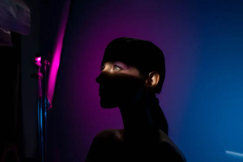
A duotone is a photo reproduced in just two colors — a dark and a light — mapped to the shadows and highlights. It is one of the most effective design effects for turning an ordinary photo into a striking, brand-coherent visual. This guide covers how the duotone effect works, the color pairs that look good, how to apply it, and where it earns its place in design.
Quick answer: how do you make a duotone?
Convert the photo to grayscale, then map the dark tones to one color and the light tones to another. The result is a two-color image with full tonal range but a unified color mood.
| Tool | Method |
|---|---|
| Browser | Duotone Effect tool |
| Photoshop | Gradient Map adjustment layer |
| ImageMagick | -colorspace gray + -clut with a gradient |
| Canva | Built-in duotone filter |
The color pair is the main creative decision.
How does the duotone effect work?
A duotone replaces the photo's full color with a gradient between two colors — one for the shadows, one for the highlights. Midtones blend between them. The photo keeps its tonal structure (you can still see the shapes and lighting) but everything sits in a two-color world.
This is why duotone looks intentional where a plain color filter looks like a mistake: it remaps the whole tonal range into a designed palette, rather than tinting one channel. The effect is rooted in print (two-ink reproduction) and now lives everywhere in digital design.
What color pairs work best?
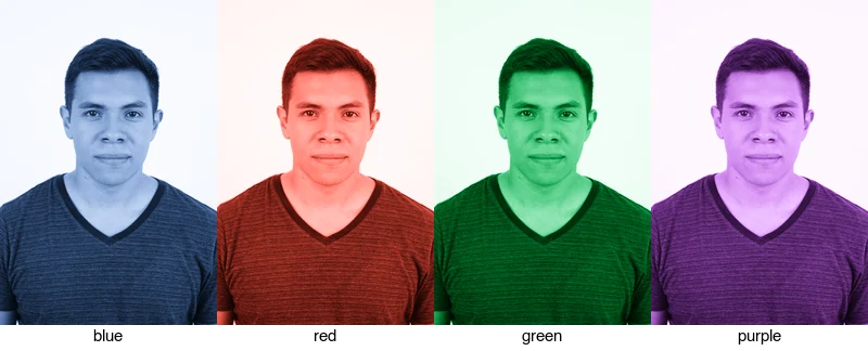
High-contrast pairs read strongest — a deep shadow color against a light highlight color. Four reliable directions:
| Mood | Shadow color | Highlight color |
|---|---|---|
| Corporate / tech | Deep blue | Light blue / white |
| Bold / energetic | Dark red | Cream |
| Calm / natural | Forest green | Pale green |
| Creative / premium | Deep purple | Pink |
The safest starting point is a single hue used for both ends (dark and light of the same color), which guarantees harmony. For brand work, use the brand's colors.
Where is duotone used?
Duotone solves a specific design problem: making a set of photos look cohesive and on-brand without reshooting them.
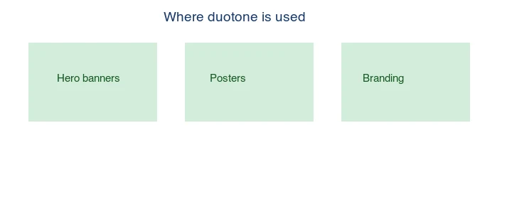
- Hero banners — a duotone background unifies a stock photo with the brand palette.
- Posters and flyers — striking, printable in two inks.
- Branding — consistent visuals across a campaign from varied source photos.
- Editorial — a magazine spread with a unified color mood.
The common thread is cohesion: duotone makes mismatched photos look like one set. The Adobe design guide to duotone and the Canva design school cover the design theory in depth.
Method 1: Browser editor
For one image, use the Duotone Effect tool: apply the duotone filter, pick the two colors, and export. This is the fastest path and lets you preview color pairs live.
Method 2: Photoshop (Gradient Map)
- Open the photo.
- Add a Gradient Map adjustment layer.
- Set the gradient's left stop (shadows) to your dark color and the right stop (highlights) to your light color.
- Adjust the midpoint for the tonal balance.
Gradient Map is the cleanest duotone tool because it maps the full tonal range directly to your two-color gradient. You can add more than two stops for a tritone or quadtone, but two is the classic, strongest look — extra colors tend to muddy the effect rather than enrich it.
Method 3: ImageMagick (batch)
## Build a 2-color gradient LUT, then apply it to the grayscale photo
magick -size 1x256 gradient:"#1a3a6b"-"#cfe0f5" lut.png
magick input.jpg -colorspace gray lut.png -clut output.jpg

## A folder
mkdir -p out
for f in *.jpg; do magick "$f" -colorspace gray lut.png -clut "out/$f"; done
-clut (color lookup table) maps each gray level to the corresponding color in the gradient, producing the duotone. This is the right approach for applying one duotone to hundreds of images.
How do you choose the right photo for duotone?
Duotone works best on photos with strong tonal contrast and simple composition — portraits, architecture, single subjects. Photos with lots of fine color detail (a crowded market scene) lose what made them interesting when reduced to two colors, because the effect deliberately throws away hue information in favor of a designed palette. A high-contrast black-and-white source is ideal because the duotone maps cleanly onto its tonal structure, and any photo that already reads well in black and white will read well as a duotone.
The test is to squint at the photo or convert it to grayscale in your head: if the composition still holds without color, it will hold as a duotone. If the photo depends on color to make sense — a red apple on a green tree, a color-coded chart — duotone will strip the meaning out of it. When sourcing for a duotone campaign, shoot or pick for shape, light, and contrast first, and let the color be applied later. See how to enhance photo quality to get the tonal contrast right first.
Common mistakes
- Low-contrast color pairs. Two similar colors produce a muddy image. Use a dark and a light.
- Busy source photos. Detail that relies on color is lost. Pick simple, high-contrast photos.
- Clashing with brand colors. Match the duotone to the palette it will sit in.
- Forgetting the midpoint. The tonal balance lives in the gradient's midpoint; adjust it.
- Over-tinting skin. Duotone on faces can look odd; test on the actual subject.
Frequently asked questions
What is a duotone effect?
A photo reproduced in two colors — one mapped to shadows, one to highlights — keeping the tonal range but replacing full color with a designed pair.
What colors make a good duotone?
A high-contrast pair: a deep shadow color and a light highlight color. The same hue in dark and light is the safest starting point.
Can I duotone any photo?
Technically yes, but it looks best on simple, high-contrast photos. Busy scenes lose what makes them interesting.
How is duotone different from a color filter?
A filter tints; a duotone remaps the whole tonal range to two colors, which is why it looks intentional and design-led. The remap is total: every pixel lands somewhere on the gradient between your two chosen colors, so the final image reads as a deliberate art direction rather than a mild tint on top of the original photograph.
How does the duotone effect work?
A duotone maps every tone in the image — from black to white — across a gradient between two colors (a shadow color and a highlight color). The shadows take the dark color, the highlights take the light color, and the midtones blend. It is a tone-to-color remap, not a tint, which is why it produces a designed look rather than a wash.
What color pairs work best for a duotone?
A dark, saturated shadow color and a lighter, contrasting highlight color — deep blue shadows with warm yellow highlights, for example. Two similar colors produce a muddy, unreadable result; high contrast reads as a deliberate design. Test the pair on your actual image, since the same pair behaves differently on different source tones.
Where is duotone used?
In editorial design, branding, and hero imagery — anywhere a striking, branded look is wanted. Duotone unifies a set of varied photos under one color treatment, which is why it suits brand systems and magazine layouts. It discards the original colors, so keep the original if you may want the natural look. See the blend mode guide.
Can I apply a duotone to text?
Yes — a duotone on text maps the text's tones across the two-color gradient, producing a striking branded headline. Keep the text high-contrast so the gradient reads clearly. Duotone text suits posters and hero headlines more than body copy, where plain legibility wins.
How do I pick duotone colors for a brand?
Sample two colors from the brand palette: a dark version of the primary for the shadows and a lighter tint (often a secondary or neutral) for the highlights. Test the pair on a real photo, because the same pair behaves differently on different source tones. Keep the contrast high — two similar colors produce a muddy, unreadable result.
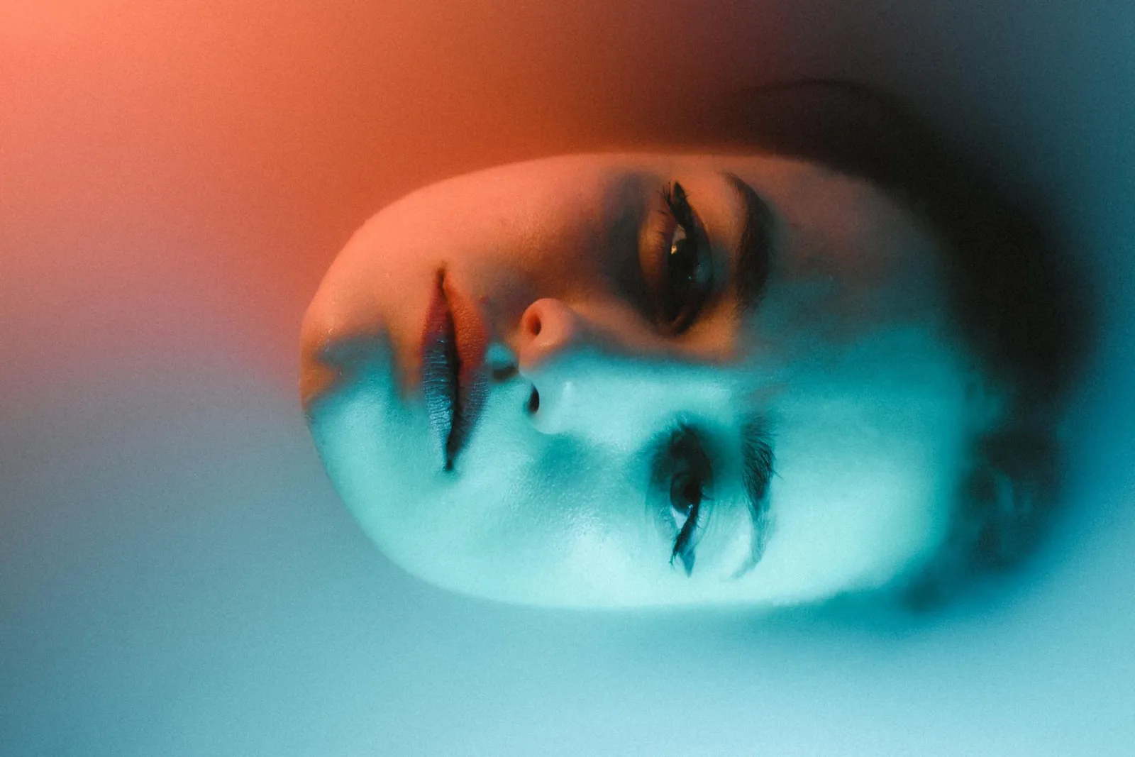
Image credits
- Duotone before/after, color-pairs, and use-cases diagrams — generated by the author from a portrait photograph (Pexels #5931195, photo by August de Richelieu) by applying two-color tint gradients to demonstrate the duotone effect.
Use the free tools while you follow the guide.
Keep reading
2026-07-28
AI Action Figure Trend: How to Prep Your Photo Right
Turn a photo into a collectible toy portrait: what makes the prompt work, and the crop, background, and resolution steps that avoid an obvious fake.
2026-07-26
AI Anime Generator Guide: Prompts, Styles, and Safe Exports
A practical AI anime generator workflow for portraits, avatars, banners, and social posts, with prompt templates, style checks, and export rules.
2026-07-26
Text-to-Image AI in 2026: How Prompt Generation Actually Works
Text-to-image AI turns a written prompt into a finished picture. Here is how the models, prompts, and settings behind image generation fit together in 2026.