2026-06-28 · Updated 2026-07-10
Image Border Generator: Add Frames and Borders to Photos
Add borders and frames to photos for Instagram, prints, and product shots. Real border styles, exact width settings, and the tools that produce clean, consistent frames.
Last updated: July 10, 2026
A border is the cheapest way to make a photo look finished. A clean white frame around an Instagram post, a thin keyline around a product shot, a thick matte border for a print — each signals a different context, and the right one makes an ordinary photo look intentional. This guide covers the border styles that actually get used, the width and color settings that work, and how to apply a consistent frame across a set of images.
Quick answer: how do you add a border to a photo?
Open the photo in our Border Generator tool, pick a border style (solid color, matte, Polaroid, or keyline), set the width as a percentage of the image rather than a fixed pixel value, and export. For a set of images that need matching frames, use a batch tool so every photo gets the same border proportion. Avoid fixed-pixel borders — a 40px frame looks right on a 1000px image but overwhelms a 400px thumbnail.
Why add a border to a photo?
A border does two jobs: it separates the image from its background, and it signals context. On a white webpage, a light photo with no border can blend into the page and look unfinished. A one-pixel keyline fixes that instantly. On social media, a consistent border becomes a visual signature — followers recognize your posts by the frame before they read the content.
| Context | Border style | Why it works |
|---|---|---|
| Instagram feed | White matte, even margins | Consistent grid, gallery feel |
| Product shot | Thin keyline, 1-2px | Separation without distraction |
| Thick matte border | Room for matting and signing | |
| Portfolio | Polaroid-style | Casual, analog mood |
| Thumbnail | Subtle inner shadow | Depth without a hard edge |
Which border style should you choose?
The border should match where the image lives. A Polaroid frame on a corporate product shot looks out of place; a thin keyline on a casual photo looks sterile.
- Solid color border — the default. White is safe, black is dramatic, brand colors tie into an identity.
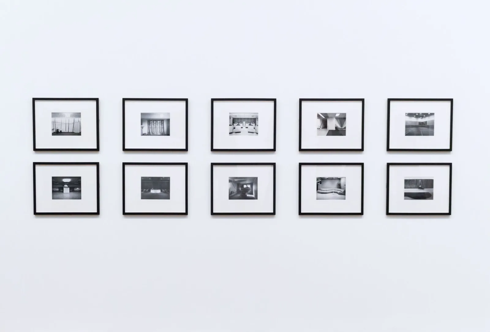
- Matte border — a wide, even border that mimics a matted print. Works for portfolios and galleries.
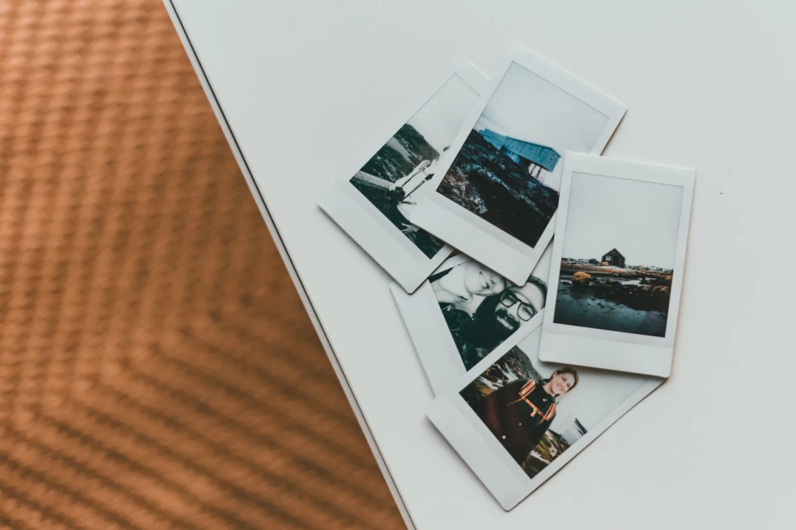
- Polaroid border — a thicker bottom edge than the other three sides, evoking instant film.
- Keyline — a one-to-two pixel stroke, often in gray, that defines the edge without framing it.
- Inner border — a stroke drawn inside the image edge, leaving the original dimensions intact.
How do you set border width correctly?
The most common mistake is using a fixed pixel width. A 40px border looks generous on a 1200px image and absurd on a 300px one. Set the width as a percentage of the shortest edge instead.
- Measure the shortest edge of your image.
- Set the border to 4-8% of that edge for a matte look, or 1-2% for a keyline.
- Apply the same percentage to every image in a set so the frames match.
- Export and check the result at the display size, not just full-screen.
For a set of Instagram posts, a 6% white border on a 1080px square gives a roughly 65px frame that looks consistent across the grid. For a print, the matte border might be 5% with extra bottom margin for a signature.
Color and consistency choices
The border color changes the mood more than people expect. White feels clean and gallery-like. Black feels dramatic and modern. A brand color reinforces identity but can clash with the photo's palette. The color extraction guide explains how to pull a palette from the photo itself so the border matches rather than fights the image.
- White borders work for almost everything and are the safe default.
- Black borders add drama but darken the perceived image.
- Neutral grays (10-20% gray) soften without competing.
- Match the border color to the display background so it reads as a frame, not a box.
Batch-applying borders
If you frame images regularly — a weekly Instagram set, a product catalog, a print run — applying borders one at a time is slow and inconsistent. The fix is to batch-apply the same border settings to a whole folder.
- Define the border once as a percentage of the shortest edge.
- Run the batch tool over the folder with those settings.
- Export to a new folder so the borderless originals stay intact.
- Spot-check three or four images at display size to confirm the frame holds up.
Consistency is the whole point of a batch pass. When every image in a feed or catalog shares the same frame proportion, the collection reads as a designed set rather than a pile of files. For the related task of fitting images into fixed-aspect frames without distortion, the aspect ratio guide covers the resize-and-crop math.
Common border mistakes
- Fixed pixel widths — use percentages so borders scale with the image.
- Borders that match the photo's edge color — the frame disappears. Pick a contrasting tone.
- Overly thick borders on small images — the frame swallows the photo.
- Inconsistent frames in a set — batch-apply to keep them uniform.
- Forgetting the export format — borders with sharp edges compress better as PNG or lossless WebP than JPEG. The format comparison explains the trade-off.
Border use cases by platform
Each platform rewards a slightly different framing approach, mostly because of how images display in feeds versus standalone pages.
| Platform | Border approach | Reason |
|---|---|---|
| Even white matte, 5-7% | Creates a consistent grid | |
| No border or thin keyline | Pins crop unpredictably | |
| E-commerce | Subtle 1px keyline | Separation from white page |
| Thick matte, signed bottom | Matting and presentation | |
| Thin border or shadow | Reads on dark and light clients |
A border that works on Instagram can fail on Pinterest because Pinterest crops images into tall cards, and a wide matte gets cut off. Test the frame on the actual platform before committing a set. The social media image sizes guide lists the current display dimensions so you can size and frame for each platform correctly. Instagram's own media specifications for businesses document the recommended crop ratios that determine how much of your border survives in the feed.
For the technical detail of how CSS borders and box-shadow render frames on the web versus baked-in image borders, the Mozilla box-shadow reference documents the layering that lets a web border sit outside the image without changing its dimensions.
When should you skip the border?
Not every photo needs a frame. A full-bleed hero image on a landing page is stronger without a border because the image carries the whole space. A photo with a busy background may already define its own edge and look cluttered with an added frame. Use a border when the image needs separation or context, and skip it when the image is strong enough to stand alone. Before you resize or compress a bordered image for the web, apply the frame first so the border is calculated on the final dimensions, not the source.
Frequently asked questions
How wide should a photo border be?
Roughly 2 to 8 percent of the image's shortest edge. Too thin reads as an accident; too thick eats the photo. A consistent border width across a set reads as intentional framing.
What color border works best?
White or black for a clean gallery look; a color sampled from the photo ties the frame to the image. Avoid clashing colors that fight the subject. Consistency across a batch matters more than the specific color.
Can I batch-apply borders?
Yes — a command-line tool or the Image Cropper applies the same border to a whole folder. Keep the border width consistent across the set so the framing reads as a deliberate series, not random.
Should I add a border before or after resizing?
After resizing, so the border width is correct relative to the final dimensions. Adding a border before resizing scales the border unpredictably. Resize first, then add the border at its intended width.
Can I add a border to a PNG with transparency?
Yes, but place the border inside the canvas so it does not cover the transparent corners, or the border fills the transparency with its color. Keep the border as a separate layer so you can adjust it without touching the cutout.
Use the free tools while you follow the guide.
Keep reading
2026-09-13
How to Blur Faces and License Plates Before You Post
Blur or pixelate faces and license plates so they stay unreadable. Which method actually anonymizes, what fails, and how to avoid leaking EXIF location data.
2026-08-27
Invisible Watermarks: What Image Files Now Carry in 2026
Paint embeds a server-issued GUID in AI images, platforms strip C2PA manifests, and a plain WebP export drops all of it. What your files really carry, and how to check.

2026-07-28
Batch Image Processing: Pipeline Order, Settings, and Tools
Batch image processing runs resize, compress, and convert jobs across whole folders. The pipeline order, measured quality settings, tool choice, and automation.