2026-03-28 · Updated 2026-07-12
Change Image Aspect Ratio Without Distortion
Change an image aspect ratio without stretching it: choose crop, pad, or outpaint, use platform ratios, check safe zones, and export clean files.
Last updated: July 12, 2026
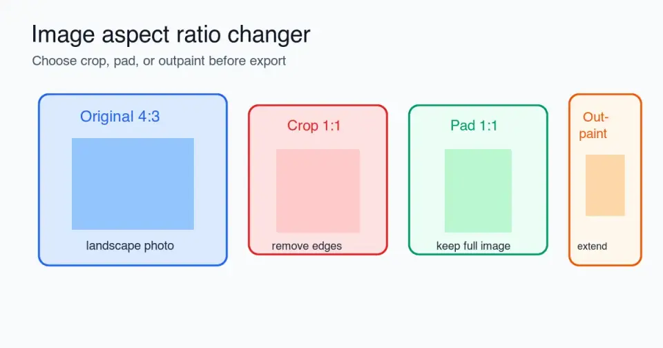
Changing an image aspect ratio should never mean stretching the photo. The clean workflow is to decide whether the new frame should remove pixels, add empty space, or extend the scene. This guide shows when to crop, when to pad, when to outpaint, which ratios to use for common platforms, and what to check before export.
Quick answer: how do you change aspect ratio without distortion?
Use crop, pad, or outpaint. Do not unlock width and height and drag the image into a new shape. That stretches the subject, turns circles into ovals, and makes product photos look wrong.
Pick crop when the important subject still fits after trimming the edges. Pick pad when every pixel matters, such as logos, product photos, certificates, screenshots, or marketplace images. Pick outpaint when the image is too tight and you need more background around the subject.
After the ratio change, resize to the actual upload size, compress once, and open the exported file. For ordinary resizing where the ratio stays the same, use the Image Resizer or the workflow in resize an image without losing quality.
| Method | What changes | Best for | Risk |
|---|---|---|---|
| Crop | Removes edge pixels | Portraits, banners, thumbnails | Subject or text can be cut off |
| Pad | Adds border or background space | Logos, product photos, documents | Can look empty if the background is mismatched |
| Outpaint | Generates or extends background | Tight lifestyle photos, hero images | Generated edges may need inspection |
| Stretch | Forces width and height | Almost never | Distortion |
What does aspect ratio mean?
Aspect ratio is the proportional relationship between width and height. A 1200 x 800 image is 3:2. A 1080 x 1080 image is 1:1. A 1920 x 1080 image is 16:9. The pixel count can change while the ratio stays the same.
The browser and many design tools use this same idea. MDN describes CSS aspect-ratio as the preferred width-to-height ratio used to size a box when one dimension is flexible. That matters when an image needs to fit a responsive card or hero area without layout shift. See the MDN aspect-ratio reference for the technical behavior.
In image editing, the practical rule is simpler: change the frame, not the subject. If a 4:3 camera photo must become a 9:16 Story, the editor needs to remove side detail, add top and bottom space, or extend the background. It should not squeeze the original into a tall rectangle.
Should you crop, pad, or outpaint?
Start by asking what would be unacceptable in the final file. If losing the left and right edges is fine, crop. If losing any part of the image is not fine, pad. If padding would look like a poster pasted on a wall, outpaint.
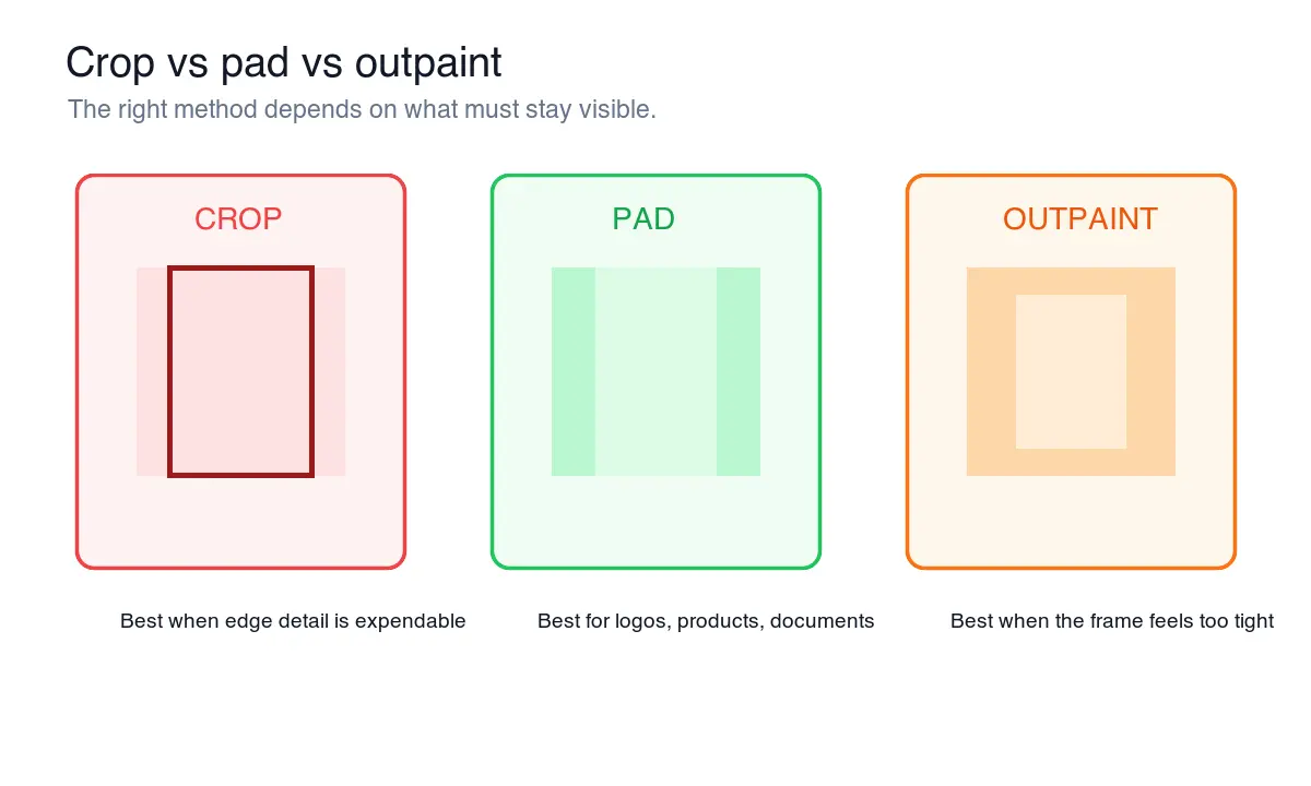
Use this decision table before touching the export controls.
| Situation | Use | Why |
|---|---|---|
| A headshot needs a square avatar | Crop | Faces tolerate edge trimming if the eyes stay centered |
| A shoe photo must fit a marketplace square | Pad | The product shape should not be cut or stretched |
| A YouTube thumbnail needs a wider frame | Outpaint or crop | Widen the background if the subject is already tight |
| A certificate needs a 4:5 preview | Pad | Text and borders must remain intact |
| A website hero image has extra scenery | Crop | Wide heroes often benefit from tighter framing |
| A logo needs a social preview | Pad | Clear space protects the mark |
| A screenshot needs a mobile preview | Pad or recapture | Cropping interface edges can remove context |
For product photos, padding is usually the safest first pass. For editorial images, crop often looks cleaner. For AI-assisted edits, image outpainting is useful when the original frame is good but too narrow or too short.
How do you crop without cutting off the subject?
Set the target ratio first, then move the crop box before resizing. Cropping after resize gives you fewer pixels to work with and makes mistakes harder to fix.
Use this order:
- Duplicate the original file.
- Choose the required ratio, such as 1:1, 4:5, 16:9, or 9:16.
- Lock the crop box to that ratio.
- Place the subject inside the safe area, not against the edge.
- Check text, hands, product edges, and logos.
- Apply the crop.
- Resize to the final pixel dimensions.
- Export to WebP, JPEG, or PNG as needed.
The safe area is the part of the image that should survive previews, overlays, and automatic platform crops. Keep faces, product names, subtitles, and call-to-action text away from the outer 10-15% of the frame when the destination may add UI on top.
For exact crop tools and no-code workflows, see crop image online. If you only need a circular avatar, use the separate crop image to circle workflow because the visible shape changes again after the square crop.
When is padding better than cropping?
Padding is better when the full image is the product. That includes logos, packaging, product catalog shots, app screenshots, scanned documents, certificates, ID photos, and charts.
Padding can use a solid color, blurred background, extended canvas, or brand color. The safest choice is usually the destination background color. A white product photo for a white marketplace page should get white padding. A transparent logo can stay PNG if the destination supports transparency.
Avoid padding that fights the subject. A blurred duplicate background can work for casual social posts, but it often looks cheap around ecommerce products and documents. For store images, read the ecommerce image guide before deciding whether the product should fill more of the frame.
Padding checklist:
- Match the destination background when possible.
- Keep the subject optically centered, not just mathematically centered.
- Leave enough breathing room for automatic thumbnail crops.
- Avoid busy blurred backgrounds behind text.
- Export transparent logos as PNG when transparency is required.
- Use WebP or JPEG for normal photos.
Which aspect ratios should you use for each platform?
There is no universal best ratio. Choose the ratio for the placement, then make alternate exports when one image needs to work in several places. A square product tile, a vertical Story, and a wide blog hero are different files.
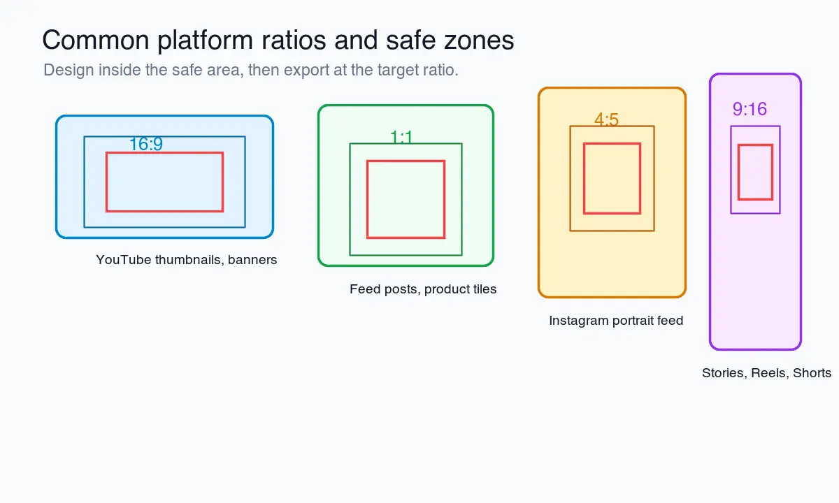
| Ratio | Common pixel size | Good for | Notes |
|---|---|---|---|
| 1:1 | 1080 x 1080 | Product tiles, avatars, grid posts | Easy to reuse, but can waste vertical feed space |
| 4:5 | 1080 x 1350 | Portrait feed images, product promos | Strong mobile feed shape |
| 16:9 | 1280 x 720 or 1920 x 1080 | Video thumbnails, slides, blog covers | YouTube custom thumbnails use a 16:9 shape; see YouTube Help |
| 9:16 | 1080 x 1920 | Stories, Reels, Shorts, vertical ads | Keep text away from top and bottom UI zones |
| 3:2 | 1500 x 1000 | Photography, portfolios, some catalog images | Matches many camera exports |
| 2:3 | 1000 x 1500 | Pinterest-style vertical images | Useful when vertical discovery matters |
Meta's business help pages note that feed placements support 1:1 and 4:5, with vertical 4:5 recommended for single-image ads in that context. Check the current Meta aspect ratio guidance before building paid creative, because ad placements can change.
If you manage many social exports, keep a ratio preset list instead of manually typing dimensions every time. The social media image sizes guide is a better place to check current platform dimensions before a campaign handoff.
How do you avoid quality loss after changing ratio?
Changing ratio and changing pixel dimensions are separate operations. First decide the frame. Then resize. Then compress. Recompressing the same JPEG multiple times can add visible artifacts, especially around text and flat color.
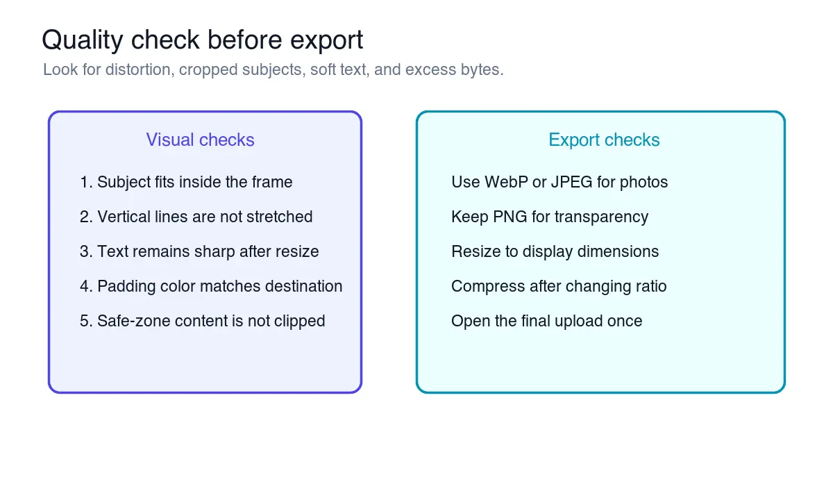
I resized each diagram in this article to its display-oriented dimensions and exported the final assets as WebP so the examples stay sharp without oversized downloads. The same order works for user images:
- Keep the original untouched.
- Change the ratio using crop, pad, or outpaint.
- Resize the result to the final display size.
- Use a high-quality resampling filter when resizing down.
- Export once.
- Check the final file at 100% zoom.
- Upload the final file and inspect the live preview.
Google's image guidance recommends sharp, clear images placed near relevant text, with descriptive alt text that explains the image in context. That is useful for search and for people using assistive technology. See Google's SEO starter guide and Google Image SEO best practices.
For format choice, use WebP for most web photos and diagrams, JPEG when compatibility is the constraint, and PNG when transparency or crisp interface pixels matter. The image format guide explains the trade-offs.
What should you check before export?
Open the final file, not just the editor preview. Editor canvases can hide scaling, compression, and crop problems.
Check these items:
- The subject is not stretched horizontally or vertically.
- Important text is inside the safe zone.
- Hands, hair, product corners, and shadows are not accidentally clipped.
- Padding looks intentional on the destination background.
- Outpainted areas do not invent obvious repeated patterns.
- Small text remains readable at the upload size.
- File format matches the destination.
- File size is reasonable for the page or platform.
- The image still makes sense as a thumbnail.
- The filename describes the image instead of using
final-final-2.jpg.
For websites, also check layout behavior. If the image sits inside a responsive card, set width and height or CSS aspect ratio so the page does not jump while images load. For image-heavy pages, pair the final export with image optimization for SEO so filenames, alt text, and compression are not handled at the last minute.
Common mistakes
The most common mistake is forcing exact dimensions without locking the ratio. That is how a 4:3 photo becomes a distorted square. The second mistake is choosing a crop because it looks clean in the editor, then discovering the platform preview crops it again.
Avoid these:
- Stretching a photo to meet a required upload size.
- Cropping a product image so the shadow or packaging edge disappears.
- Putting text at the top of a 9:16 image where app UI may cover it.
- Padding with a color that clashes with the destination page.
- Outpainting around people without checking hands, hair, and background lines.
- Exporting a 4000px image for a 600px card.
- Compressing the original before the ratio decision is done.
Summary
An image aspect ratio changer is useful only if it preserves the subject. Crop when you can lose edge pixels. Pad when every pixel needs to stay. Outpaint when the background must grow naturally around a tight subject.
Choose the target ratio before resizing, protect safe-zone content, export once, and inspect the final upload. That small order of operations prevents the visible problems users notice first: stretched faces, clipped products, soft text, and awkward borders.
Related guides
- Resize an Image Without Losing Quality
- Social Media Image Sizes Complete Guide
- Crop Image Online Guide
- AI Image Outpainting
- Image Format Guide
Frequently asked questions
Is changing aspect ratio the same as resizing an image?
No; resizing changes the pixel dimensions while the ratio stays the same, but changing aspect ratio changes the shape of the frame itself through crop, pad, or outpaint.
When should I crop instead of pad an image to a new ratio?
Crop when the subject still fits after trimming the edges, such as portraits and banners; pad when every pixel matters, such as logos, product photos, and documents.
Does padding an image reduce its quality?
No, padding adds border or background space around the untouched original pixels, so the subject itself is never stretched or resampled.
What aspect ratio should I use for Instagram Stories or Reels?
Use 9:16 at roughly 1080 x 1920 pixels, and keep text away from the top and bottom UI zones on that frame.
Why does stretching an image to a new ratio look wrong?
Stretching forces width and height independently, which turns circles into ovals and distorts faces and product shapes instead of preserving them.
Can outpainting replace cropping for a tightly framed photo?
Yes for lifestyle and hero images where the subject is already tight in frame, since outpainting extends the background instead of removing existing pixels.
What ratio and size work best for marketplace product photos?
A 1:1 square around 1080 x 1080 pixels with padding is the safest default so the product shape is never cropped or stretched.
How do I keep a logo protected when its aspect ratio changes?
Pad the logo with clear space on the destination background color instead of cropping or stretching it, and export as PNG when transparency is required.
Image credits
- Aspect ratio workflow cover, crop-pad-outpaint decision, platform safe-zone, and export checklist diagrams were generated for this article with real 1:1, 4:5, 16:9, and 9:16 frame geometry.
Use the free tools while you follow the guide.
Keep reading
2026-07-26
How to Batch Resize Images: Free Tools and Scripts Compared
Resize hundreds of images at once with free online tools, ImageMagick, XnConvert, and Python scripts. Copy-paste commands, preset sizes, and a practical workflow.
2026-07-26
Bulk Image Resizer: Resize Hundreds of Images at Once (Free)
Resize hundreds of images in bulk for free with a browser tool, ImageMagick, XnConvert, or a Python script, with real byte savings and the safe batch workflow.
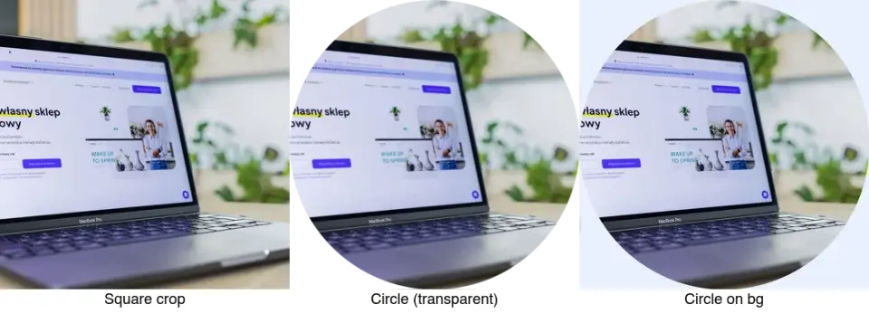
2026-07-26
How to Crop an Image to a Circle (Profile Photos and Avatars)
Crop an image to a circle for avatars and profile photos: the square-first rule, making a transparent circle PNG or a circle on a background, and where circles are used.