2026-06-28 · Updated 2026-07-10
Negative Photo Effect: Invert Colors for a Film-Negative Look
Create a negative photo effect by inverting colors: the film-negative look, partial inversions, and the photos where color inversion produces striking, surreal results.
Last updated: July 10, 2026. The invert operation is a fixed, fully reversible mathematical transform; the creative applications built around it continue to evolve over time.
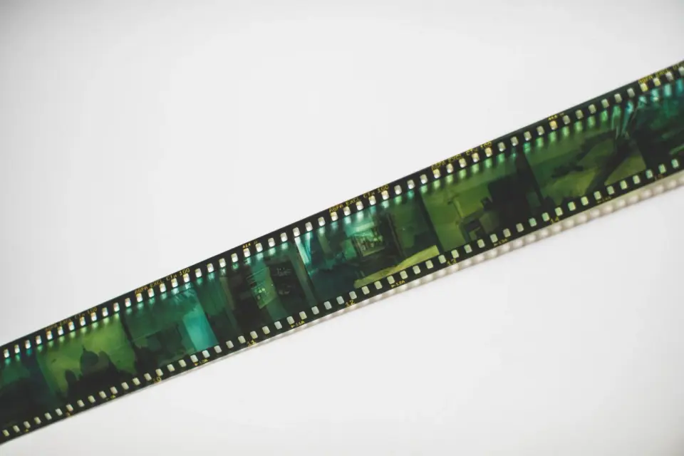
The negative effect inverts every color in an image — dark becomes light, red becomes cyan, the whole tonal range flips — producing the orange-and-blue look of developed film negatives. As an effect, it is a one-step transform with surprisingly varied creative uses, from surreal art to film-negative aesthetics to partial inversions that invert only part of the image. It is also fully reversible, which makes it safe to experiment with freely. This guide covers how color inversion works, the creative applications, and how to control the effect beyond a simple full invert.
Quick answer: how do you make a negative photo effect?
Use our Negative Effect tool to invert every pixel's color in one click, or use any editor's invert filter or adjustment. The result is the film-negative look, where the tonal range flips and colors shift to their complements (red to cyan, blue to yellow). For a subtler effect, invert only part of the image with a mask, or invert and then reduce opacity to blend with the original. The effect is striking on high-contrast images with bold colors and less interesting on flat or muted ones. Compress the result normally, since inversion does not change the file's compressibility.
How does color inversion work?
Inversion is a per-pixel transform: each color value is subtracted from the maximum. A pixel with red at 200 becomes red at 55 (255 minus 200), and so on for green and blue. The result is that every color becomes its complement.
| Original color | Inverted color |
|---|---|
| Red | Cyan |
| Blue | Yellow |
| Green | Magenta |
| Black | White |
| Gray | Same gray (complement of mid-gray is itself) |
- Each channel flips independently.
- Mid-gray (128) is its own complement and stays the same.
- The tonal range reverses — darks become lights and vice versa.
- Inverting twice returns the original, so the effect is fully reversible.
What is the creative use of the negative effect?
Beyond the literal film-negative look, inversion has several creative applications that make it more than a novelty.
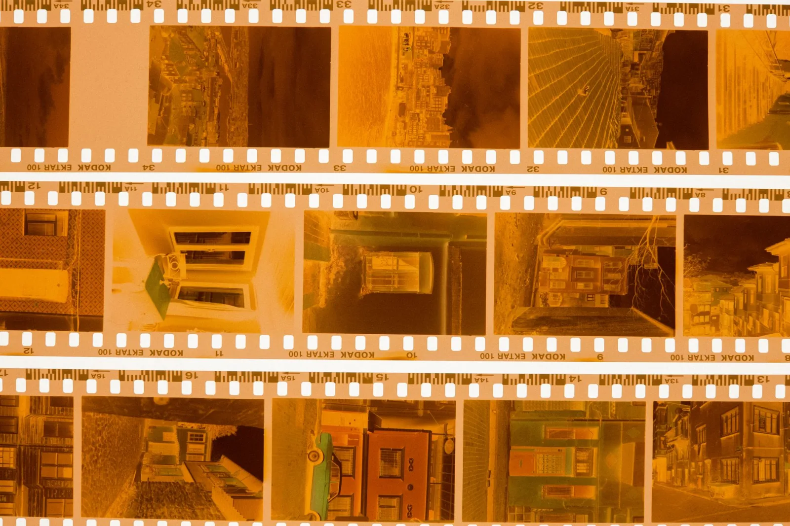
- Film-negative aesthetic — the orange-and-blue tones of developed film.
- Surreal and dreamlike art — familiar scenes become alien when inverted.
- Text contrast for accessibility — inverting can improve readability in some contexts.
- Partial inversions — inverting only part of the image for a split-reality effect.
- Duotone preparation — inversion is sometimes a step toward a stylized color treatment.
The surreal application is the most artistically interesting. A landscape with a blue sky and green grass becomes an alien scene with a yellow sky and magenta ground — the same shapes, entirely different colors. This makes inversion useful for science fiction graphics, album art, and any context where you want the familiar to feel strange.
How do you do a partial inversion?
A full invert is a one-click effect; a partial invert is where the creative control lives. By masking the inversion to part of the image, you create a split between normal and inverted regions.
- Apply an invert adjustment layer above the image.
- Add a mask to the adjustment layer.
- Paint on the mask to reveal the inversion only where you want it.
- Feather the mask edge for a smooth transition between regions.
- A hard mask edge creates a graphic split; a feathered edge creates a gradient blend.
- Inverting the sky but not the ground is a classic partial-invert composition.
- Partial inversion lets you keep recognizable regions while transforming others.
When does the negative effect work best?
Inversion rewards certain image qualities and falls flat on others.
| Image quality | Inversion result |
|---|---|
| Bold, saturated colors | Striking complements |
| High contrast | Strong tonal flip |
| Simple composition | Clean, graphic result |
| Flat, muted colors | Dull, uninteresting inversion |
| Complex detail | Busy, hard to read |
- Images with strong colors produce the most dramatic inversions.
- High-contrast images flip dramatically; low-contrast images look muddy.
- Simple compositions read better inverted than busy ones, because the color shift is the point.
Combining inversion with other effects
Inversion combines well with other transforms to produce richer results than inversion alone. A few pairings are particularly effective, and understanding them expands the creative range of the simple invert operation.
| Companion effect | Combined result |
|---|---|
| Invert + duotone | Stylized two-tone surrealism |
| Invert + grain | Vintage film-negative texture |
| Invert + blur | Dreamlike, soft surrealism |
| Invert + high contrast | Bold, graphic color blocks |
The duotone pairing is especially interesting: inverting first, then mapping the tonal range to two colors, produces results that would be hard to reach either effect alone. The duotone guide covers the color-mapping step, and pairing it with an initial invert opens a different region of the color space. Similarly, adding grain to an inverted image leans into the film-negative aesthetic — the orange and blue tones plus texture read convincingly as developed film, which connects to the vintage filter guide for the broader analog treatment.
Inverting to recover and analyze
Inversion has a practical use beyond art: it can reveal detail in dark or overexposed regions. A severely underexposed photo, when inverted, sometimes shows shadow detail that was hard to see in the original — the flip turns the dark region light where the eye can parse it. This is the same reason astronomers and microscopists use inverted displays. It is not a fix for bad exposure, but it is a quick analytical tool for checking what is in the shadows.
Common negative-effect mistakes
- Inverting a busy image — the result is unreadable chaos. Use on simple compositions.
- Expecting realism — inversion is inherently surreal; do not fight it.
- Full invert when partial would work — a split invert is often more interesting than a full one.
- Forgetting it is reversible — if an invert does not work, undo it; nothing is lost.
- Ignoring the color complement — know that red becomes cyan, blue becomes yellow, so you can predict the result.
For the technical basis, the Mozilla canvas pixel manipulation reference documents the per-pixel subtraction that inversion uses, and the CSS filter invert documentation covers applying inversion non-destructively in the browser. The duotone guide covers a related color-remapping effect, and the glitch guide covers another stylized transform. The negative effect is the simplest color transform there is, and its power is in that simplicity — one operation, fully reversible, with creative uses that go well beyond the film-negative look it originally mimicked.
Frequently asked questions
How does color inversion work?
Each pixel's color values are subtracted from the maximum (255 in 8-bit), so black becomes white, red becomes cyan, and so on. It is a mathematical inversion of the color channels. A film negative look comes from inverting a photo as if it were the negative.
What is the creative use of the negative effect?
A surreal, graphic, or film-negative aesthetic — it abstracts a photo into something otherworldly. It suits posters, album art, and experimental design more than documentary or product photography.
How do I do a partial inversion?
Invert only some channels, or invert at reduced opacity so the original shows through. A partial inversion keeps some recognizable color while adding the negative cast. Blend the inverted layer with the original to control the strength.
When does the negative effect work best?
On high-contrast images with bold shapes and colors. Soft, low-contrast photos turn muddy when inverted. Match the effect to images with enough structure that the inversion reads as a deliberate look.
Is the negative effect reversible?
Yes — inverting an inverted image restores the original (it is a mathematically reversible operation). So you can experiment non-destructively: invert, adjust, and invert back to compare. Keep the original to be safe.
What is a partial inversion?
Inverting only some color channels, or inverting at reduced opacity so the original shows through. A partial inversion keeps some recognizable color while adding the negative cast, producing a more nuanced surreal look than a full invert. Blend the inverted layer with the original to control the strength.
What does inverting a photo look like?
Colors flip to their complement: black becomes white, red becomes cyan, blue becomes yellow, and skin tones turn a surreal blue-green. It produces a film-negative or otherworldly graphic aesthetic. On high-contrast images with bold shapes it reads as a deliberate effect; on soft photos it looks like a mistake. Match the effect to images with enough structure to carry it.
Use the free tools while you follow the guide.
Keep reading
2026-07-28
AI Action Figure Trend: How to Prep Your Photo Right
Turn a photo into a collectible toy portrait: what makes the prompt work, and the crop, background, and resolution steps that avoid an obvious fake.
2026-07-26
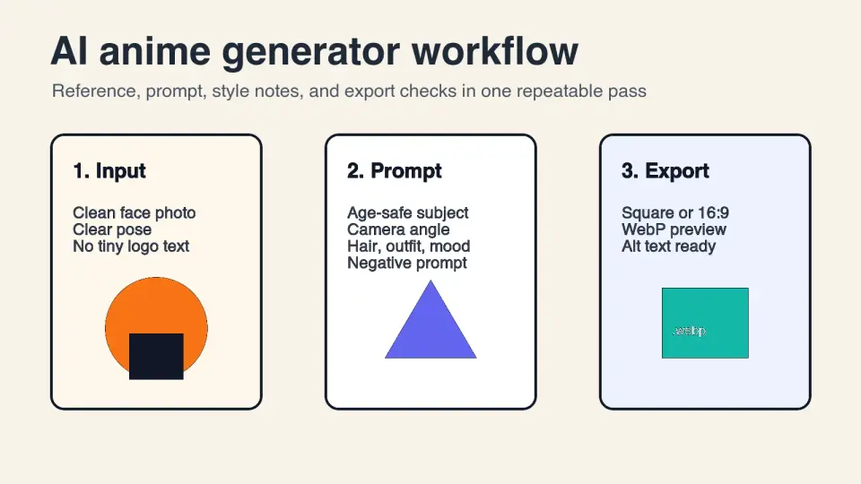
AI Anime Generator Guide: Prompts, Styles, and Safe Exports
A practical AI anime generator workflow for portraits, avatars, banners, and social posts, with prompt templates, style checks, and export rules.
2026-07-26
Text-to-Image AI in 2026: How Prompt Generation Actually Works
Text-to-image AI turns a written prompt into a finished picture. Here is how the models, prompts, and settings behind image generation fit together in 2026.