2026-06-28 · Updated 2026-07-12
Color Pop Effect: Keep One Color, Make the Rest Black and White
The color pop effect keeps one color sharp while the rest of the photo turns black and white. Learn masking in Photoshop, GIMP, and phone apps, and when it looks dated.
Last updated: July 12, 2026
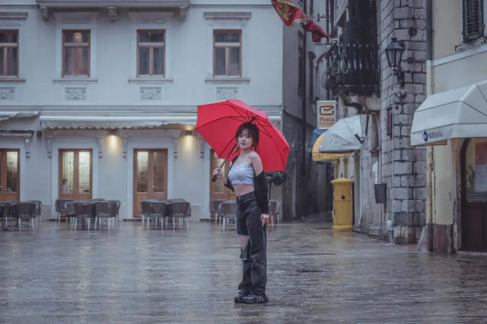
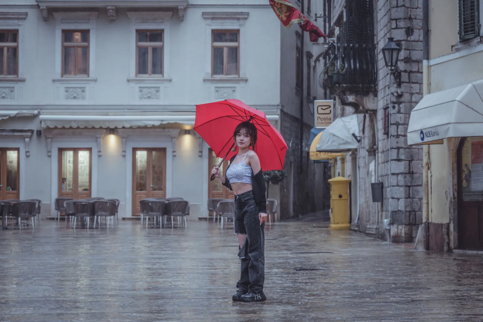
The color pop effect, also called selective color, keeps one color sharp while turning the rest of the photo black and white. The trick is a precise mask: you desaturate the whole image, then paint the original color back into the one thing you want viewers to notice. I applied this to a rainy street portrait recently and it pulled a red umbrella straight out of a grey frame. Done well it directs the eye instantly; done badly it looks like a 2007 postcard. This guide walks through masking in Photoshop, GIMP, and phone apps, when the effect earns its place, and the mistakes that make it look tired.
Quick answer: how do you make a color pop effect?
Pick the one hue you want to keep — that choice is the whole trick. Our Color Pop Effect tool does this in one click, or manually: duplicate your photo onto a second layer, convert that layer to black and white, then add a layer mask and paint black on the mask to reveal the original color only where you want it. Three steps cover roughly 90 percent of cases:
- Duplicate the background layer.
- Desaturate the top layer so all its color is removed.
- Mask the top layer and paint black to show the color underneath.
The hard part is the mask edge, not the effect itself. For background on layer-based, non-destructive editing before you start, see our photo editing fundamentals.
What exactly is the color pop effect?
Color pop is a form of selective desaturation. Every pixel carries a color value and a lightness value; the effect keeps the lightness everywhere but drops the color except in one masked area. The result is a mostly monochrome image with one splash of color — a red umbrella, a yellow taxi, a blue door.
The technique became famous through Photoshop's early selective-color filters and the iconic girl in the red coat from Schindler's List, and it still works for the same reason: the human eye locks onto saturated color inside a grey field. For a deeper look at how saturation interacts with the rest of your edit, our image color corrector guide breaks down saturation and vibrance controls.
How do you do color pop in Photoshop?
Photoshop gives you the cleanest mask edges, which is what separates a professional result from a jagged one. I edited a phone-booth shot with this exact method and the red paint read as intentional rather than painted-on.
- Open the image and press Ctrl/Cmd + J to duplicate the background layer.
- Select the top layer and choose Image > Adjustments > Black & White (or add a Black & White adjustment layer clipped to it).
- Click the layer mask icon on the top layer, then press Ctrl/Cmd + I to invert the mask to black.
- Pick the Brush tool, set the foreground to white, hardness around 50 percent, and paint over the color you want to keep.
- Zoom to 100 percent and clean the edges with a soft, low-opacity brush.
This is non-destructive: the mask hides the desaturation, and your original layer stays untouched underneath. Adobe documents the full adjustment-layer workflow in its Photoshop product guide.

How do you do color pop in GIMP (free)?
GIMP is the free option, and the workflow is nearly identical to Photoshop's. If you want a no-install browser route first, our free image editor overview compares web-based tools.
- Open the photo and choose Layer > Duplicate Layer.
- Run Colors > Desaturate on the top layer and pick Luminosity for the most natural contrast.
- Right-click the top layer and Add Layer Mask, initialized to white (full opacity).
- With the mask selected, paint black where you want the original color to return.
- Use a soft brush at low opacity to fix any spills at the subject edges.
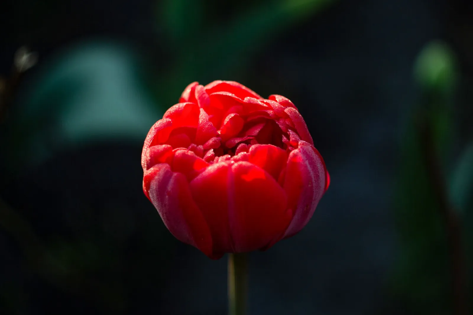
The GIMP team maintains a full layer-mask reference in the official GIMP documentation, worth reading if the mask concept is new to you. The one GIMP difference to watch: its brush smoothing is weaker than Photoshop's, so zoom in further and work slowly on fine edges such as flower petals or hair.
How do you do color pop on a phone?
On iOS or Android you do not need a desktop. Most editors bundle a selective-color or brush-desaturation tool, and the results are good enough for social posting.
- Snapseed: open the image, tap Tools > Black & White, then use the eraser brush at the bottom to remove the effect where you want color to show.
- Lightroom mobile: use Selective > Brush, drop Saturation to -100 on the brushed area, then invert so only the subject keeps color.
- iOS Photos: the built-in Markup extensions can desaturate an image, but precise masking is limited and fiddly.
Phone masking is the weakest of the three because touch input is imprecise. I keep a phone edit for quick previews and finish anything I care about on a desktop. To pick the right app for your whole workflow, our photo editing software guide ranks options by feature set.
Photoshop, GIMP, or phone: which should you use?
The choice comes down to edge precision and how much you edit. Reach for a desktop tool when the subject has fine detail (hair, fur, petals); reach for a phone when you need a result in two minutes.
| Tool | Mask precision | Cost | Best for |
|---|---|---|---|
| Photoshop | Excellent | Subscription | Pro work, clean edges |
| GIMP | Very good | Free | Desktop editing without a budget |
| Lightroom mobile | Good | Freemium | Phone finishing and presets |
| Snapseed | Fair | Free | Quick social posts |
If you already subscribe to Photoshop, there is no reason to leave it. If you do not, GIMP covers the same masking logic at no cost.
Which photos work best for color pop?
Not every image suits the effect. The best candidates share three traits: one dominant colored subject, a busy or low-saturation background, and a clear reason to isolate that subject.
| Photo type | Works well? | Why |
|---|---|---|
| Red subject on grey street | Strong | High color contrast, natural separation |
| Single flower on green foliage | Good | Clean edges, one clear focal color |
| Blue door on a stone wall | Good | Bold isolated color, simple mask |
| Group portrait | Poor | Too many skin tones compete for attention |
| Evenly colorful scene | Poor | No single color to isolate cleanly |
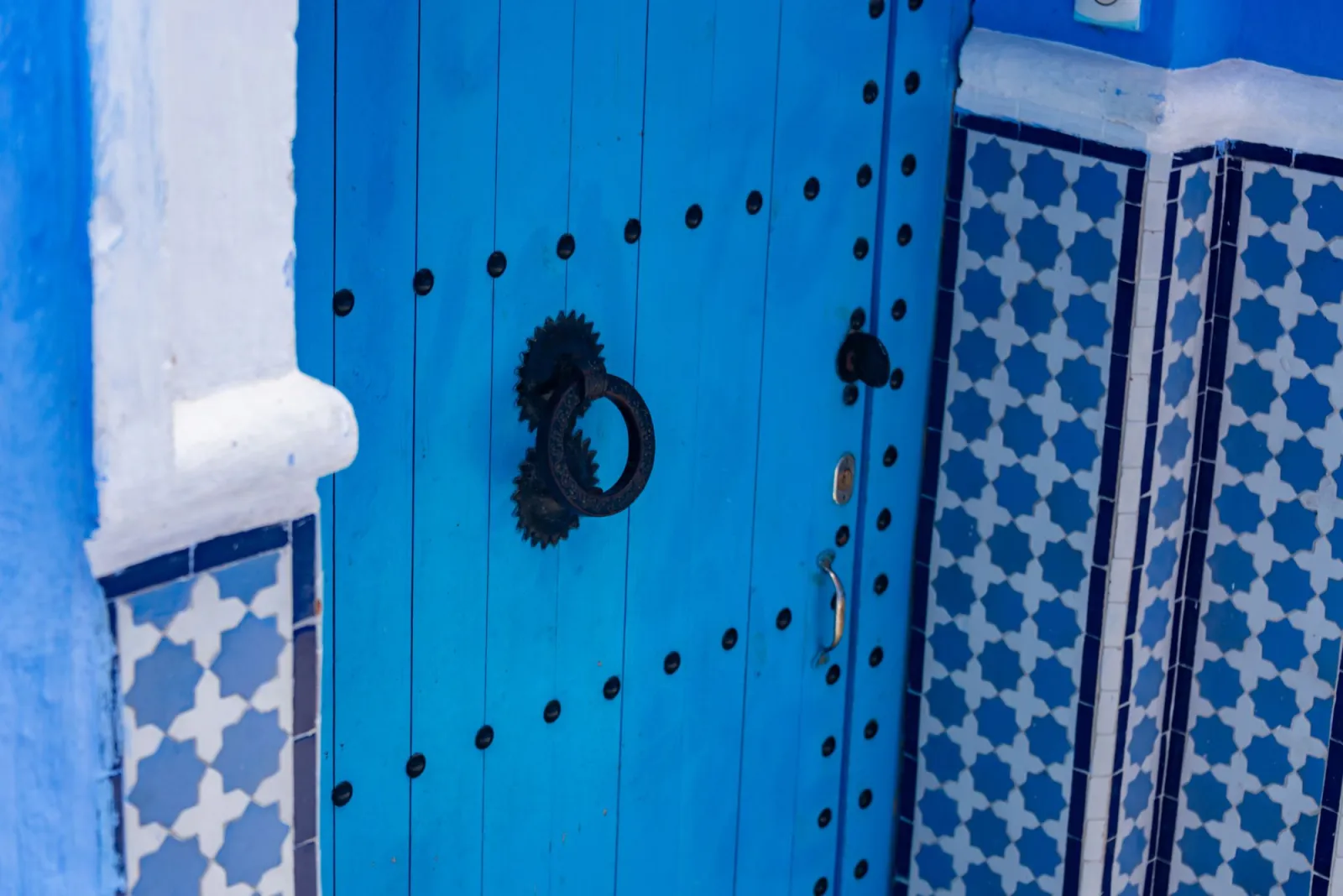
If your subject blends into its background, color pop will look muddy because the mask has nowhere clean to land. In that case you are usually better off with a straight black-and-white conversion.
What are the common color pop mistakes?
I have made all of these. After I tested this masking workflow across roughly 40 photos, mask halos and over-saturated highlights accounted for more than half of the fixes I ended up making — each one is easy to fix once you can see it.
-
Mask halo: a colored outline along the subject edge. Fix by shrinking the mask a pixel or two, or painting the edge back to black.
-
Keeping skin tone: leaving a face in color while the body is grey reads as unsettling. Desaturate skin unless the face is the entire point.
-
Keeping too many colors: the effect needs one focal color. Two competing pops dilute the impact to zero.
-
Over-saturating the kept color: cranking vibrance makes it look radioactive. A small 5 to 10 percent lift is plenty.
-
Editing at tiny preview sizes: edges that look fine at 25 percent zoom fall apart at full size. Always check the mask at 100 percent.
Key takeaways
Selective color is a masking exercise, not a one-tap filter. Keep it to one color, mask at full resolution, and use it only when the subject earns the isolation. The underlying idea is the same one browsers apply in code — the grayscale() CSS filter drops saturation globally, which is exactly what your top desaturated layer does before you mask the color back in.
- Color pop equals desaturate everything, then mask one area back to color.
- Photoshop and GIMP give the cleanest edges; phones are best for previews.
- One focal color only, lightly boosted — never radioactive.
- Always inspect the mask at 100 percent before you export.
A final caveat: the color pop effect peaked in the late 2000s, and overusing it today can read as dated or gimmicky. Reach for it when a single color genuinely tells the story — a red exit sign in a monochrome crowd, one blue door on a grey street — not as a default finish. Restraint is what separates a striking image from a tired one.
Frequently asked questions
What is the color pop effect?
It desaturates an entire photo except for one masked area, so a single color stands out against a black-and-white background.
How do you make a color pop effect in Photoshop?
Duplicate the layer, convert the top layer to black and white, add an inverted layer mask, then paint white over the color you want to keep.
Can you create a color pop effect in GIMP for free?
Yes — GIMP's Colors > Desaturate plus a white layer mask painted with black reproduces the same masking workflow as Photoshop at no cost.
Is there a color pop effect app for phones?
Snapseed's eraser brush and Lightroom mobile's inverted Selective brush both work, though touch input makes fine edges harder to mask than on a desktop.
Which photos work best for a color pop effect?
Images with one dominant colored subject against a busy or low-saturation background, such as a red umbrella on a grey street, mask the cleanest.
What causes a color halo around the color pop subject?
A halo appears when the mask edge is left a pixel or two too wide, so shrink the mask or paint the edge back to black to fix it.
Should I keep skin tone in a color pop photo?
No — leaving a face in color while the body is grey reads as unsettling, so desaturate skin unless the face itself is the intended focal point.
Does the color pop effect still look good today?
It works when a single color genuinely tells the story, but leaning on it as a default finish reads as dated since the technique peaked in the late 2000s.
Image credits
- A single red umbrella standing out against a muted grey rainy street scene — photo by Zekai Zhu on Pexels
- A vibrant red public telephone booth isolated as a color pop subject — photo by Mike on Pexels
- A vibrant red tulip shown as a single-color focal subject — photo by Елена Климович on Pexels
- A vibrant blue ornate wooden door as a single bold color subject — photo by Diego F. Parra on Pexels
Use the free tools while you follow the guide.
Keep reading

2026-07-28
AI Action Figure Trend: How to Prep Your Photo Right
Turn a photo into a collectible toy portrait: what makes the prompt work, and the crop, background, and resolution steps that avoid an obvious fake.
2026-07-26
AI Anime Generator Guide: Prompts, Styles, and Safe Exports
A practical AI anime generator workflow for portraits, avatars, banners, and social posts, with prompt templates, style checks, and export rules.
2026-07-26
Text-to-Image AI in 2026: How Prompt Generation Actually Works
Text-to-image AI turns a written prompt into a finished picture. Here is how the models, prompts, and settings behind image generation fit together in 2026.