2026-03-28 · Updated 2026-07-12
How to Add a Neon Glow Effect to Any Image
Learn how to add a neon glow effect that looks intentional: pick the right photo, set glow color and radius, mask edges, and export clean WebP files.
Last updated: July 12, 2026
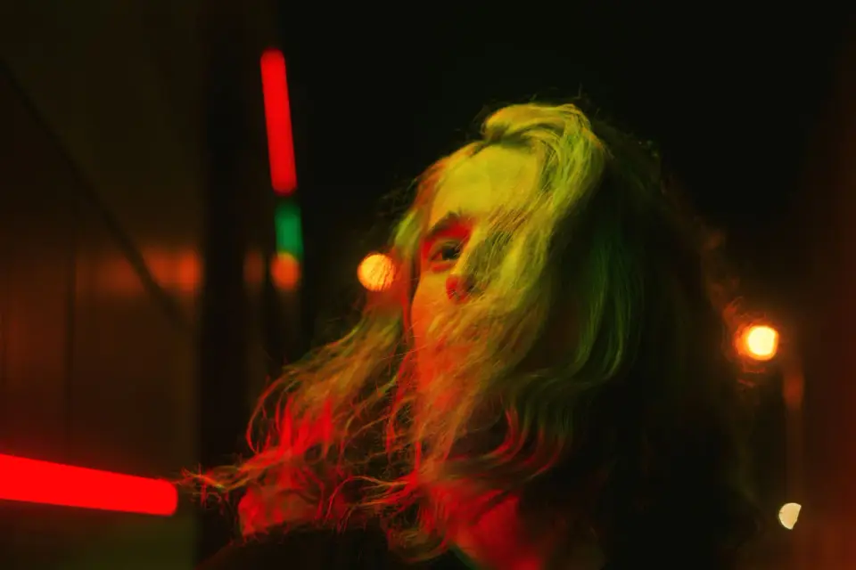
A neon glow effect works when the light feels attached to something in the image: a sign, rim light, outline, object edge, or colored reflection. It fails when the glow is just a bright blur pasted over the whole frame. Use this guide to build a cleaner neon look for portraits, product shots, posters, and social posts.
Quick answer: how do you add a neon glow effect?
Our Neon Glow Effect tool automates this in one click, or for manual control: start with a photo that already has a dark background, visible edges, or a clear light source. Duplicate the subject or light shape, blur the duplicate, color it cyan, pink, violet, or green, then blend it back with Screen, Linear Dodge, or Add. Keep a sharp inner core and a softer outer halo.
For most images, use two glow layers:
| Layer | Typical setting | What it controls |
|---|---|---|
| Inner glow | 2-8 px blur, high opacity | The crisp lit edge or sign tube |
| Outer glow | 20-80 px blur, low opacity | The haze that spreads into nearby darkness |
| Color grade | Blue/magenta shadows, warmer highlights | The scene mood after the glow is added |
| Mask | Brush off skin, eyes, logos, and busy text | Prevents the effect from smearing important detail |
If you want a fast browser workflow, apply the effect, then run the final file through the Image Compressor or compare export formats with the AVIF vs WebP guide. If you want a hand-built edit, the layer method below gives more control.
What makes a neon glow effect look real?
Neon looks believable when brightness, color, and direction agree. A pink sign should cast a faint pink tint on nearby walls. A cyan outline around a person should be strongest on the side facing the imaginary light. The background should usually stay darker than the glow, otherwise the halo disappears.
Use this photo checklist before editing:
- Pick a dark or midtone background, not a white studio wall.
- Look for clean subject edges, hair outlines, text, signs, glasses, or product silhouettes.
- Avoid low-resolution screenshots; blur magnifies compression artifacts.
- Leave some empty space around the glowing object so the halo has room to fall off.
- Check skin tones before adding saturation. Neon color should tint skin, not replace it.
- Decide whether the glow is a real light source, a graphic outline, or a cyberpunk color grade.
For adjacent looks, the image glitch effect guide covers digital distortion, and the light leak effect guide covers a softer analog color wash. Neon sits between them: graphic like glitch, but still tied to light.
Which photos work best for neon glow?
Good neon source images have contrast. A portrait under colored light, a storefront sign, a city alley, a black product on a dark set, or a gaming-style poster usually needs less work than a flat daylight photo.
| Source image | Use neon for | Watch out for |
|---|---|---|
| Night portrait | Rim light, eyewear reflections, hair edge | Over-saturated skin and glowing teeth |
| Neon sign or text | Sign tube, surrounding haze, wall spill | Blurry letters if the inner core is too soft |
| City street | Color grade, reflection on pavement | Muddy shadows if every color is pushed |
| Product photo | Outline, edge separation, launch graphic | Glow hiding product texture or labels |
| Social poster | Bold subject outline and background energy | Too many colors competing with the headline |
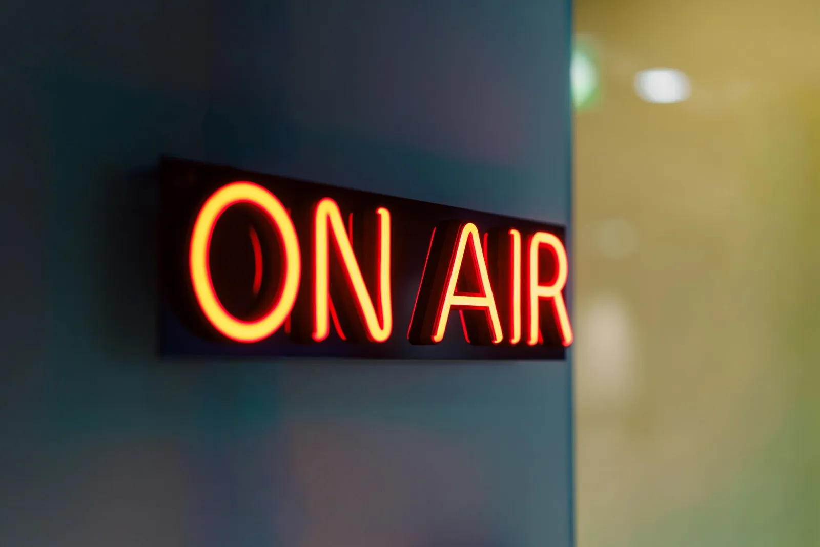
The sign image above is a useful reference: the brightest part is narrow, while the haze gets weaker as it spreads. If your edited glow has the same brightness across the whole blur, it will look like a sticker.
How do you build the effect step by step?
Use this order in Photoshop, Photopea, GIMP, or any editor with layers, blur, blend modes, and masks. Adobe documents Outer Glow and other layer styles in its Photoshop layer effects guide, and MDN's blend mode reference is a useful primer on how Screen, Overlay, and related compositing modes change pixels.
-
Clean the base image. Crop first, remove dust or distractions, and fix exposure before adding glow.
-
Select the glow source. This can be a sign, outline, object edge, handwritten path, or duplicated subject edge.
-
Create a sharp core. Fill or stroke the selected shape with a saturated color. Keep this layer crisp.
-
Duplicate the core. Blur the duplicate with a small radius for the inner glow.
-
Duplicate again. Blur the next copy with a wider radius for the outer halo.
-
Set the blend mode. Try Screen for a controlled glow, Linear Dodge/Add for a hotter result, and Overlay when you only want tint.
-
Mask the spill. Paint the glow off eyes, skin highlights, product labels, and readable text.
-
Add reflected color. Brush a low-opacity tint onto nearby surfaces that would catch the light.
-
Grade the whole image. Deepen shadows, cool the background, and protect highlights from clipping.
-
Export and inspect. View at final size on a phone and desktop before posting.
Do not start with the strongest intensity. Build glow in layers. A subtle outer halo plus a sharp inner line usually reads more expensive than one huge blur.
How should you choose glow color and radius?
Choose color from the job the image needs to do. Cyan and magenta feel digital and energetic. Red feels aggressive and can clip fast. Green can look sci-fi or medical. Violet is forgiving on portraits because it is less likely than green to make skin look sick.
Radius depends on output size. A 50 px glow can look restrained on a 3000 px poster and ridiculous on a 600 px thumbnail. Judge the effect at the size where people will actually see it.
| Decision | Safer starting point | Push it when |
|---|---|---|
| Color count | One main neon color plus one accent | The image is a poster or music cover |
| Inner radius | 2-8 px | The source is text, tubing, or a thin outline |
| Outer radius | 20-80 px | The background is very dark and uncluttered |
| Opacity | 20-45% for outer glow | You need a stylized cyberpunk frame |
| Saturation | Strong on glow, restrained on skin | The subject is not a face or product label |
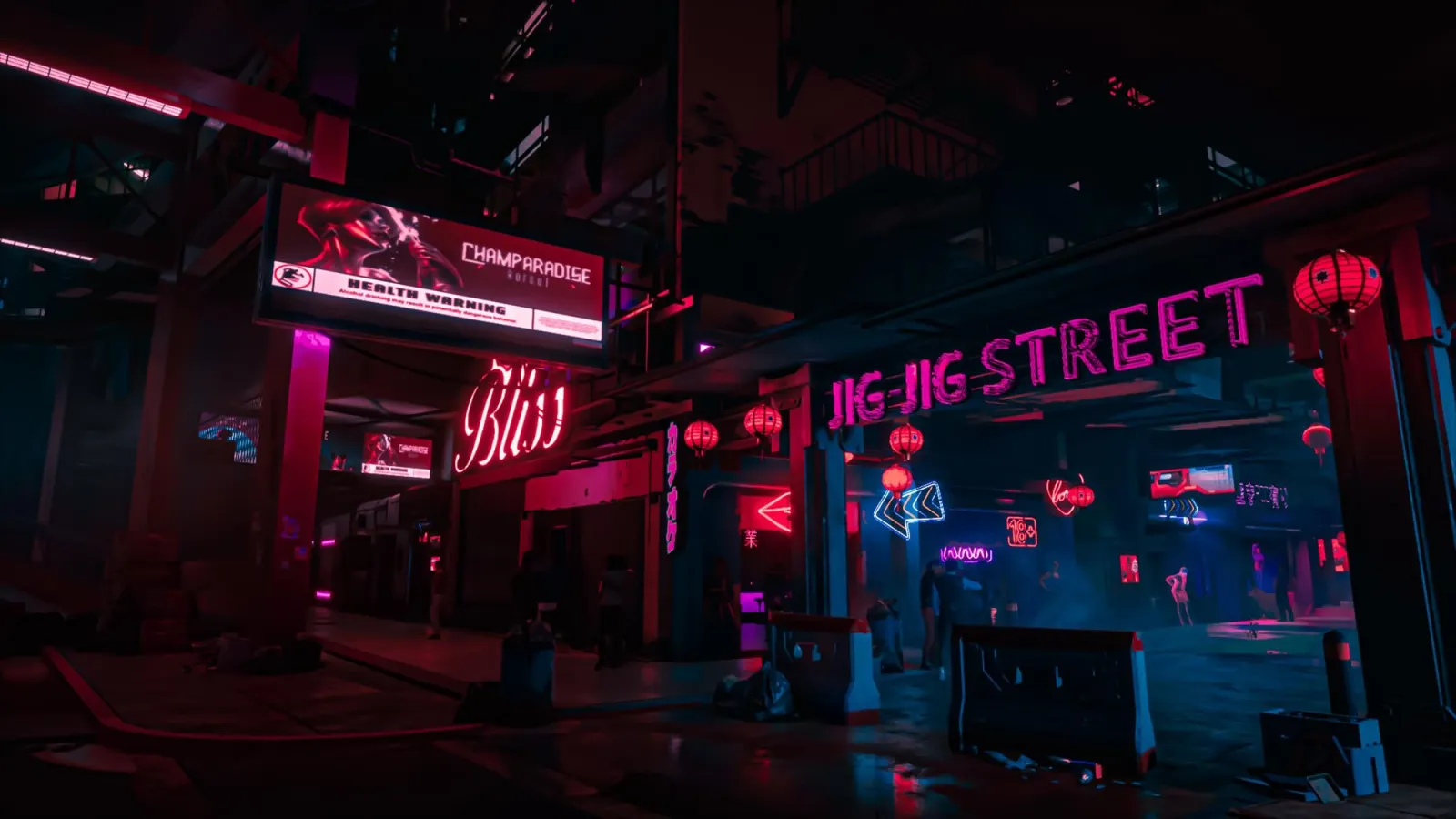
Use a city image like this as a palette reference. Notice how the strongest colors live in the lights and reflections, while many shadows remain close to black. That restraint is what keeps neon color from turning into noise.
How do you keep faces, products, and text clean?
The mask is where the effect becomes usable. A portrait can handle colored rim light, but eyes and teeth should stay readable. A product launch image can use a glow outline, but the product surface and brand mark still need texture. A social graphic can use glowing text, but the headline must not blur.
Use this masking pass:
- Zoom to 100% and remove glow from pupils, teeth, small logos, and fine jewelry.
- Leave a thin rim on hair, shoulders, glasses, or product edges.
- Reduce glow opacity over warm skin highlights.
- Add a little color spill on nearby walls, pavement, clothing, or packaging.
- Toggle the glow group off and on. If the base photo looks broken without it, fix the base first.
- Convert the final post to WebP, then compare it with the uncompressed edit for banding.
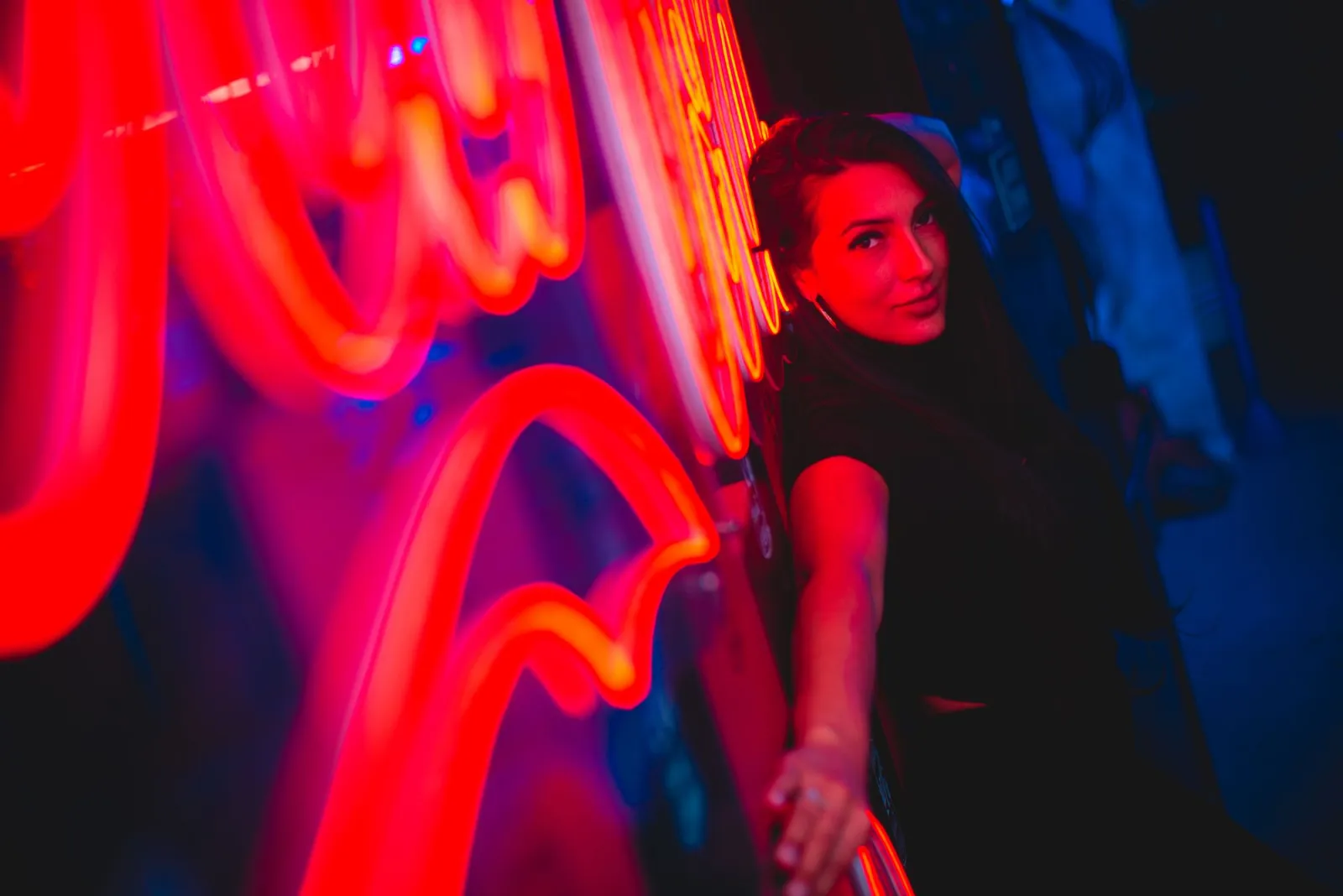
For product work, read the product photography guide before applying a heavy effect. For posts and ads, match the crop to the social media image sizes guide before you fine-tune radius, because a square crop and a story crop need different halo space.
What are the most common neon glow mistakes?
Most bad neon edits are too bright, too even, or too disconnected from the scene. Fix those before adding more color.
| Mistake | What it looks like | Better fix |
|---|---|---|
| One giant blur | Foggy color covers the whole frame | Split inner and outer glow layers |
| No light source | The glow floats with no reason | Attach it to an edge, sign, or object |
| White background | Halo disappears or looks gray | Darken the background or choose another image |
| Clipped channels | Flat blocks of hot pink or red | Lower opacity and check histogram/highlights |
| Over-sharpened export | Crunchy edges around the glow | Resize first, then compress once |
| Too many colors | The viewer cannot find the subject | Use one dominant neon color and one accent |
After editing, optimize the result. Neon gradients can band if compressed too hard, while dark backgrounds can show block artifacts. The image compression deep dive explains why smooth gradients and sharp edges need different export settings.
What export settings should you use?
I tested the example images in this article as WebP exports after resizing the long edge to 1600 px. The dark backgrounds survived better when the glow stayed on separate masked layers until the final export; flattening early made it harder to fix banding around the outer halo.
Export from the largest clean edit, but resize to the actual destination. For web pages, WebP is a practical default because it handles photographs and soft gradients well at smaller sizes. Keep a PNG or PSD master if you may reopen the layers.
Use these starting points:
- Resize to the display width before compression.
- Export WebP around quality 80-86 for neon portraits and posters.
- Use PNG for masters, transparent overlays, or text-heavy graphics you will edit again.
- Inspect dark gradients for banding after compression.
- Check the image on a phone, because small screens make over-glow obvious.
- Keep filenames descriptive, such as
neon-portrait-blue-rim.webp.
If the image is for a blog or storefront, also add descriptive alt text and a compressed fallback. The image SEO checklist covers naming, alt text, and performance checks.
Frequently asked questions
What is a neon glow effect?
It is a lighting effect where a bright, saturated color appears to emit from an edge, sign, outline, or light source instead of sitting on top of the whole image as a flat blur.
What makes a neon glow effect look realistic instead of fake?
A believable glow keeps brightness, color, and direction consistent with an actual light source, so the color tints nearby surfaces and fades unevenly instead of covering the frame at one flat intensity.
Which types of photos work best for a neon glow effect?
Photos with a dark or midtone background and visible edges, such as night portraits, neon signs, city streets, black product shots, and gaming-style posters, need the least rework.
Which blend mode should I use to add neon glow?
Use Screen for a controlled glow, Linear Dodge or Add for a hotter and more intense result, and Overlay when you only want to tint the surface rather than brighten it.
How do I choose the right neon glow color?
Pick color for the job the image needs to do: cyan and magenta read as digital and energetic, red is aggressive and clips fast, green leans sci-fi, and violet is the most forgiving on skin tones.
How do you keep faces and text readable under a neon glow?
Mask the glow off pupils, teeth, small logos, and readable text at 100% zoom so only edges like hair, shoulders, and product outlines carry the effect.
What is the most common neon glow mistake?
The most common mistake is one giant, evenly bright blur with no attached light source, which is fixed by splitting the glow into a sharp inner layer and a softer outer halo.
What export settings work best for a neon glow image?
Resize to the display width first, then export WebP around quality 80-86, and keep a PNG or PSD master for any file you may reopen and re-edit.
Image credits and sources
- Cover portrait - photo by Dmitry on Pexels, converted to WebP.
- Neon sign - photo by Jakub Zerdzicki on Pexels, converted to WebP.
- City alley - photo by kaio ryan on Pexels, converted to WebP.
- Neon portrait - photo by Alessandro Alves on Pexels, converted to WebP.
- Technical references: Adobe's Photoshop layer effects documentation and MDN's CSS blend mode reference.
Use the free tools while you follow the guide.
Keep reading
2026-07-28
AI Action Figure Trend: How to Prep Your Photo Right
Turn a photo into a collectible toy portrait: what makes the prompt work, and the crop, background, and resolution steps that avoid an obvious fake.
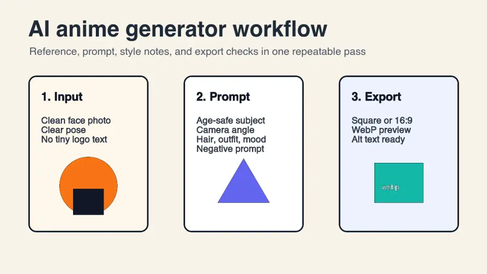
2026-07-26
AI Anime Generator Guide: Prompts, Styles, and Safe Exports
A practical AI anime generator workflow for portraits, avatars, banners, and social posts, with prompt templates, style checks, and export rules.
2026-07-26
Text-to-Image AI in 2026: How Prompt Generation Actually Works
Text-to-image AI turns a written prompt into a finished picture. Here is how the models, prompts, and settings behind image generation fit together in 2026.