2026-03-28 · Updated 2026-07-12
Responsive Image Breakpoints: Practical WebP Guide
Choose responsive image breakpoints, write srcset and sizes markup, and verify CDN WebP variants without shipping oversized mobile images.
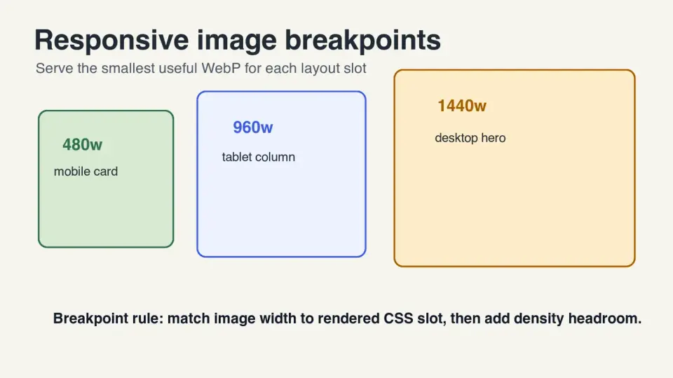
Last updated: July 12, 2026
Responsive image breakpoints are the image widths you generate so phones, tablets, laptops, and high-density screens can download a file close to the size they actually render. Pick too few and mobile users receive desktop pixels. Pick too many and your build, cache, and CDN fill with variants nobody needs.
This guide covers the practical middle: measure the layout slot, generate a short WebP ladder, write srcset and sizes, then verify the browser chooses the right file from the CDN.
Quick answer: which responsive image breakpoints should you use?
Use breakpoints that match the real rendered image slot, then add density headroom for retina screens. For many article images, a useful WebP ladder is 480w, 720w, 960w, 1200w, and 1440w. For full-width hero images, add 1920w if the design can actually render that wide.
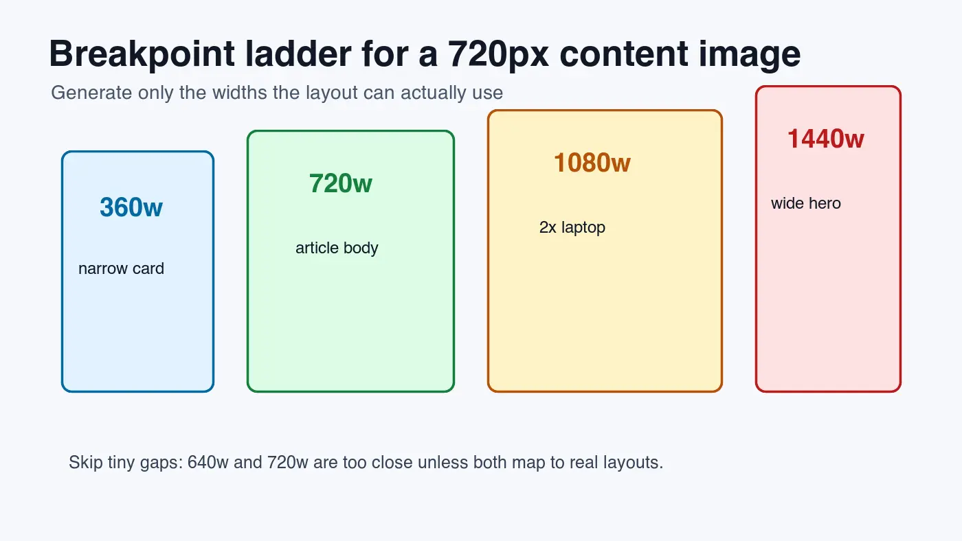
Do not copy CSS breakpoints blindly. A page can have a 1280px layout breakpoint while the image itself renders inside a 720px article column. In that case, a 1440w image may already cover a 2x display, and a 1920w variant may be wasted.
The reliable method is simple: inspect the largest CSS slot width, multiply by the highest density you want to support, round to sensible widths, and remove near-duplicates. Then pair those files with a truthful sizes attribute so the browser can choose correctly.
What are responsive image breakpoints?
Responsive image breakpoints are generated file widths, not necessarily design breakpoints. CSS breakpoints change the layout. Image breakpoints give the browser a menu of files, such as 480w, 720w, 960w, and 1440w.
MDN's responsive images guide explains the core problem: the browser needs enough information to choose an appropriately sized image before layout is complete. The srcset attribute lists candidates, while sizes describes the slot the image will occupy.
That separation matters. If srcset is correct but sizes lies, the browser may still download a larger file than needed. If sizes is correct but the generated files skip the useful widths, the browser has no good choice.
| Term | What it controls | Example | Common mistake |
|---|---|---|---|
| CSS breakpoint | Layout changes | @media (min-width: 900px) |
Treating it as the image width |
| Image breakpoint | Available file width | photo-960.webp 960w |
Generating too many tiny steps |
sizes |
Predicted rendered slot | (min-width: 900px) 720px, 92vw |
Leaving the default 100vw |
| DPR | Device pixel density | 2x phone screen | Serving a 1x file that looks soft |
For format choices, pair breakpoints with a modern web format. WebP is a safe default for broad support, and AVIF can be worth adding for large photographic libraries. The format trade-off is covered in AVIF vs WebP Comparison.
How do you choose breakpoint widths?
Start from the rendered slot, not from the source file. A 4000px product photo does not need a 4000px web variant if the largest visible slot is 760px. It needs enough pixels to look sharp in that slot on the screens you care about.
Use this order:
- Open the page at the narrowest mobile layout, common tablet width, laptop width, and wide desktop width.
- Measure the rendered image slot in CSS pixels.
- Multiply each slot by 1x and 2x if you want high-density support.
- Round to a small ladder such as 480, 720, 960, 1200, 1440, and 1920.
- Remove widths that are less than about 15 percent apart.
- Stop at the largest width the design can use.
| Image use case | Typical CSS slot | Good starting ladder | Notes |
|---|---|---|---|
| Article body image | 320-760px | 480w, 720w, 960w, 1440w | 1440w covers a 720px slot on 2x screens |
| Product grid card | 160-420px | 320w, 480w, 720w, 960w | Keep thumbnails small; they repeat many times |
| Full-width hero | 360-1440px | 720w, 960w, 1440w, 1920w | Add 2560w only for genuinely wide designs |
| Sidebar thumbnail | 96-240px | 240w, 360w, 480w | Avoid sending article-size files to small cards |
| Zoomable product image | 600-1200px | 800w, 1200w, 1600w, 2400w | Only when zoom or detail inspection is real |
I encoded the four graphics in this article locally at 1400 by 788 as WebP. Each measured file is under 35 KB because the assets are flat instructional graphics. A camera photo at the same dimensions will usually be much larger, so measure your own output before setting budgets.
If a whole folder needs these widths, use a repeatable resize step. The Batch Resize Guide covers the command-line pattern for producing derived images without overwriting the master files.
What should srcset and sizes look like?
For most responsive content images, use width descriptors with sizes. Width descriptors tell the browser the real pixel width of each candidate. The sizes value tells the browser how wide the image will render in the layout.
<img
  src="https://cdn.example.com/blog/photo-960.webp"
  srcset="
    https://cdn.example.com/blog/photo-480.webp 480w,
    https://cdn.example.com/blog/photo-720.webp 720w,
    https://cdn.example.com/blog/photo-960.webp 960w,
    https://cdn.example.com/blog/photo-1440.webp 1440w"
  sizes="(min-width: 900px) 720px, 92vw"
  width="1440"
  height="810"
  alt="Product photo displayed in a responsive article layout">
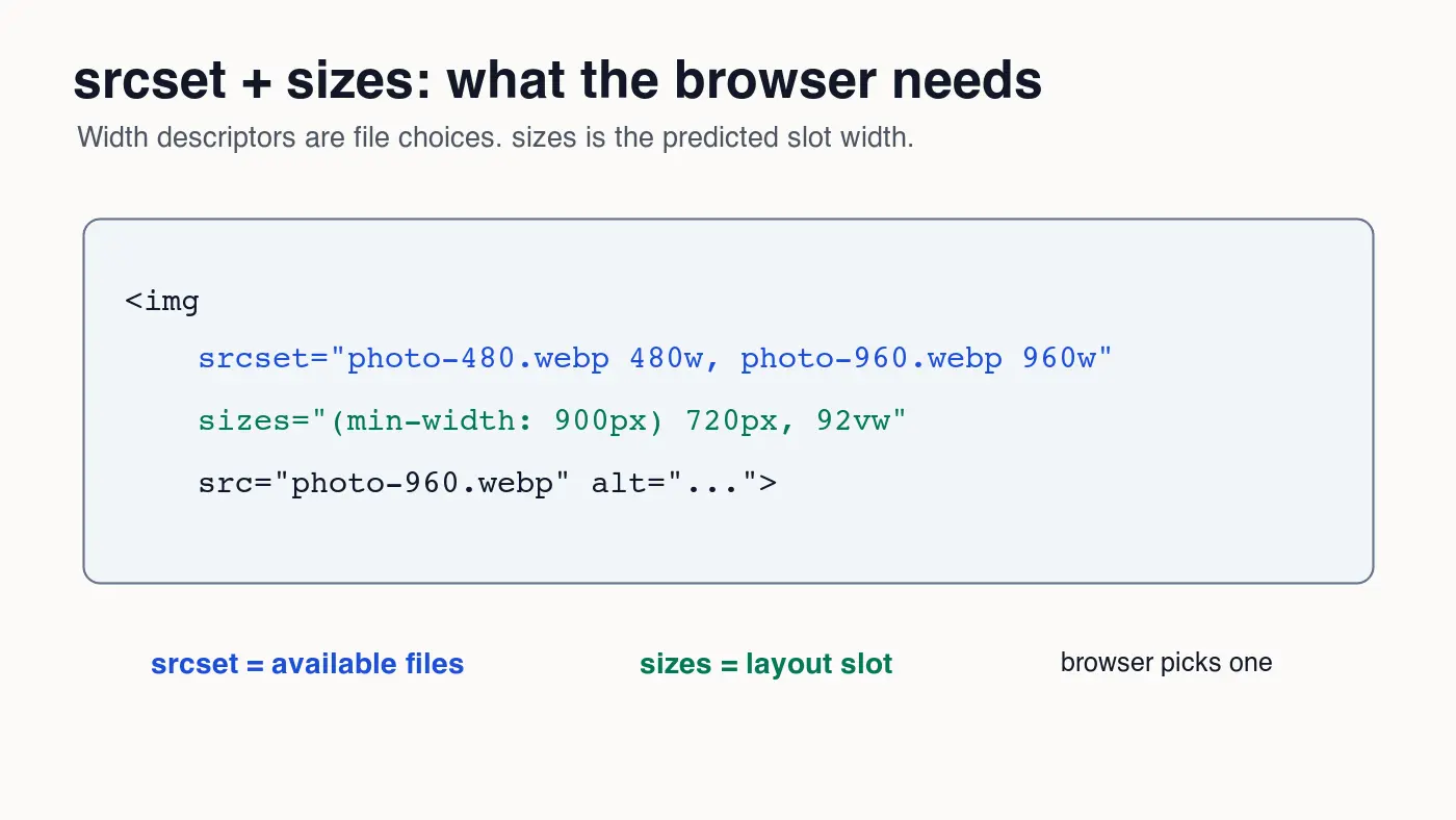
The sizes example says: once the viewport is at least 900px wide, the image slot is 720px; otherwise, the slot is 92 percent of the viewport. A phone that is 390px wide can choose a file near 720w for a 2x display instead of downloading a 1440w file.
The web.dev guide to responsive images shows the same browser-selection principle: give the browser accurate candidates and layout information so it can choose before the image request is made.
Use a <picture> element when the crop or format changes, not for every normal size change. For example, art-directed hero images may need a square mobile crop and a wide desktop crop. Plain width changes are usually simpler with one img and a good srcset.
How many image breakpoints are too many?
More variants are not automatically better. Every extra width adds build time, storage, cache entries, CDN invalidation surface, and review work. If two candidates are very close, the browser's byte savings may be too small to justify another file.
Use a compact set unless your traffic and image volume justify finer tuning. Five widths per image is often enough for article and marketing pages. Product sites with zoom, grids, and multiple crops may need more, but they should be generated by a pipeline rather than by hand.
Watch for these signs that the ladder is too dense:
640w,700w, and760wall exist for the same image.- CDN logs show some variants are almost never requested.
- Build time grows because every upload produces ten or more derivatives.
- Editors cannot tell which file belongs in frontmatter, Open Graph, and body content.
- Visual QA starts checking filenames instead of rendered pages.
Watch for these signs that the ladder is too sparse:
- Phones download the 1440w or 1920w file for ordinary body images.
- Desktop retina screens look soft because the largest candidate is too small.
- The browser always picks the same fallback
src. - PageSpeed or Lighthouse flags oversized images on mobile.
Google's image SEO best practices recommend crawlable image URLs, useful surrounding text, and descriptive alt text. Responsive delivery should preserve those basics. Do not hide important images in CSS backgrounds if they need to be indexed or understood as page content.
How do breakpoints affect Core Web Vitals?
Responsive breakpoints affect performance because image bytes often dominate the first screen. If the hero image is also the Largest Contentful Paint element, the wrong breakpoint can make the most important paint wait on a file that is twice as large as needed.
The web.dev guide to optimizing Largest Contentful Paint recommends making likely LCP images discoverable early and prioritizing them when appropriate. Breakpoints do not replace that work. They make sure the prioritized file is the right size.
For above-the-fold images:
- Set explicit
widthandheightto reserve space. - Avoid lazy loading the likely LCP image.
- Use
fetchpriority="high"only for the image that truly needs it. - Keep
sizesaccurate for the initial layout. - Verify the selected
currentSrcin DevTools.
For below-the-fold images:
- Lazy load normal gallery and article images.
- Use the same breakpoint ladder unless a smaller crop is enough.
- Compress after resizing, not before.
- Keep alt text specific to the visible image.
- Check mobile network waterfalls, not only desktop.
If your issue is mostly delayed discovery of the hero asset, read Critical Image Extraction. If the files are simply too heavy, run through the Image Compression Ratio Guide before changing markup.
What CDN checks should you run before publishing?
Breakpoints are only finished when the final URLs work. A clean Markdown draft can still fail if the CDN path is wrong, the object has the wrong content type, or the page references a local /blog/... file by accident.
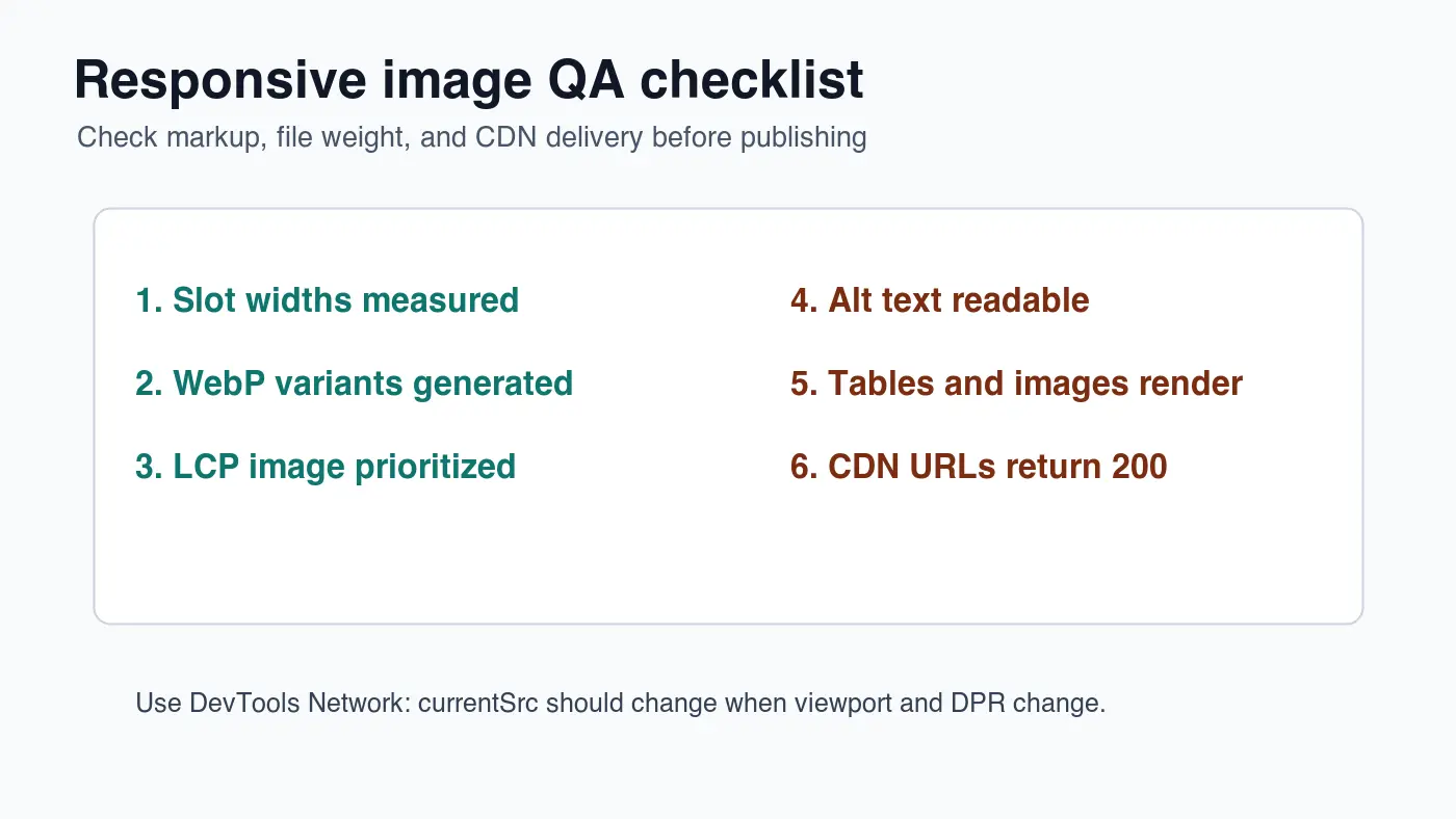
Run this pre-publish check:
| Check | Pass condition | Fix if it fails |
|---|---|---|
| Frontmatter image | CDN URL ending in .webp |
Publish the cover and update image |
| Body images | At least three unique CDN WebP URLs | Replace local paths and duplicate files |
| HTTP status | Every image returns 200 | Re-run the upload or fix the filename |
| Content type | image/webp |
Set CDN metadata on upload |
sizes accuracy |
Browser chooses mobile-sized files on mobile | Correct the slot expression |
| Alt text | Describes the visible image | Rewrite without keyword stuffing |
In Chrome DevTools, inspect the rendered image and check currentSrc. Then change the viewport and device pixel ratio. The selected URL should move through the ladder. If it never changes, the markup or framework image component may be overriding your candidates.
For a broader publishing pass, use the Complete Image Optimization Checklist. For mobile-specific budgets, pair this with the Mobile Image Optimization Guide. Lazy loading decisions are covered separately in Lazy Load Images.
Responsive image breakpoint checklist
Use this short version when reviewing a pull request:
- The master image is larger than the largest generated variant.
- Generated widths match real rendered slots.
- Widths are not packed into tiny, low-value increments.
- WebP files are compressed after resizing.
srcsetuses correct width descriptors.sizesmatches the layout, not a guessed100vw.- The likely LCP image is not lazy-loaded.
- Below-fold images are lazy-loaded.
- Width and height are present to avoid layout shift.
- CDN URLs return HTTP 200 before publish.
- Internal links point readers to compression, mobile, and lazy-loading next steps.
The useful breakpoint set is the smallest set that keeps images sharp without making phones download desktop files. Measure the slot, generate the ladder, publish the WebP files, and confirm the browser chooses the file you expected.
Frequently asked questions
What is a responsive image breakpoint?
A responsive image breakpoint is a generated file width, such as 480w or 960w, that lets the browser pick a file close to the size it actually renders instead of downloading one oversized image for every screen.
How many responsive image breakpoints do I need?
Five widths, such as 480w, 720w, 960w, 1200w, and 1440w, are usually enough for article and marketing images, with a denser ladder justified only by real zoom or product-grid use cases.
What is the difference between srcset and sizes?
srcset lists the candidate file widths available to the browser, while sizes tells the browser how wide the image will actually render in the layout so it can choose the right candidate before the request is made.
Should image breakpoints match CSS layout breakpoints?
No, image breakpoints should match the measured rendered image slot rather than the page's CSS layout breakpoints, since a 1280px layout breakpoint can still contain a much narrower image column.
When should I use the picture element instead of a plain srcset?
Use <picture> when the crop or format needs to change between layouts, such as an art-directed hero image, and keep a single img with srcset for plain width changes.
Why does the sizes attribute matter for Core Web Vitals?
An inaccurate sizes value can make the browser download an oversized file for the Largest Contentful Paint image, so keeping sizes accurate is part of getting a fast LCP.
What format should responsive breakpoint images use?
WebP is a safe default for the full breakpoint ladder, and it kept every graphic in this guide under 35 KB at 1400 by 788 pixels while remaining broadly supported.
How do I verify the browser is choosing the correct breakpoint image?
Open Chrome DevTools, inspect the image's currentSrc at different viewport widths and device pixel ratios, and confirm the selected URL moves through the ladder as expected.
Use the free tools while you follow the guide.
Keep reading
2026-09-10
Image Blurry After Export? 7 Fixes That Target the Cause
Fix an image blurry after export by checking pixels, compression and upload changes. See measured examples, PNG vs JPEG choices, and seven practical fixes.

2026-08-01
Image Compression in 2026: WebP, AVIF, JPEG XL & JPEG AI Benchmarked
I benchmarked WebP, AVIF, and JPEG XL on 4 real photos. WebP saves 32% vs JPEG, AVIF 65%, JPEG XL 30%. Full data, browser support, and which format to pick in 2026.

2026-07-26
Image Optimization Checklist: Every Step for Fast Web Images
A complete image optimization checklist: format choice, resizing, compression, responsive delivery, lazy loading, and CDN setup. Run through it before every publish.