2026-03-28 · Updated 2026-07-12
Cross Process Effect: Film Color Shift Recipe
Learn what cross processing does to color, when to use it, and how to build a believable digital cross process effect without crushing skin tones.
Last updated: July 12, 2026
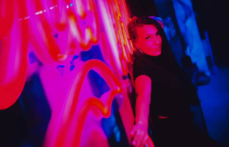
The cross process effect is the saturated, high-contrast color shift that came from developing film in chemistry meant for a different film type. Digitally, the useful version is not just "add teal and orange." It is a controlled curve and channel shift that keeps faces readable while letting shadows, signs, skies, and highlights turn strange.
Quick answer: what is the cross process effect?
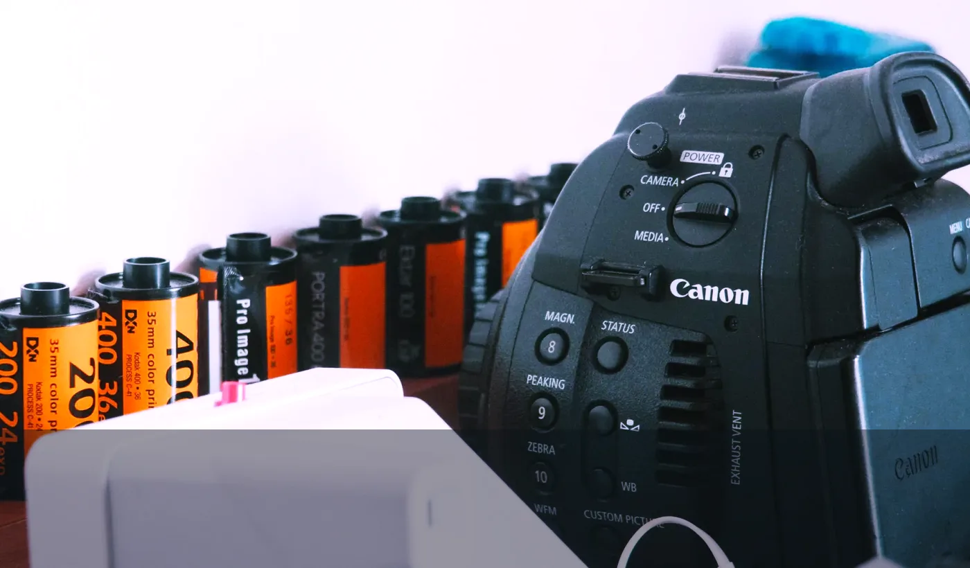
Our Cross-Process Effect tool applies a ready-made color-shifted curve in one click. The technique originally meant processing one film stock in the wrong chemical process, such as slide film in C-41 chemistry or color negative film in E-6 chemistry. Kodak's motion picture processing manuals show how film stocks are designed around specific chemical processes; mixing those worlds changes contrast, density, and color balance instead of producing a neutral scan.
In a digital editor, a believable cross process effect usually has four ingredients: an S-curve for harder contrast, separated color channels, stronger saturation in selected ranges, and a final check on skin tones. The result can look like expired film, 1990s fashion editorial work, or lo-fi travel photography depending on how far you push the channels.
Use it when the picture benefits from mood more than accurate color. It works well on night street photos, music visuals, fashion portraits, travel diaries, and social posts. It is a poor fit for catalog products, food color, passport photos, and anything where the viewer must trust the real color.
What actually changes in a cross processed photo?
The visible signature is not one single color. Cross processing bends the relationship between shadows, midtones, and highlights. Shadows often move toward cyan, blue, or green. Highlights can shift yellow, pink, or red. Contrast rises, blacks get denser, and neutral grays stop being neutral.
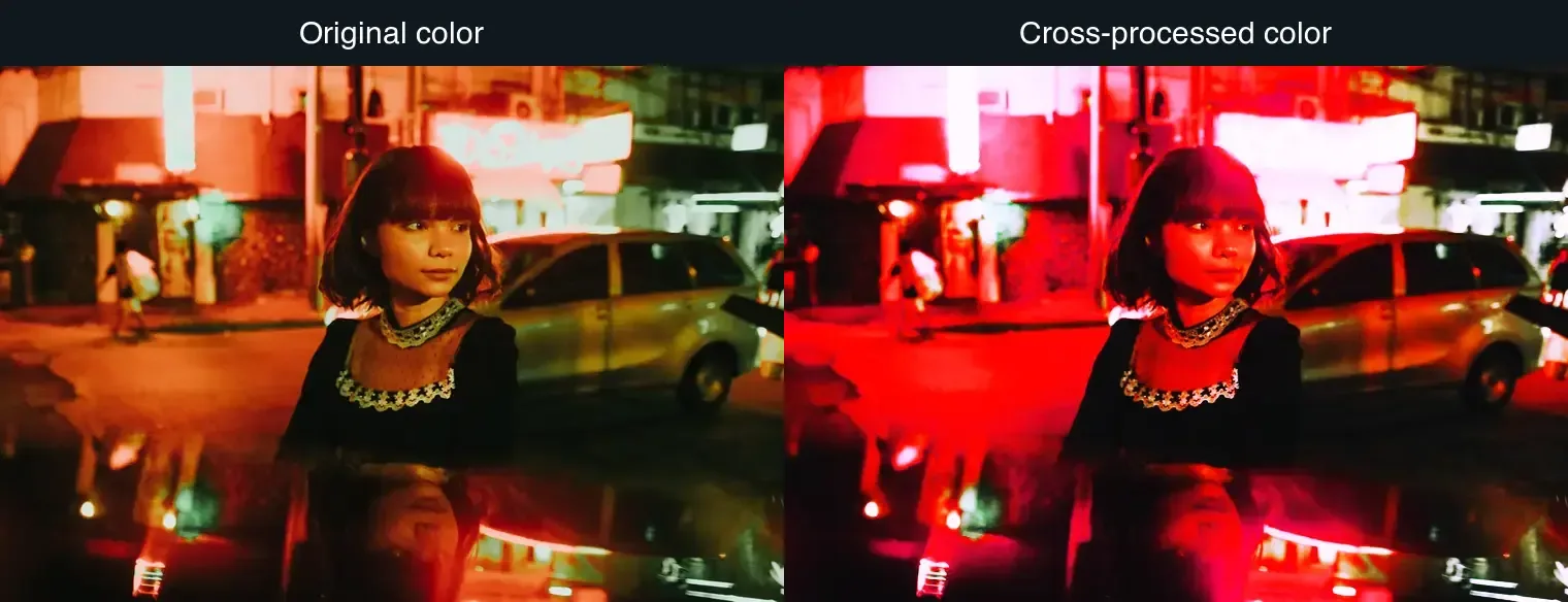
The exact look depends on the source image. A neon portrait tolerates a heavy magenta cast because the scene already has colored light. A daylight portrait needs a quieter grade because orange or red skin becomes distracting fast. Landscapes can take stronger greens and yellows, but skies may posterize if the original file is already compressed.
| Visual change | What viewers notice | Digital control to adjust |
|---|---|---|
| Higher contrast | Blacks feel heavier and highlights pop | RGB curve or contrast curve |
| Cyan/green shadows | Film-like cool shadows or lomo color | Blue and green channel curves |
| Warm or pink highlights | Sun, signs, and skin glow harder | Red channel curve and selective color |
| Stronger saturation | Colors feel less documentary | Vibrance, HSL, or saturation mask |
| Slight grain | Less clean digital finish | Film grain or noise layer |
For deeper color decisions, the image color space converter guide explains why RGB, display profiles, and export settings can change how a grade appears after upload.
When should you use cross processing?
Use cross processing when the color shift supports the subject. It is a strong editorial choice, so the best use cases have a reason for the color to feel unstable, nostalgic, or artificial.
Good fits:
- Night street portraits with neon, sodium vapor, or shop-window light.
- Concert and DJ images where accurate skin color is less important than energy.
- Travel photos that already have strong sun, signage, murals, or film texture.
- Fashion lookbooks that need a consistent campaign color.
- Album covers, posters, and thumbnails where color must read at a glance.
- Personal photo sets where the goal is memory and mood, not documentation.
Poor fits:
- Product photos where the buyer needs exact color.
- Real estate interiors where wall, wood, and lighting color must stay credible.
- Food photography, especially meat, greens, dairy, and baked goods.
- ID, passport, school, or corporate headshot work.
- Medical, restoration, archive, or evidence images.
| Source image | Safe intensity | Watch out for |
|---|---|---|
| Neon portrait | Medium to high | Red skin and clipped signs |
| Daylight portrait | Low to medium | Orange faces and gray shadows |
| Landscape | Medium | Cyan skies and radioactive greens |
| Product photo | Usually avoid | False color and buyer distrust |
| Screenshot or UI | Avoid | Text halos and unreadable brand colors |
If your goal is a related but softer retro look, compare this with the image light leak effect guide and the duotone photo effect guide. Light leaks add flare. Duotone reduces the palette. Cross processing keeps a full-color image but bends the channels.
How do you create a digital cross process effect?
Start with a high-resolution image and edit non-destructively if your tool supports layers or adjustment stacks. Adobe's Photoshop documentation for the Curves adjustment is a useful reference because the classic digital recipe is curve-based, not filter-based.
Use this order:
- Crop and straighten before grading.
- Set exposure so faces and key details are not already clipped.
- Add a gentle RGB S-curve to increase contrast.
- Open the red channel and lift highlights slightly.
- Open the green or blue channel and lift shadows slightly.
- Use HSL to reduce any skin tone that turns too red, orange, or green.
- Add a small amount of grain after resizing, not before.
- Export a copy and compare it at the final display size.
A practical starting recipe for a portrait is:
| Step | Conservative setting | Stronger setting |
|---|---|---|
| RGB curve | Small S-curve, protect highlights | Steeper S-curve, deeper blacks |
| Red channel | Lift highlights 3-6 points | Lift highlights 8-12 points |
| Blue channel | Lift shadows 3-5 points | Lift shadows 8-10 points |
| Saturation | +5 to +12 vibrance | +15 to +25 saturation |
| Grain | 2-5% fine grain | 6-10% visible grain |
The conservative version is better for portraits and client work. The stronger version is better for posters, covers, and social crops where dramatic color matters more than natural skin.
Can you make the effect with code?
Yes. Browser and server workflows can reproduce the same idea by reading pixels, applying curves, and writing the result back. The MDN Canvas pixel manipulation tutorial shows the core browser method: draw an image to a canvas, read pixel data, modify channels, and render the result.
For a simple implementation, keep the math restrained:
function crossProcessPixel(r, g, b) {
  const contrast = 1.12;
  const pivot = 128;

  r = pivot + (r - pivot) * contrast + 10;
  g = pivot + (g - pivot) * contrast - 2;
  b = pivot + (b - pivot) * contrast + (255 - b) * 0.06;

  return [
    Math.max(0, Math.min(255, r)),
    Math.max(0, Math.min(255, g)),
    Math.max(0, Math.min(255, b)),
  ];
}
That snippet is intentionally mild. Real tools should use lookup tables or curves rather than a single formula, because a good cross process grade treats shadows, midtones, and highlights differently. It should also preserve alpha, avoid repeated JPEG re-encoding, and provide a preview slider so the editor can catch broken skin tones quickly.
For web exports, pair the effect with format choices from the AVIF vs WebP comparison or the image compression deep dive. A dramatic grade often increases texture and saturation, which can make low-quality JPEG artifacts more visible.
How do you keep cross processing from looking fake?
The fastest way to ruin the effect is to push every channel equally hard. Cross processing should feel like a color decision made by the image, not a preset pasted onto the image.
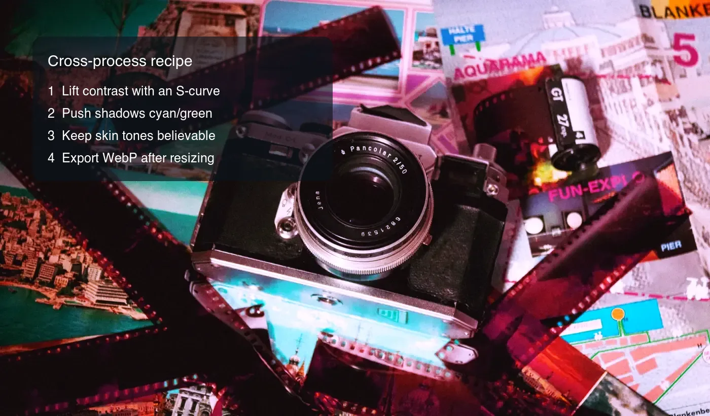
Use this checklist before exporting:
- Check skin at 100% zoom and at final social size.
- Pull back red saturation if cheeks, lips, or noses go neon.
- Keep one neutral anchor, such as a white sign, gray road, or black jacket.
- Avoid crushing all shadow detail; film-like does not mean unreadable.
- Watch blue skies for banding after compression.
- Add grain only after the main color grade is finished.
- Save a reusable preset, but adjust it per image.
- Compare before/after for five seconds, then look away and check again.
- Export WebP or AVIF for the web, but keep a higher-quality master.
- Do not batch-apply the same grade across mixed lighting without review.
| Problem | Likely cause | Fix |
|---|---|---|
| Skin looks sunburned | Red highlights or saturation too high | Lower red/orange HSL and reduce highlight curve |
| Shadows look muddy | Contrast added before exposure correction | Raise black point slightly and reduce green cast |
| Image looks like a filter | Same shift applied to every tone | Use separate shadow and highlight curves |
| Sky has bands | Compressed source or harsh gradient shift | Start from a better file and export at higher quality |
| Product color is wrong | Wrong use case | Use a cleaner grade or skip the effect |
What should you export after applying the effect?
I tested the example images here by grading the source photos, resizing the long edge to 1600 px, and exporting WebP copies for the article. The strongest color shifts made shadow noise more visible, so the cleaner result came from pulling back the grade slightly before compression instead of trying to hide artifacts afterward.
Resize first, then compress. A cross processed image often has more saturated edges and shadow noise than the original, so aggressive compression can create ugly blocks in exactly the areas that make the image interesting.
For web publishing:
- Keep the edited master as PNG, TIFF, PSD, or a high-quality JPEG.
- Resize to the largest real display size.
- Export WebP at roughly 78-85 quality for most editorial images.
- Use AVIF if your pipeline supports it and the encode time is acceptable.
- Add a JPEG fallback only if your audience includes older clients or email.
If the final file is still too large, use the image size reducer guide or the batch resize guide before lowering quality too far. Size problems are often caused by dimensions, not the cross process effect itself.
Summary: the useful version of the cross process effect
Cross processing is a color and contrast strategy with a real film origin. Digitally, the most useful version is simple: build contrast with a curve, separate color channels by tonal range, protect believable skin, then export from a clean resized master.
Use the effect when mood matters more than accuracy. Keep it off product, ID, and reference images. A good cross processed photo still has readable detail, intentional color, and one part of the image that keeps the viewer oriented.
Frequently asked questions
What is the cross process effect in photography?
It is the saturated, high-contrast color shift that results from developing film in chemistry meant for a different film stock, recreated digitally with curves and channel shifts.
What is the difference between cross processing E-6 and C-41 film?
E-6 chemistry is built for slide film and C-41 chemistry is built for color negative film, so cross processing means deliberately running one film type through the other's process.
Which photos look best with a cross process effect?
Night street portraits, concert and DJ shots, travel photos with strong signage or sun, fashion lookbooks, and album covers all suit the effect.
Which photos should avoid cross processing?
Product photos, real estate interiors, food photography, ID or passport images, and medical or archival photos should stay away from the effect.
How do you stop skin tones from looking sunburned?
Check skin at 100% zoom, then lower red and orange HSL saturation and pull back the highlight curve until faces read naturally again.
Should grain be added before or after resizing?
Add grain after resizing, not before, so the texture matches the image's final display size instead of getting crushed or exaggerated by scaling.
What export quality keeps a cross processed image clean?
Resize first, then export WebP at roughly 78-85 quality, or AVIF where the pipeline supports it, since the effect adds saturated edges and shadow noise.
Can the cross process effect be created with code?
Yes, browser Canvas pixel manipulation can shift red, green, and blue channels independently, though production tools should use lookup tables instead of a single formula.
Image credits
- Cover and before/after portrait source: photos by Alessandro Alves and Kenneth Surillo on Pexels, converted and graded to WebP.
- Film process reference: photo by Athena Sandrini on Pexels, converted and graded to WebP.
- Channel shift recipe: photo by Santiago Morales on Pexels, converted and graded to WebP.
Use the free tools while you follow the guide.
Keep reading
2026-07-28
AI Action Figure Trend: How to Prep Your Photo Right
Turn a photo into a collectible toy portrait: what makes the prompt work, and the crop, background, and resolution steps that avoid an obvious fake.
2026-07-26
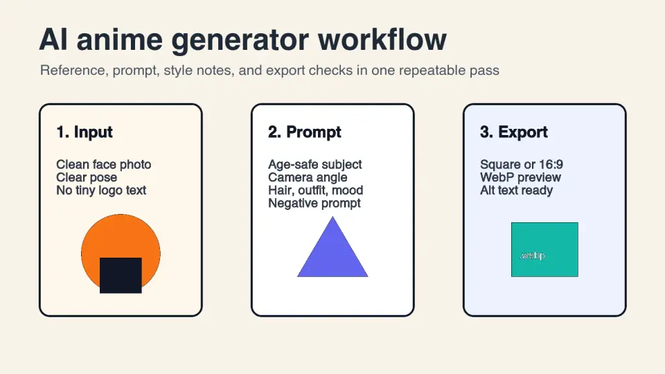
AI Anime Generator Guide: Prompts, Styles, and Safe Exports
A practical AI anime generator workflow for portraits, avatars, banners, and social posts, with prompt templates, style checks, and export rules.

2026-07-26
Text-to-Image AI in 2026: How Prompt Generation Actually Works
Text-to-image AI turns a written prompt into a finished picture. Here is how the models, prompts, and settings behind image generation fit together in 2026.