2026-03-28 · Updated 2026-07-12
How to Make a Watercolor Effect from a Photo
Turn a photo into a watercolor-style image with practical subject choices, wash texture settings, color controls, and export tips for web or print.
Last updated: July 12, 2026
Use a watercolor effect when the photo has a clear subject, simple lighting, and enough empty space for the paper texture to show. The effect falls apart fastest on tiny faces, busy foliage, harsh flash, and product shots where exact detail matters.
Quick answer: what makes a photo work as watercolor?
Our Watercolor Effect tool works best on a photo with one readable subject, soft contrast, and a background that can fade into a wash. Portraits, flowers, pets, storefronts, travel streets, and wedding details usually work. Screenshots, dense product grids, night photos, and photos with small text usually do not.
Set the effect strength high enough to simplify edges, then pull detail back into the eyes, hands, logo, or main object. A convincing watercolor image keeps a few crisp anchors and lets the rest dissolve into paper grain, pigment bloom, and uneven edges.
Export the final as PNG if you need transparency or print handoff, WebP for a fast web page, and high-quality JPEG when the destination rejects newer formats. MDN's image format reference is useful when you need to explain that choice to a client or developer.
Which photos should you choose?
A watercolor filter is less forgiving than a basic color filter. It removes detail on purpose, so the source image needs a strong silhouette before you start.
Use this selection table before uploading:
| Source photo | Watercolor result | Setting to start with |
|---|---|---|
| Single portrait with window light | Soft editorial portrait | Medium wash, medium edge detail |
| Flower, plant, food, or craft detail | Natural sketchbook look | High texture, light outline |
| Street or travel scene with one focal building | Loose postcard illustration | Medium wash, lower saturation |
| Product on white background | Often too empty or too commercial | Low wash, keep hard edges |
| Group photo with small faces | Faces become muddy | Use a different crop |
| Night photo or hard flash photo | Dark patches turn blotchy | Fix exposure first |
For portraits, crop before applying the effect. A head-and-shoulders crop usually survives better than a full-body photo where the face becomes a few painted dots. For landscapes, remove half the sky if it is flat; watercolor needs variation, not a giant blank rectangle.
Good source checks:
- The subject is recognizable as a thumbnail.
- The brightest area is not blown out.
- Important edges are not hidden by motion blur.
- The background has room to simplify.
- There is no tiny text that must stay readable.
- The image is at least 1200 px wide for web use.
If the photo is weak, fix basics first. Crop with the ideas in the photo editing fundamentals guide, correct color with the online color corrector guide, then apply the painterly effect.
How do you set watercolor texture and edges?
Watercolor style is mostly three controls: wash strength, edge detail, and paper texture. Different tools name them differently, but the decisions are the same.
Start with these settings, then adjust while zoomed to 100%:
| Control | Safe starting point | Raise it when | Lower it when |
|---|---|---|---|
| Wash strength | 55-70% | The photo still looks too photographic | Faces, jewelry, or logos look melted |
| Edge detail | 35-55% | The subject loses its silhouette | The result looks like a traced poster |
| Paper texture | 20-40% | Flat areas look digital | Texture competes with skin or text |
| Pigment bleed | 15-30% | You want a loose handmade border | Colors smear across important edges |
| Saturation | -5 to +10 | The image feels gray after the wash | Reds and blues look synthetic |
The most common mistake is maxing out every slider. Real watercolor has contrast between quiet washes and sharper marks. If every edge blooms and every surface has the same paper grain, the result looks like a filter preset.
For portraits, protect the eyes, eyebrows, mouth line, and hairline. For pets, protect the eyes and nose. For buildings, protect rooflines, doors, signs, and window rhythm. You can let clothing folds, trees, pavement, and distant backgrounds loosen.
If your tool supports masking, use this order:
- Apply the watercolor effect globally.
- Reduce effect strength on the face or main object.
- Add texture back to large blank areas.
- Increase edge detail only where the silhouette needs help.
- Compare before and after at thumbnail size.
For another painterly style with heavier brush marks, see the oil painting photo effect guide. If you want bold ink lines instead of transparent washes, the comic book effect guide is a better match.
What color settings make it look painted instead of filtered?
Watercolor color should feel slightly selective. You do not need every source color. Two or three dominant hues, plus a small accent, usually read better than a fully saturated photo.
I tested this workflow on portraits and botanical source images while preparing the examples for this post: the best results came from reducing overall contrast first, then adding a small saturation lift after the wash. Doing it in the opposite order made red and blue areas look printed rather than painted.
Use these color decisions:
- Warm portraits: keep skin warm, lower orange saturation slightly, and avoid blue shadows on the face.
- Botanical photos: let greens separate into two tones so leaves do not become one flat patch.
- Travel buildings: keep one accent color, such as a door, awning, or flower box.
- Food photos: use a light wash; heavy paper texture can make food look dry.
- Brand graphics: sample the brand color after the effect, because watercolor filters shift hue.
The paper color matters too. Pure white can make the result look digital. A slight warm paper tone is usually safer for portraits and florals. Cool paper works better for winter scenes, blue interiors, and architectural sketches.
Avoid automatic "vintage" settings unless you actually want a sepia print. Watercolor is transparent and airy; too much brown shadow makes it look aged rather than painted.
How should you export a watercolor image?
Export depends on where the image will live. A watercolor image has soft gradients and texture, so compression artifacts can show up in paper grain faster than they do in a normal photo.
| Destination | Format | Practical export rule |
|---|---|---|
| Blog, landing page, portfolio | WebP | 1600 px wide, quality 78-85 |
| Instagram or Pinterest | JPEG | Export at platform size, quality 85-90 |
| Print card or framed art | PNG or high-quality JPEG | 300 DPI at final print dimensions |
| Transparent sticker or overlay | PNG | Keep alpha; avoid JPEG |
| Developer handoff | WebP plus source PNG | Small web asset plus editable master |
For web pages, image bytes still affect loading speed. Google's LCP guidance calls out large images as common Largest Contentful Paint elements, so resize before format conversion. If the image displays at 900 px wide, do not upload a 5000 px export.
Use this export checklist:
- Save a full-resolution master before compression.
- Resize to the actual display width.
- Export WebP for web when the destination supports it.
- Keep JPEG as a compatibility fallback for email or older upload forms.
- Check the image at 100% zoom for blocky paper texture.
- Compress a copy, not your only master file.
The AVIF vs WebP comparison explains when WebP or AVIF is worth using. For a deeper explanation of quality settings and artifacts, read how image compression works.
What workflow gives the most reliable result?
Use this order when you need a watercolor-style image for a post, invitation, profile image, or product story:
- Choose a photo with one main subject.
- Crop to remove clutter before applying the effect.
- Fix exposure and white balance.
- Apply a medium watercolor wash.
- Restore detail on the important subject areas.
- Tune paper texture after the composition works.
- Limit the palette to a few readable colors.
- Export one master and one web-sized copy.
- View it on a phone before publishing.
- Replace the source photo if the thumbnail is unreadable.
For a fast online workflow, use the AI art generator from photo when you want a more interpretive result, or use a lighter editor when you only need a filter. If the final image goes on a public page, run it through the image SEO optimization checklist before publishing.
Common mistakes to avoid
The quickest way to ruin a watercolor effect is to chase detail and softness at the same time. Decide what must stay readable, then let the rest simplify.
Watch for these issues:
- Muddy faces: lower wash strength around eyes, nose, and mouth.
- Fake paper grain: reduce texture opacity if it looks tiled or too sharp.
- Over-saturated pigment: lower saturation before blaming the effect.
- Lost subject edge: add outline or edge detail only around the subject.
- Blotchy shadows: brighten the source photo before applying the effect.
- Tiny unreadable text: remove it, crop it out, or choose a different image.
- Huge export files: resize first, then use the image compressor.
- Wrong format: use the image converter when the upload destination requires JPEG, PNG, or WebP.
Summary
A good watercolor photo effect starts before the filter. Pick a simple photo, crop hard, fix exposure, and keep a few sharp anchors. Use medium wash strength, restrained paper texture, and selective color instead of pushing every slider to maximum.
Export the image for the job: WebP for a fast page, JPEG for broad upload compatibility, and PNG when transparency or print handoff matters. Check the final at thumbnail size and 100% zoom; if it fails either view, adjust the crop or choose a cleaner source photo.
Frequently asked questions
What kind of photo works best for a watercolor effect?
A photo with one readable subject, soft contrast, and a background that can fade into a wash works best, which is why portraits, flowers, pets, and travel streets usually hold up.
Which photos should you avoid turning into a watercolor image?
Skip screenshots, dense product grids, night photos, and images with small text, since the effect removes detail on purpose and those sources depend on detail staying sharp.
What wash strength should you start with?
Start around 55-70% wash strength and only raise it if the photo still looks too photographic after the first pass.
How do you stop faces from looking muddy in a watercolor effect?
Lower the wash strength and edge detail around the eyes, nose, and mouth so those anchors stay recognizable while the rest of the image simplifies.
Should you raise saturation before or after applying the watercolor wash?
Add the saturation lift after the wash, since testing this order on portraits and botanical photos showed that raising it first makes reds and blues look printed rather than painted.
What file format should you export a watercolor image in?
Use WebP for a fast web page, JPEG for social platforms like Instagram or Pinterest, and PNG when you need transparency or a print handoff.
How is a watercolor effect different from an oil painting effect?
Watercolor relies on transparent washes and paper texture, while the oil painting effect builds up heavier, opaque brush marks.
What is the most common mistake when applying a watercolor filter?
Maxing out every slider at once is the most common mistake, since real watercolor needs contrast between quiet washes and a few sharper marks.
Image credits
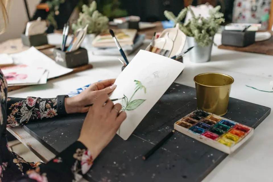
- Cover and botanical workflow image: photo by Pavel Danilyuk on Pexels, converted to WebP.
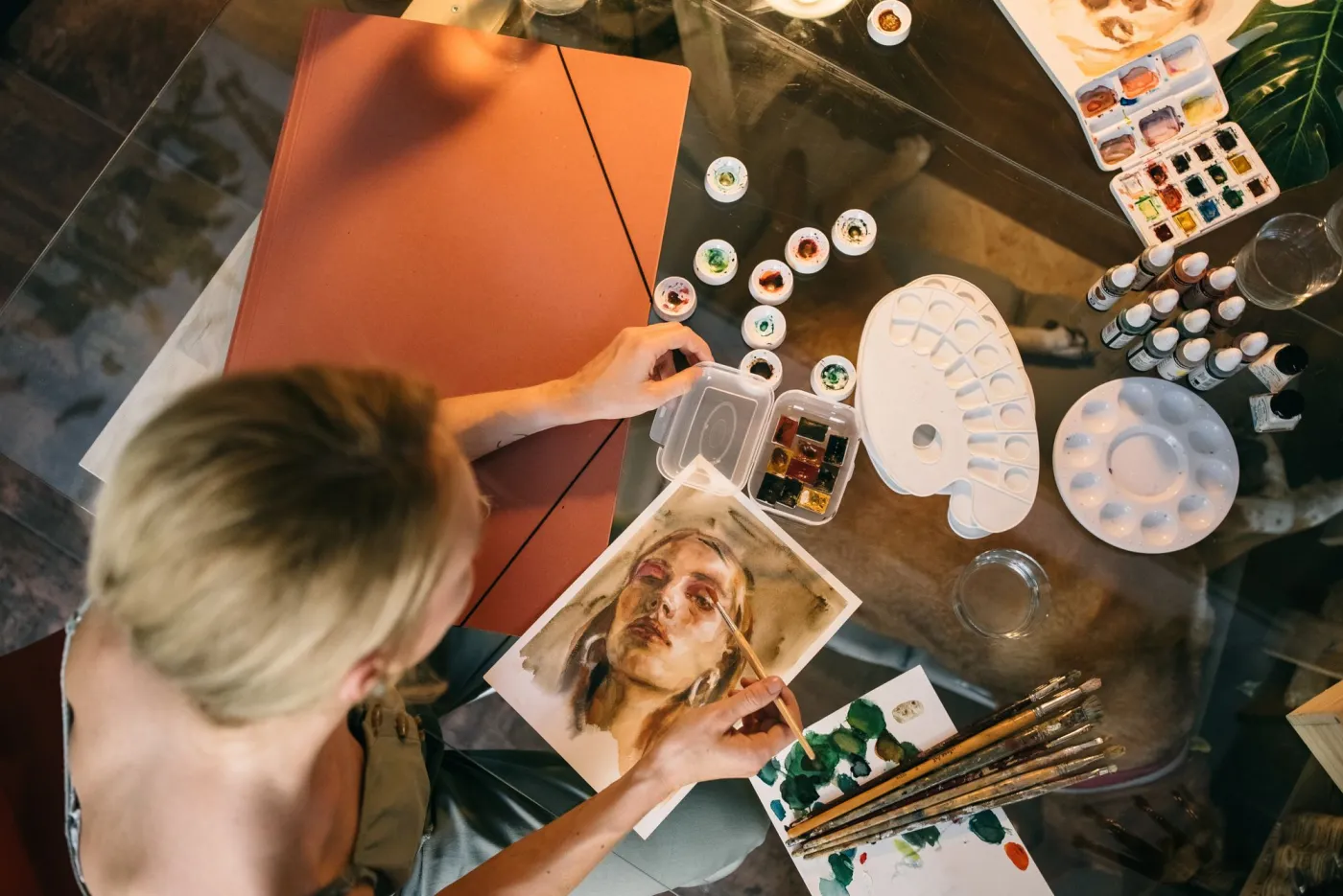
- Portrait watercolor process: photo by Leeloo The First on Pexels, converted to WebP.
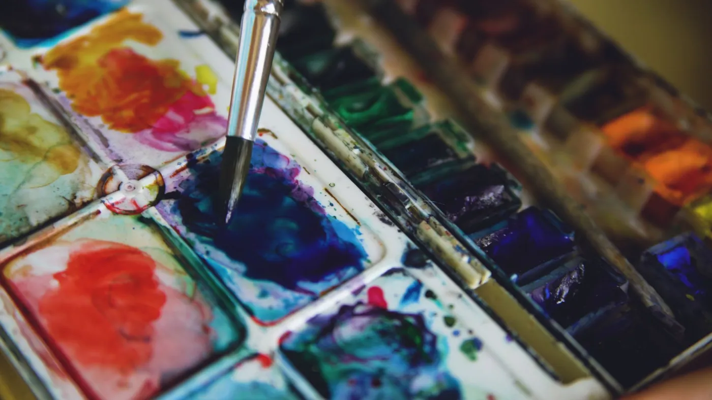
- Palette color control: photo by Vitaly Gariev on Pexels, converted to WebP.
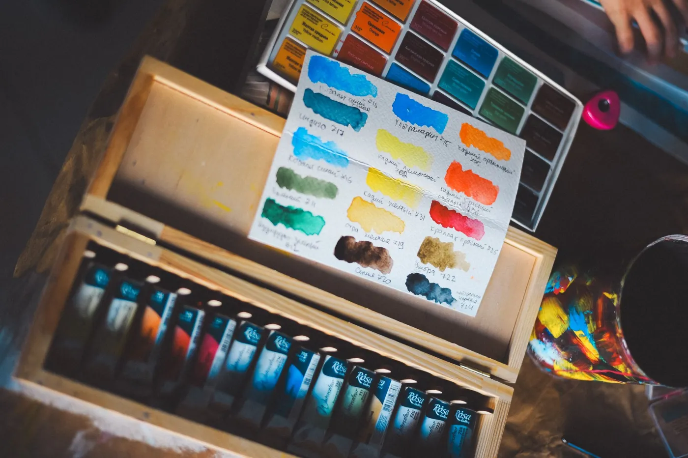
- Workspace texture reference: photo by Daka on Pexels, converted to WebP.
Use the free tools while you follow the guide.
Keep reading
2026-07-28
AI Action Figure Trend: How to Prep Your Photo Right
Turn a photo into a collectible toy portrait: what makes the prompt work, and the crop, background, and resolution steps that avoid an obvious fake.
2026-07-26
AI Anime Generator Guide: Prompts, Styles, and Safe Exports
A practical AI anime generator workflow for portraits, avatars, banners, and social posts, with prompt templates, style checks, and export rules.

2026-07-26
Text-to-Image AI in 2026: How Prompt Generation Actually Works
Text-to-image AI turns a written prompt into a finished picture. Here is how the models, prompts, and settings behind image generation fit together in 2026.